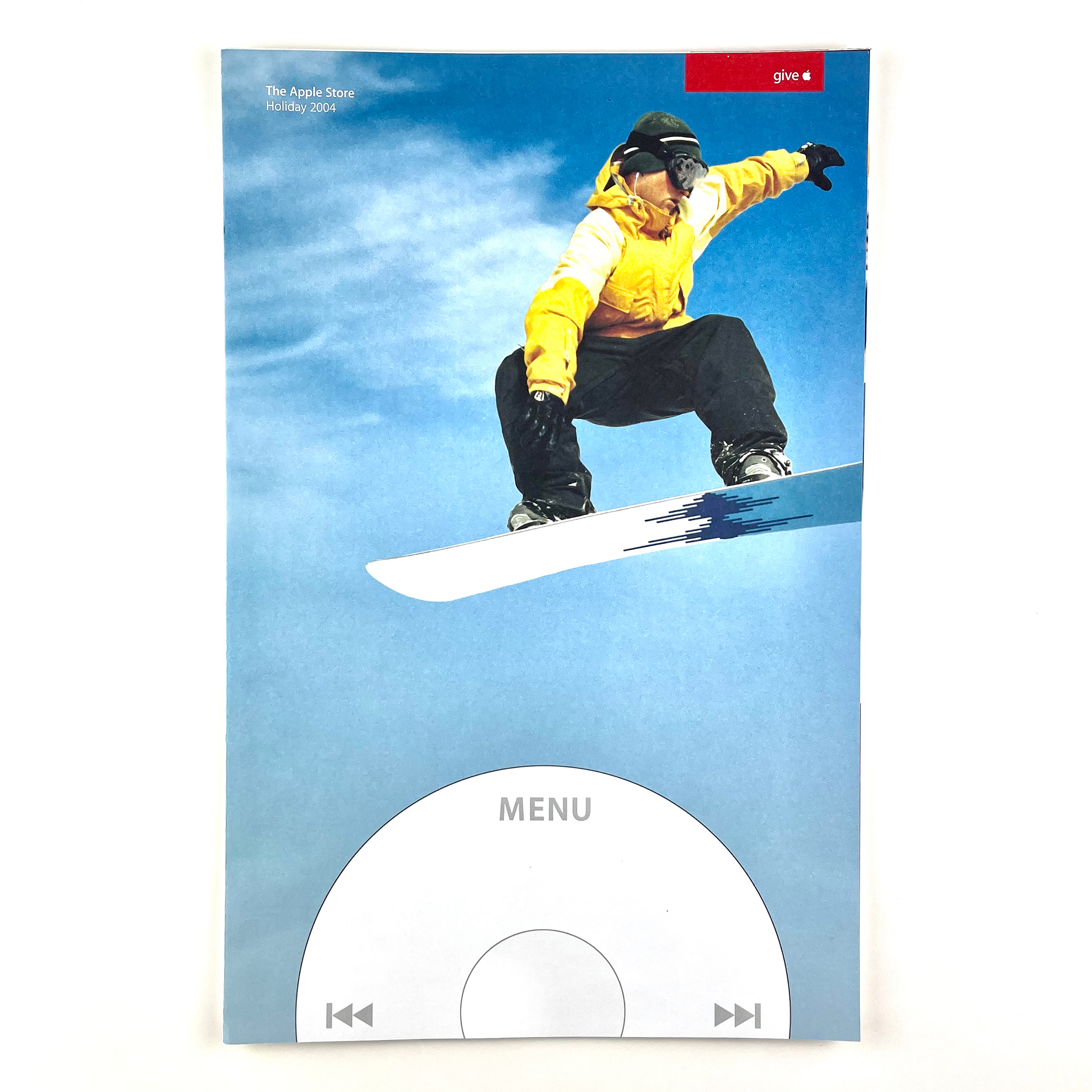
I remember picking up this catalog at an Apple Store in 2004. It is large for a catalog at 11 x 17 inches and is printed on heavy matte paper. Each spread features “lifestyle” photos of people using then-current Apple products in everyday settings. Each product is then described in detail including features, uses, and available peripherals. Full-page “case studies” from regular people using the products in real life are also included.
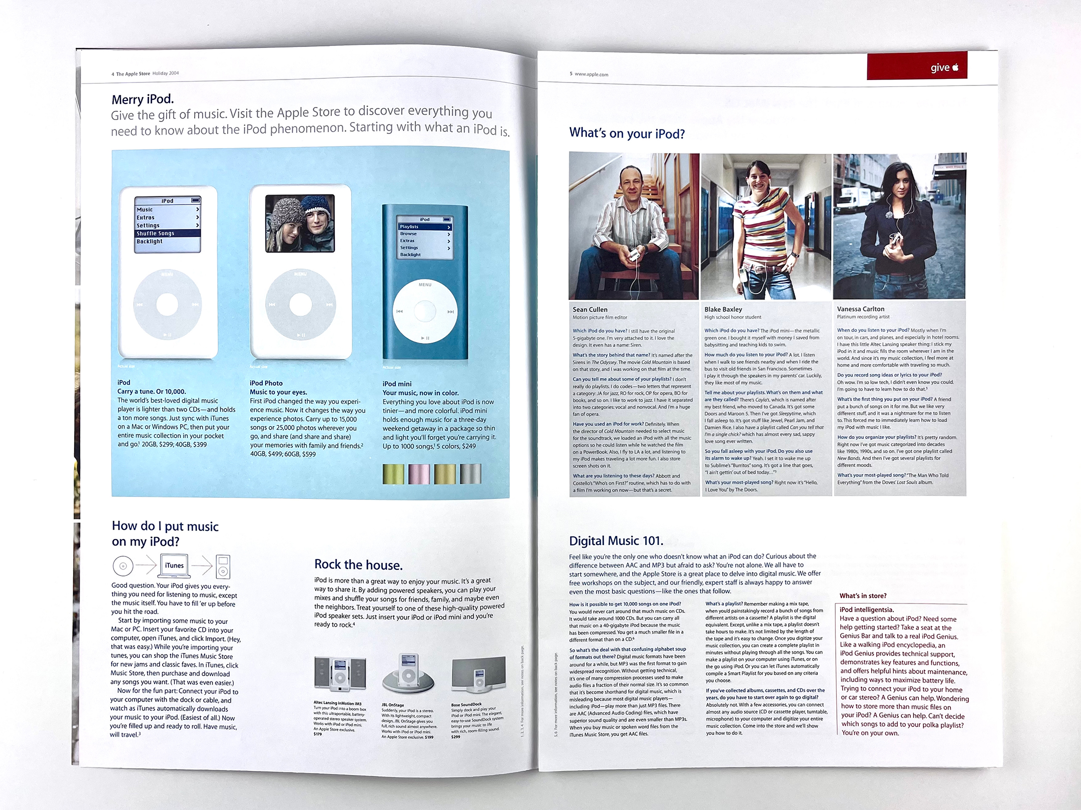
The first product featured is iPod. The 2004 models included iPod with scroll wheel (with a monochrome display), iPod Photo (color display), and iPod mini (monochrome display and available in four colors).
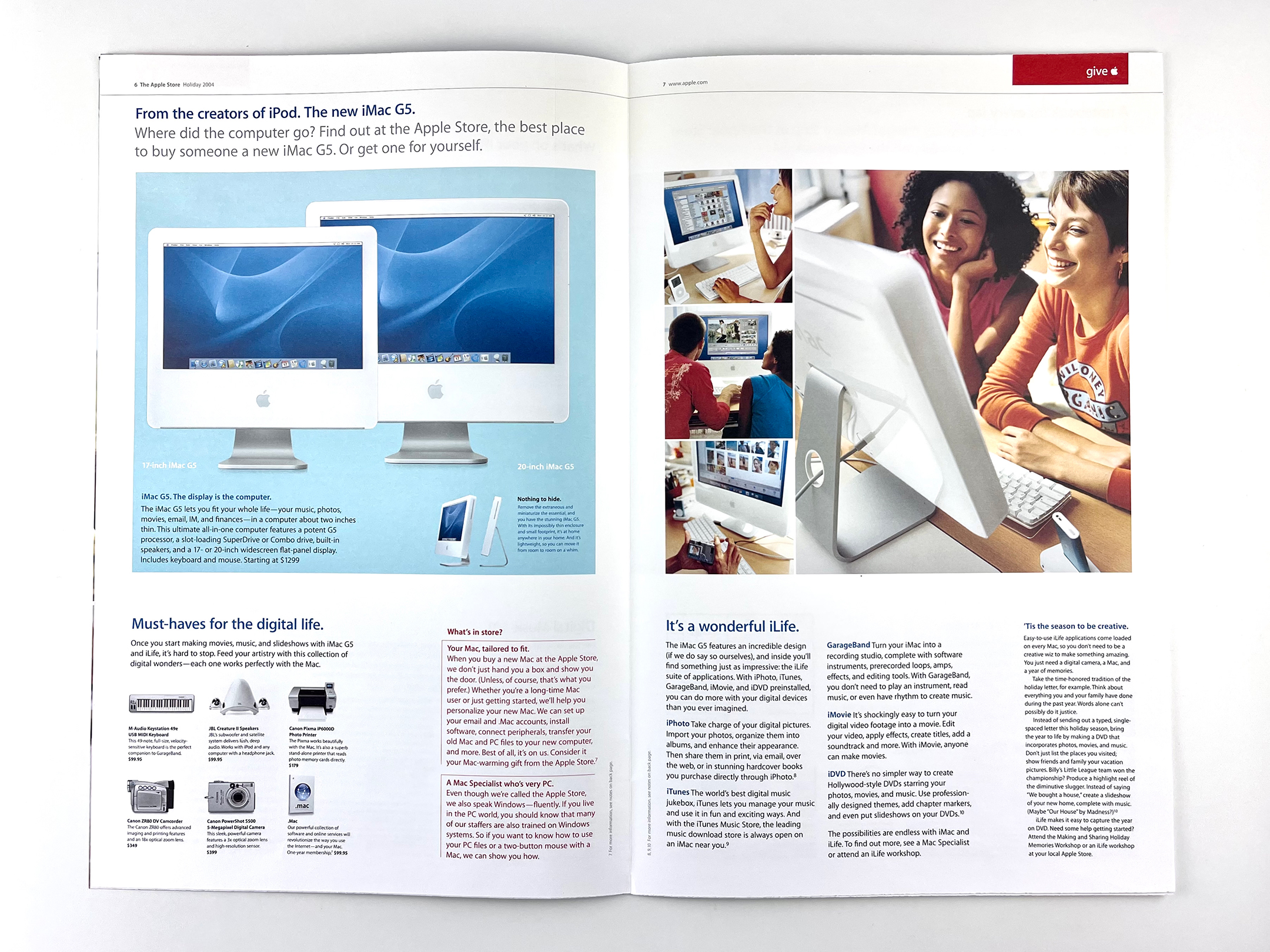
The next spread highlights the iMac G5. These were Apple’s second flat-panel iMac models that were available with 17 or 20-inch “widescreen flat panel” displays. The iLife apps are mentioned here in holiday contexts.
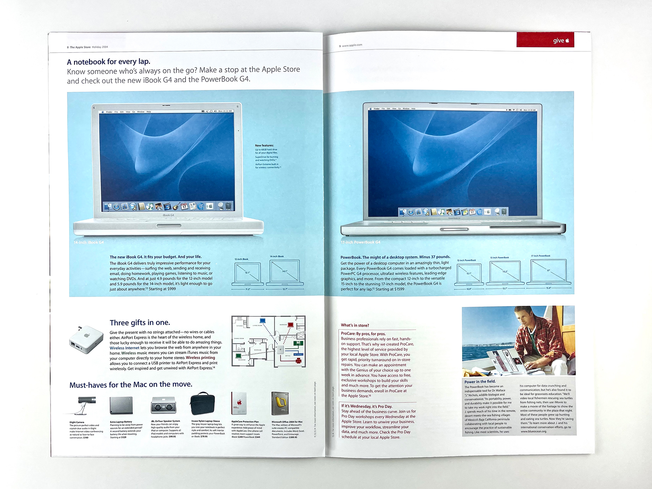
Apple “notebooks” are shown next, including the white 12 and 14-inch iBook models and the 12, 15, and 17-inch PowerBook G4 models. The AirPort Express is mentioned as a solution for streaming music and wireless printing in the home.
The last 2-page spread includes “A day in the life of a Genius,” and highlights in-store workshops and presentations.
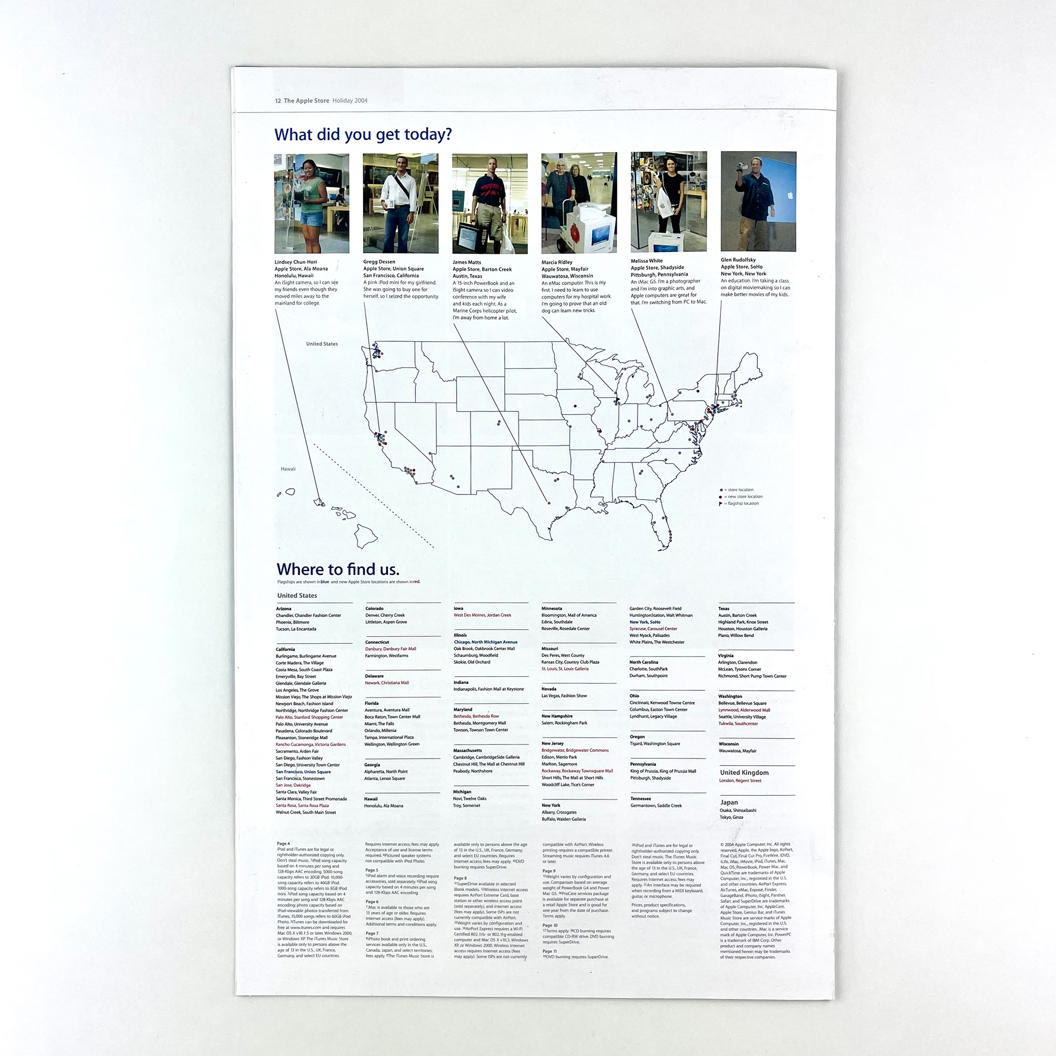
The back page shows a map of the United States and the locations of all Apple Stores worldwide. Six happy Apple customers are also featured with their Apple Store purchases across the US.