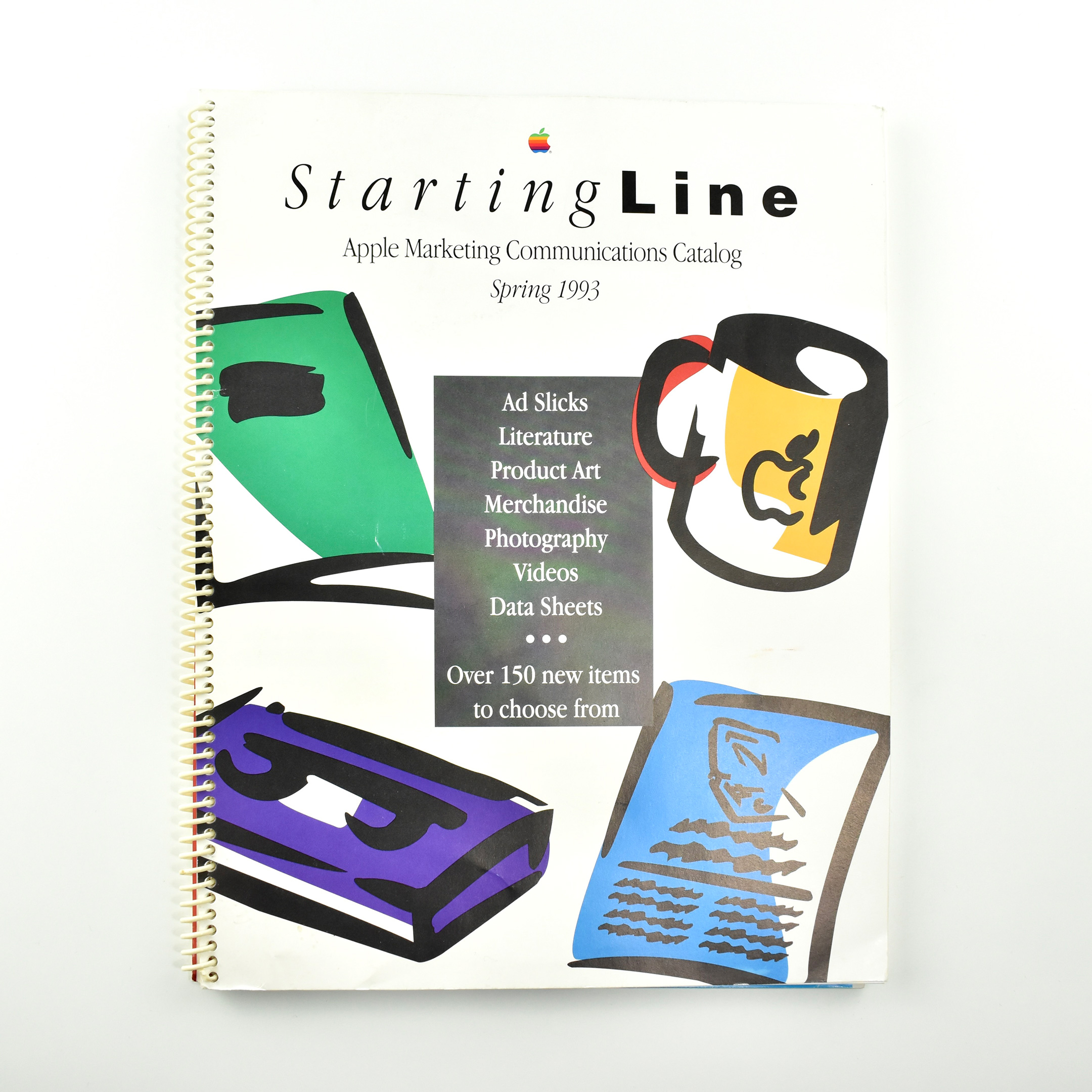
This catalog is titled StartingLine: Apple Marketing Communications Catalog and was released in Spring 1993. It measures 8.5 x 11 inches and is spiral-bound with white plastic. The front and back covers feature colorful, brush-stroke stylized graphics of the types of products featured in the catalog. The cover describes the contents of the catalog as containing:
Ad Slicks Literature Product Art Merchandise Photography Videos Data Sheets Over 150 new items to choose from
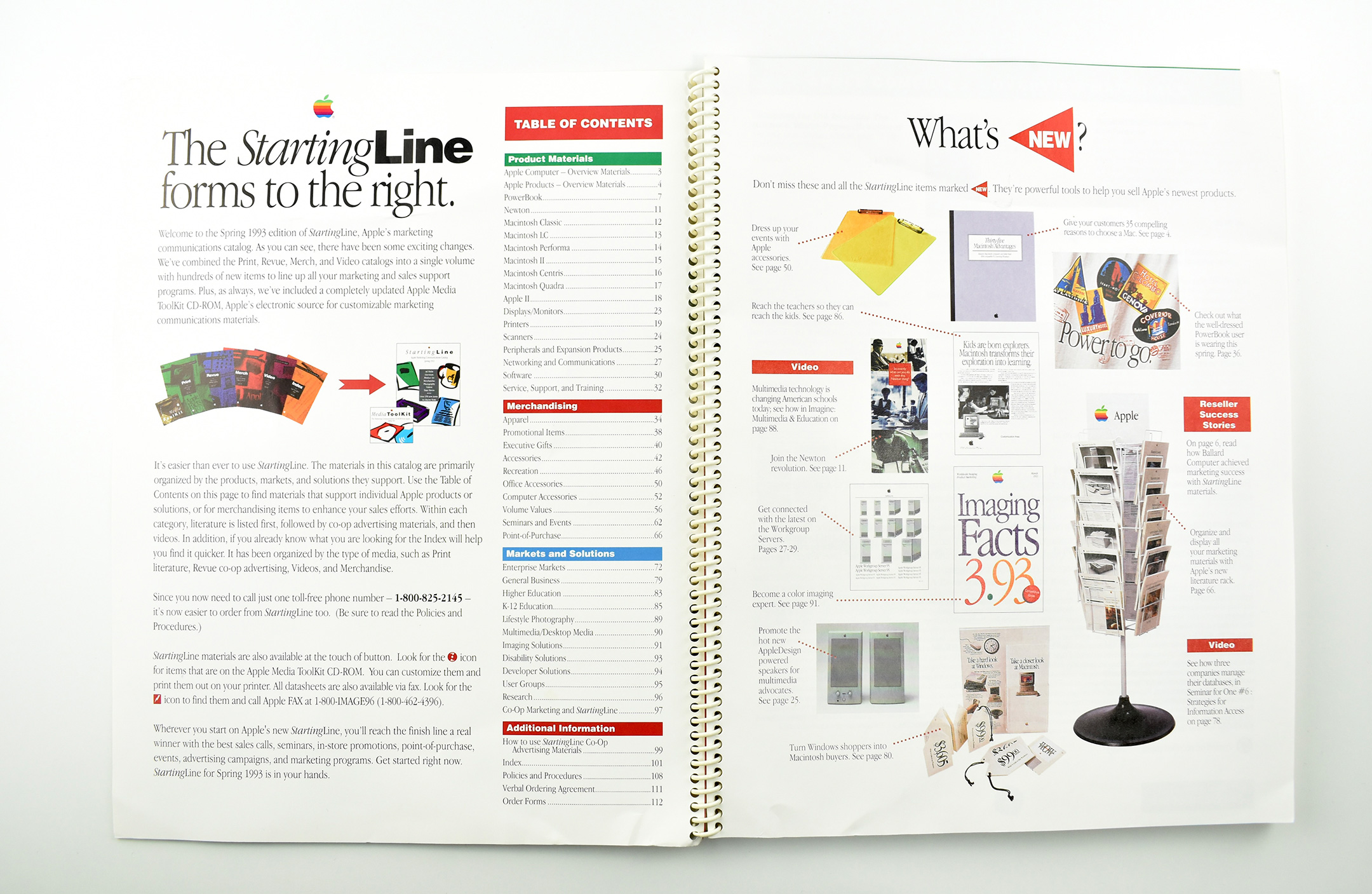
The Table of Contents reveals four major sections: Product Materials, Merchandising, Markets and Solutions, and Additional Information. The catalog provides a welcome message:
“Welcome to the Spring 1993 edition of StartingLine, Apple’s marketing communications catalog. As you can see, there have been some exciting changes. We’ve combined the Print, Revue, Merch, and Video catalogs into a single volume with hundreds of new items to line up to all your marketing and sales support programs. Plus, as always, we’ve included a completely updated Apple Media ToolKit CD-ROM, Apple’s electronic source for customizable marketing communications materials.”
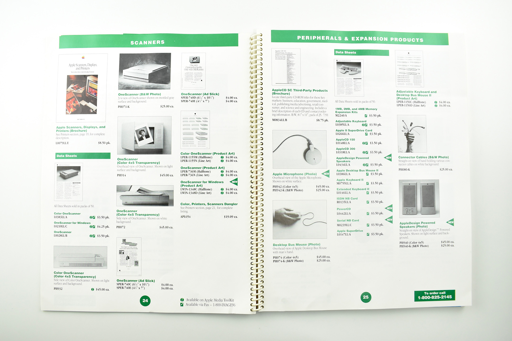
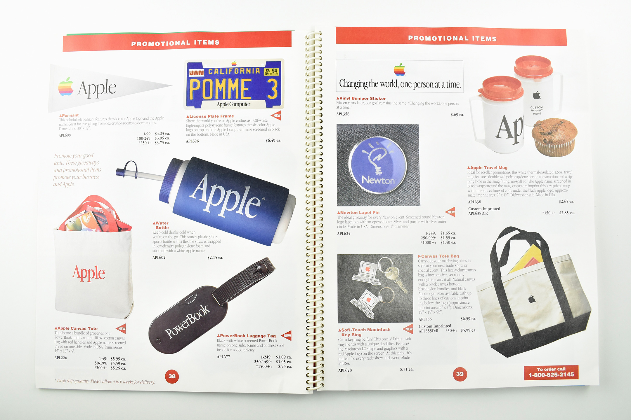
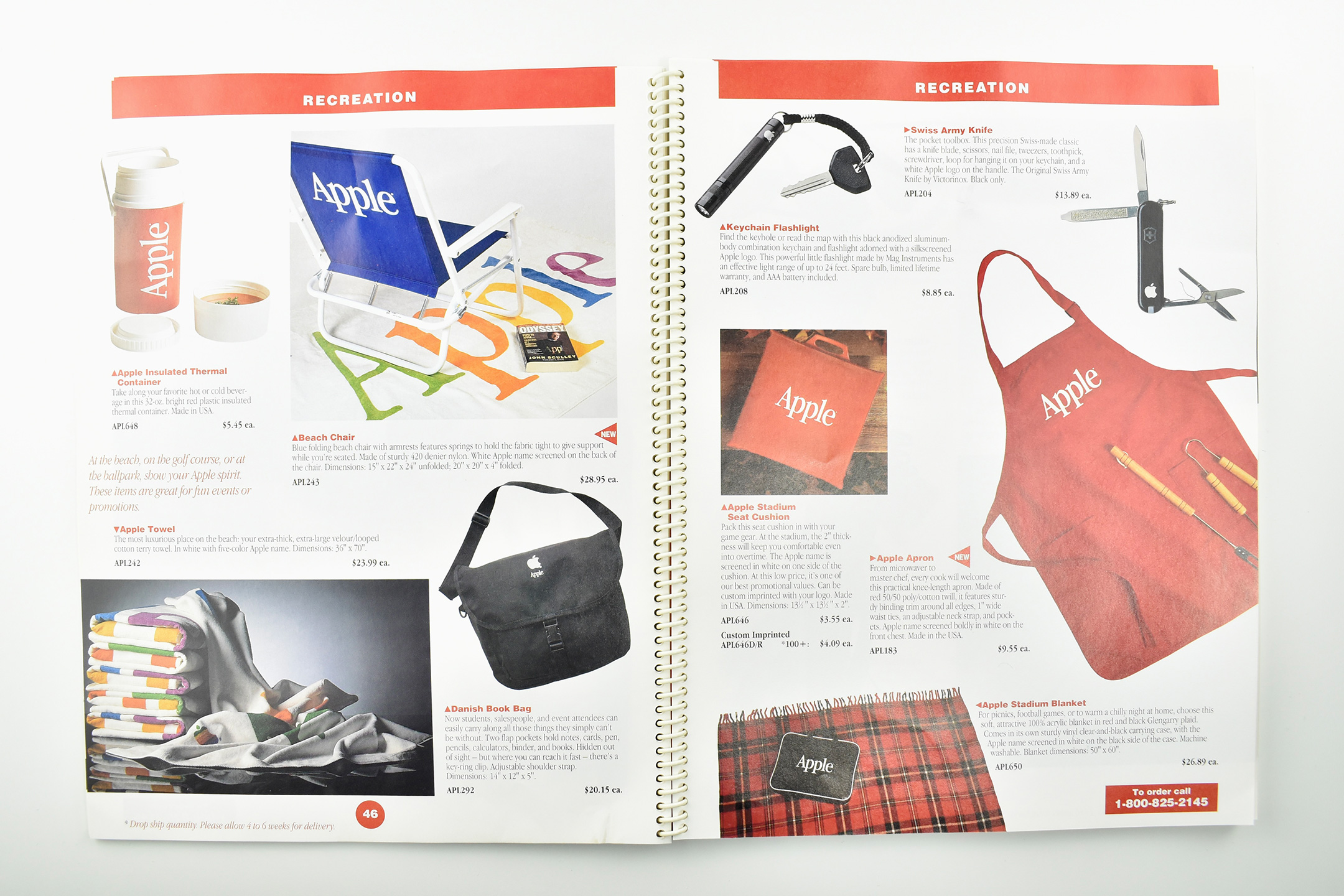
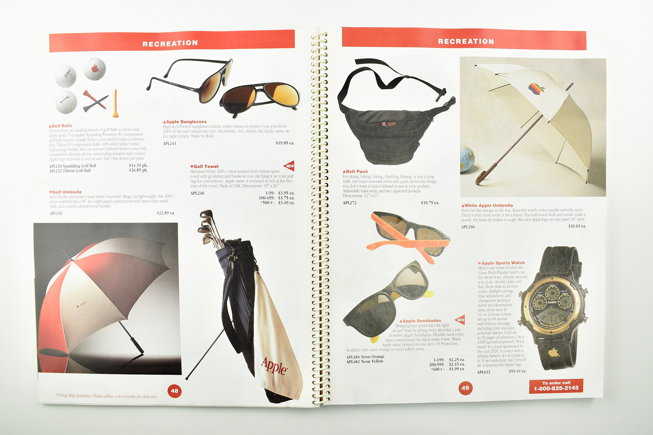
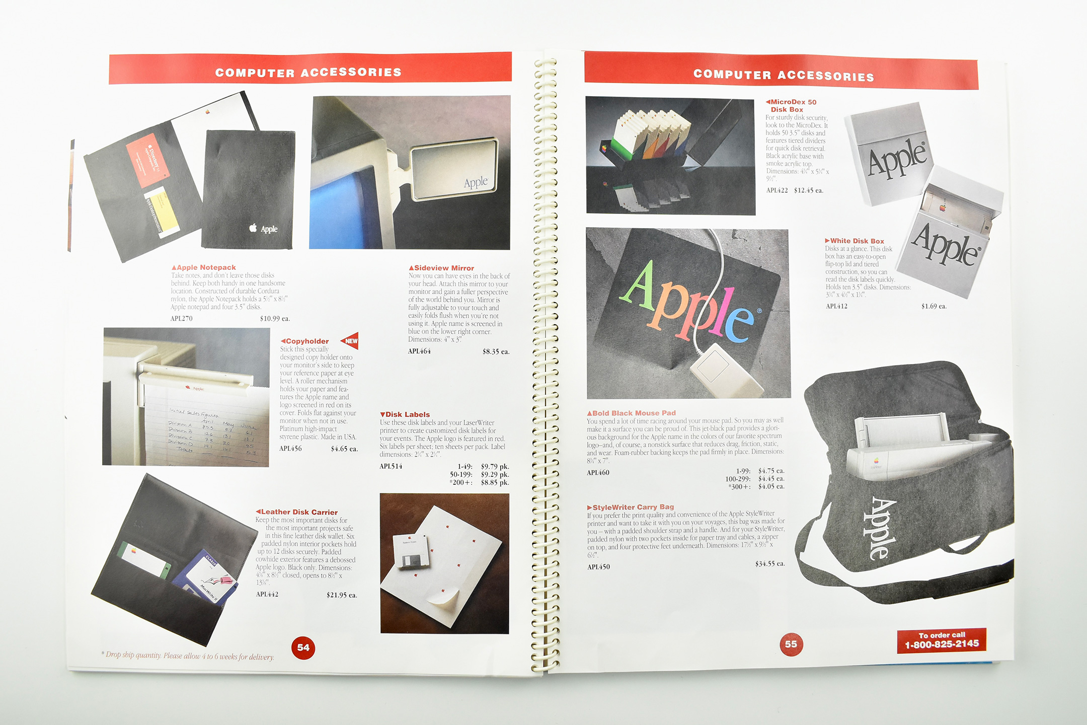
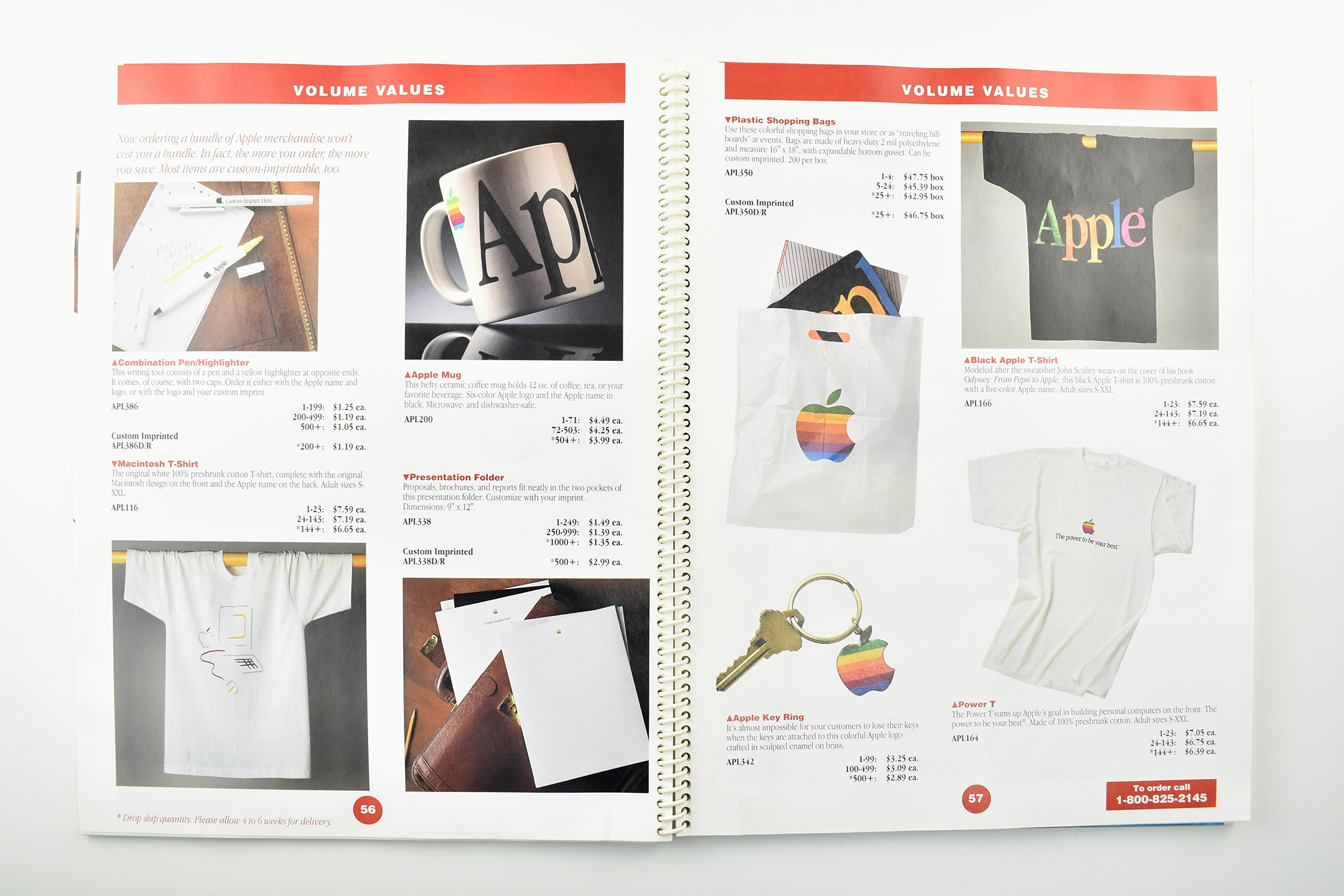
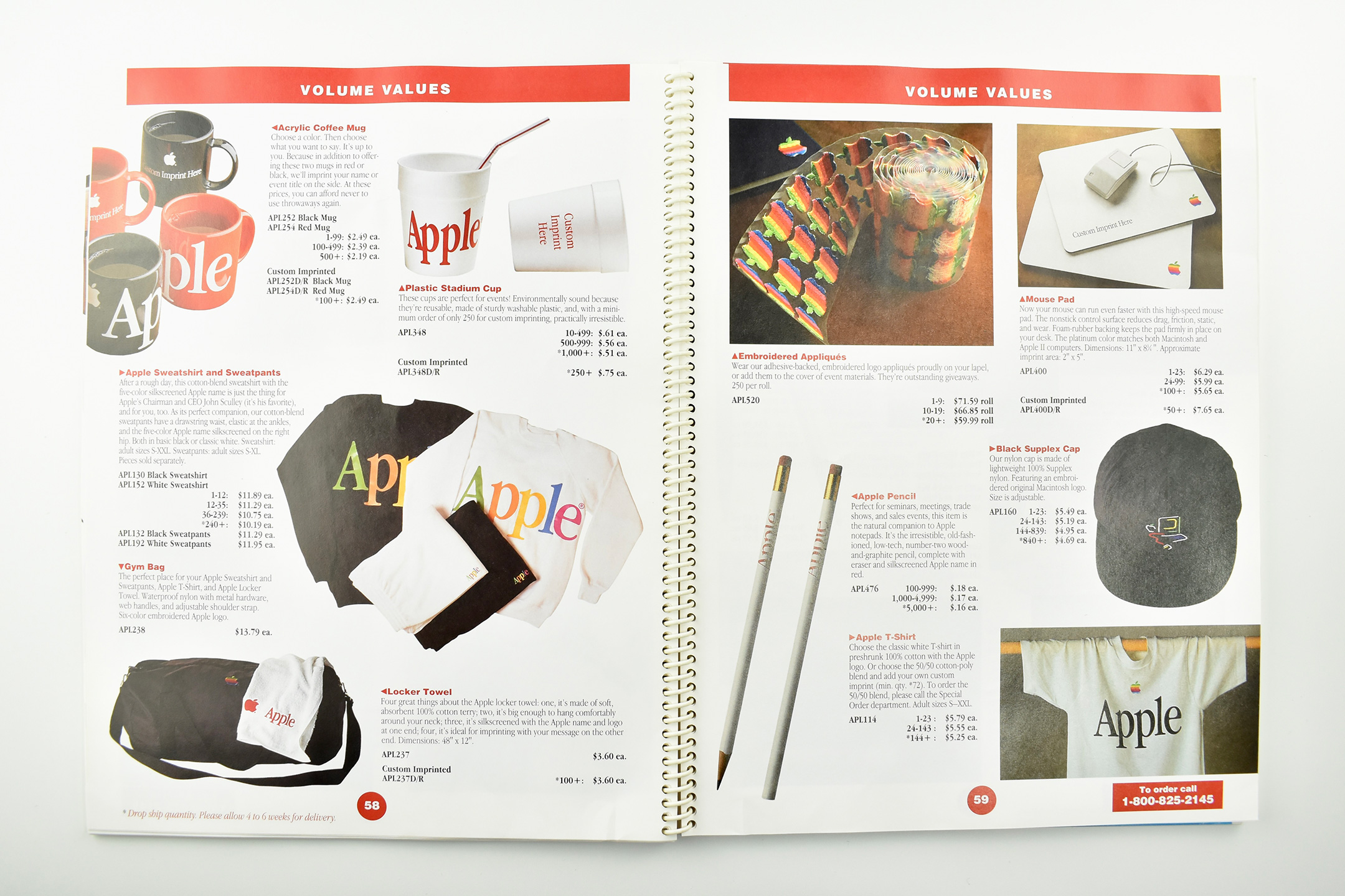
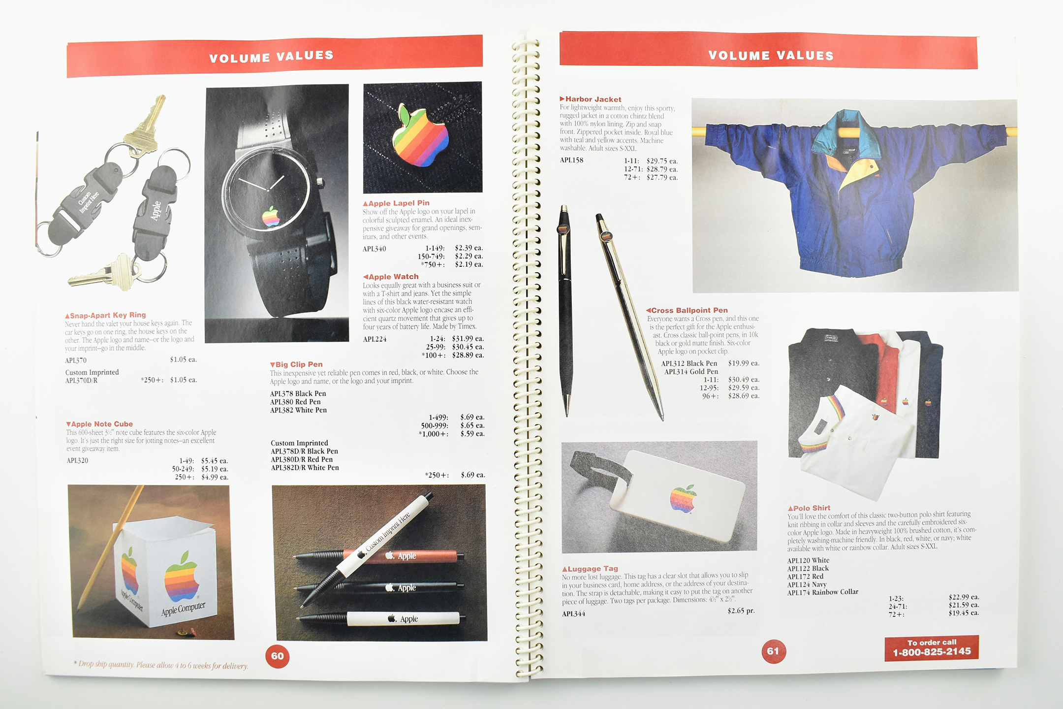
For a collector, the Merchandising section of this catalog is a treasure trove of Apple-logo item information from the time. Included below are photos of the entire Merchandising section that provide product shots and descriptions. This source has allowed me to confirm provenance, date, and an “official” description for several items in my collection.
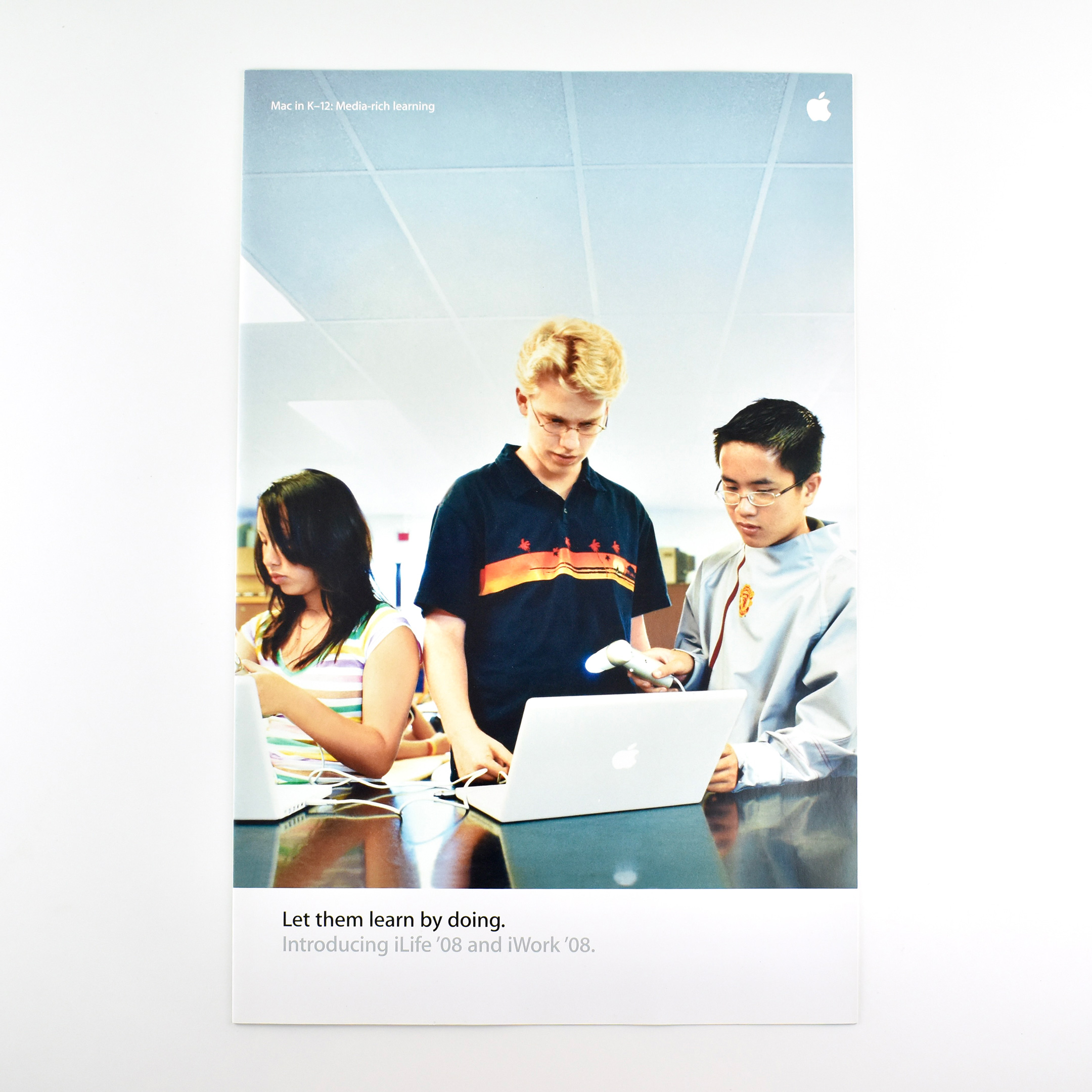
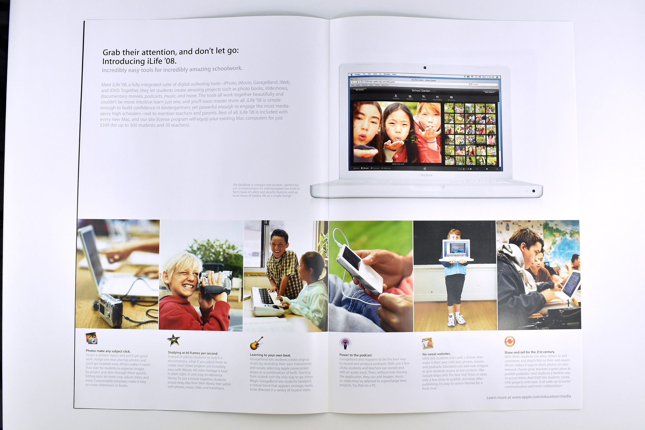
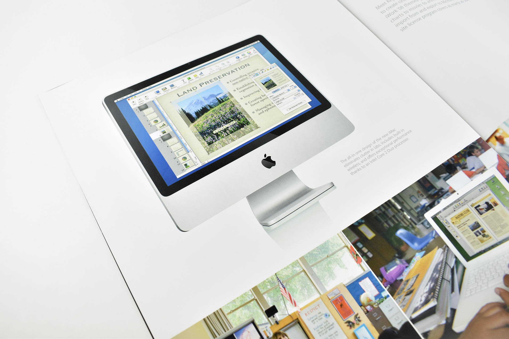
This large, full-color brochure measures 11×17 inches and folds out into a 2-up layout with a total measurement of 22×17 inches. The brochure was provided to Apple Education customers and explains how iWork ’08 and iLife ’08 could be used in the classroom.
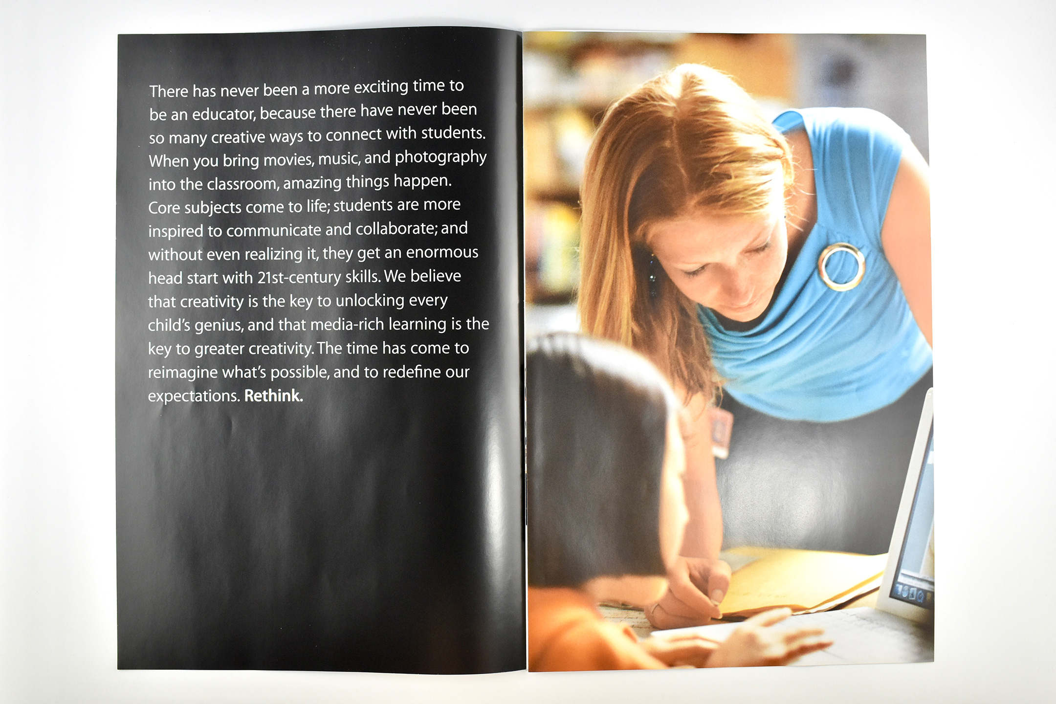
The cover includes three students using white MacBook notebooks with USB science probes in a classroom. Upon opening the brochure, the first spread is a striking photo of a teacher working with a student with an all-black facing page with white text (in the then-current Apple Myriad font). The text reads:
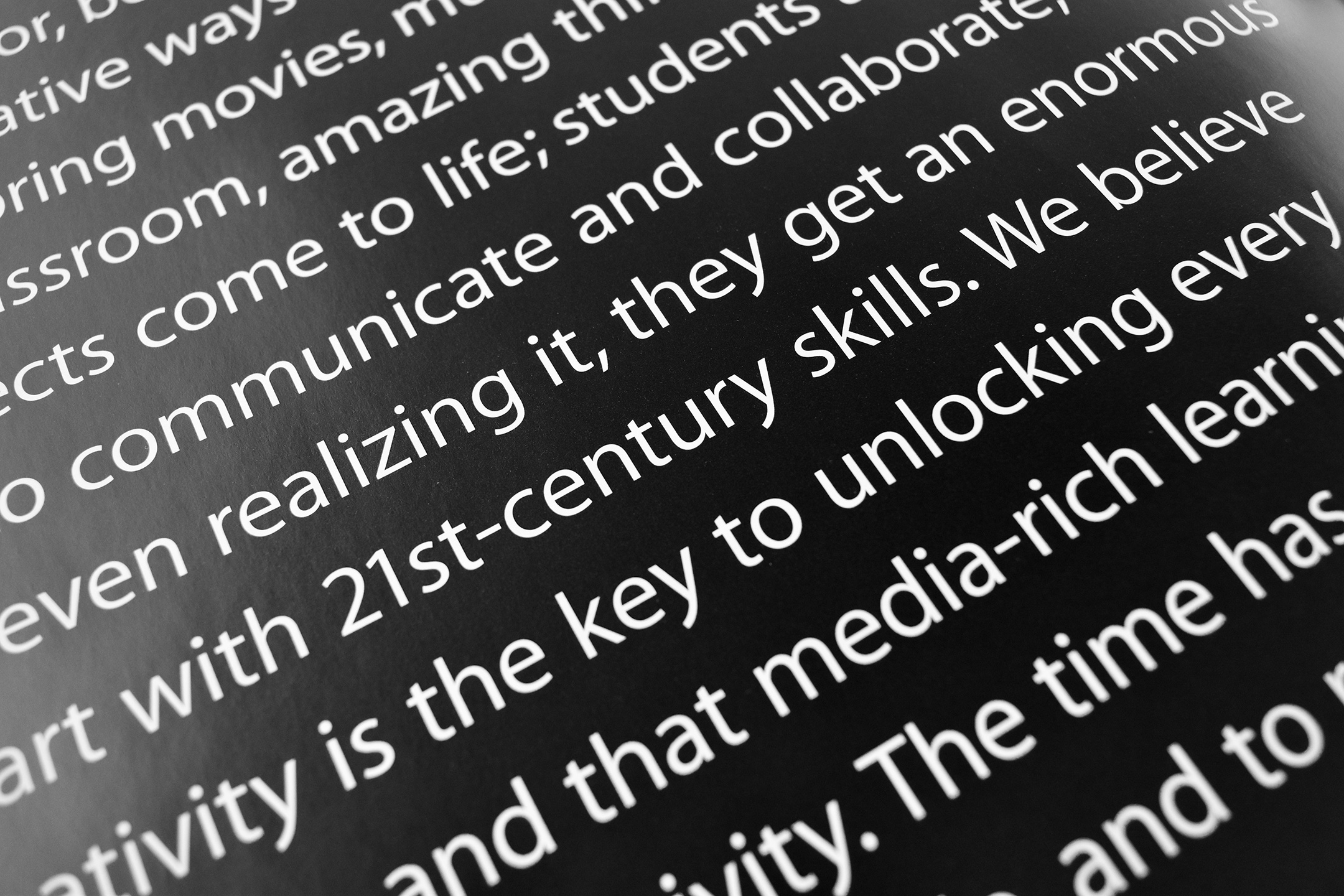
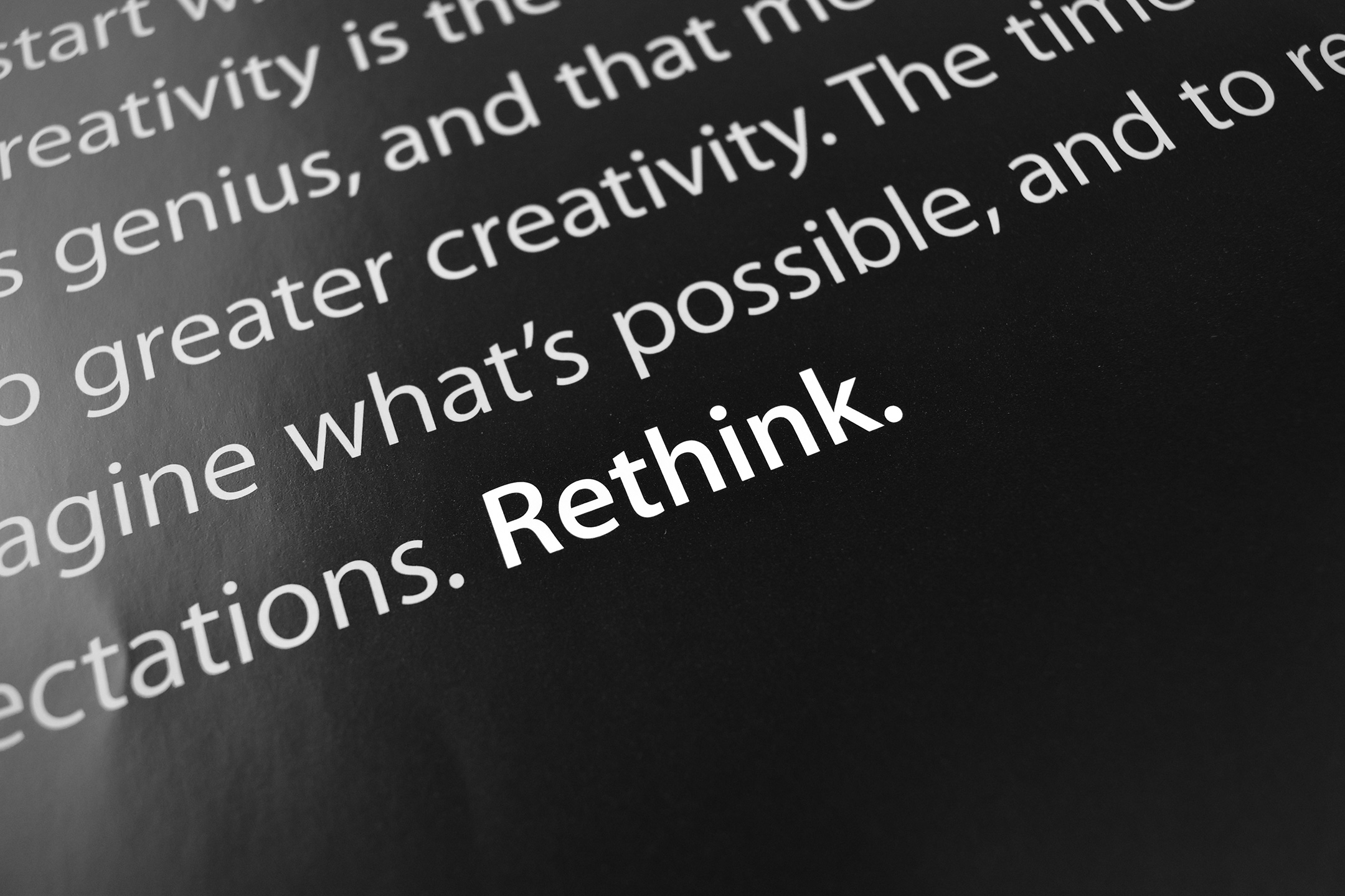
“There has never been a more exciting time to be an educator, because there have never been so many creative ways to connect with students. When you bring movies, music, and photography into the classroom, amazing things happen. Core subjects come to life; students are more inspired to communicate and collaborate; and without even realizing it, they get an enormous head start with 21st-century skills. We believe that creativity is the key to unlocking every child’s genius, and that media-rich learning is the key to greater creativity. The time has come to reimagine what’s possible, and to redefine our expectations. Rethink.”
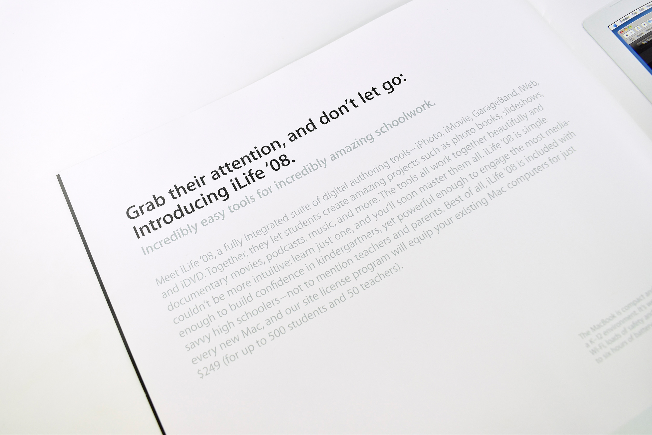
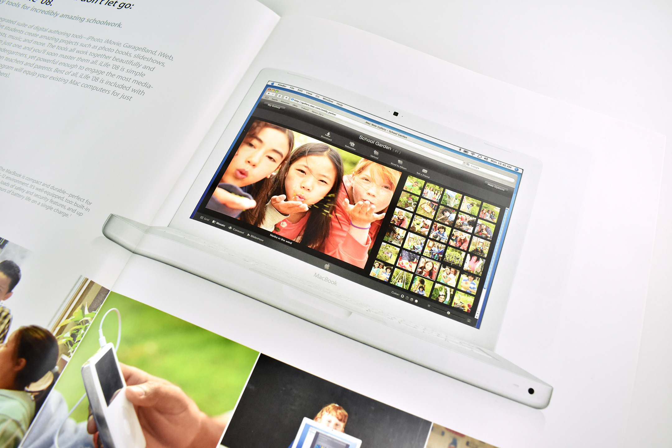
The center, 2-page spread is on an all-white background and outlines six features of iLife ’08 pictured along with a white MacBook. The text reads:
“Grab their attention, and don’t let go: Introducing iLife ’08. Incredibly easy tools for incredibly amazing schoolwork. Meet iLife ’08, a fully integrated suite of digital authoring tools—iPhoto, iMovie, GarageBand, iWeb and iDVD. Together, they let students create amazing projects such as photo books, slideshows, documentary movies, podcasts, music, and more. The tools all work together beautifully and couldn’t be more intuitive: learn just one, and you’ll soon master them all. iLife ’08 is simple enough to build confidence in kindergartners, yet powerful enough to engage the most media-savvy high schoolers—not to mention teachers and parents…”
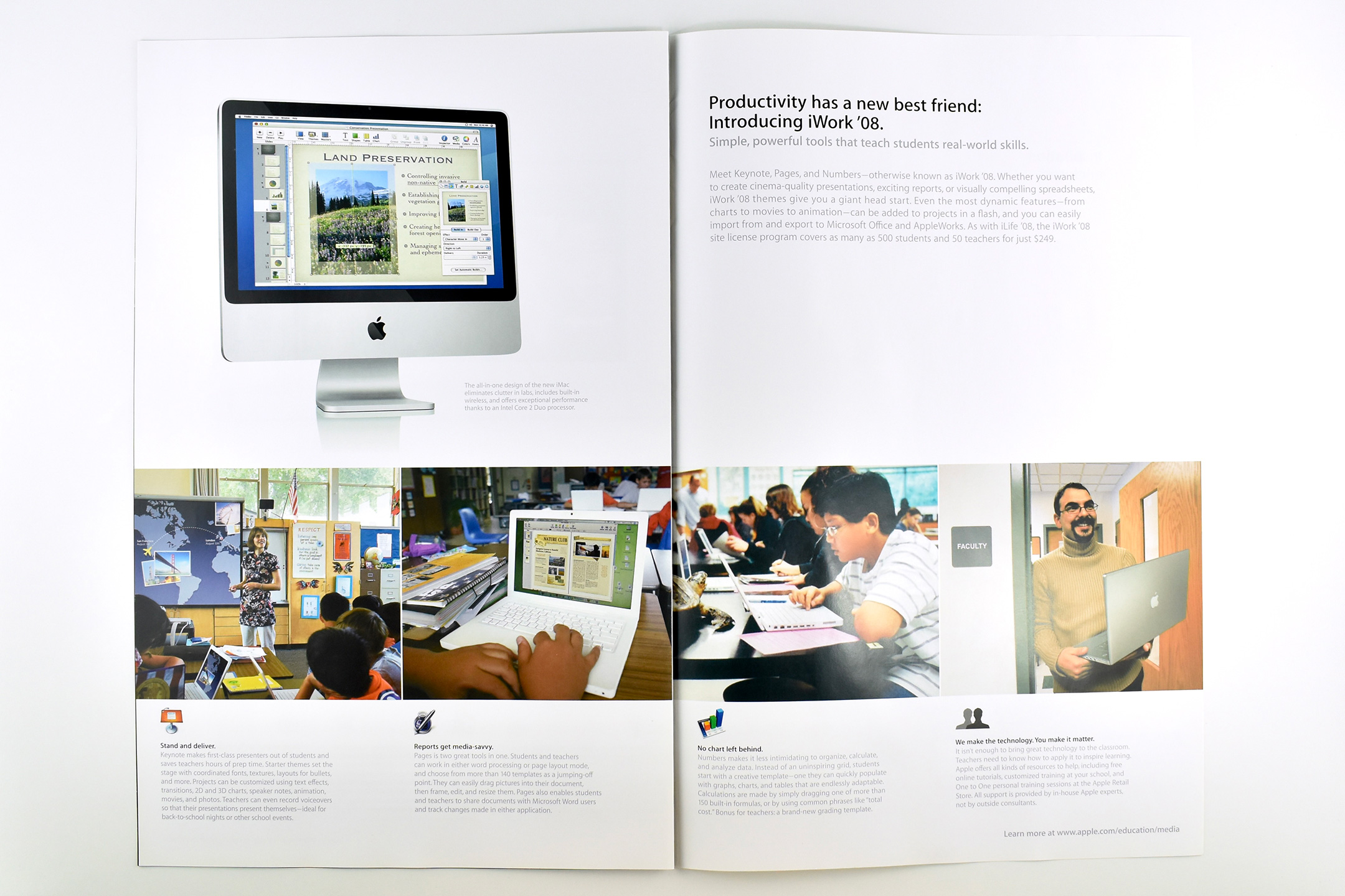
The third and final spread, also on an all-white background, features iWork ’08 and a photo of a silver iMac. Its text reads:
“Productivity has a new best friend: Introducing iWork ’08. Simple, powerful tools that teach students real-world skills. Meet Keynote, Pages, and Numbers- otherwise known as iWork ’08. Whether you want to create cinema-quality presentations, exciting reports, or visually compelling spreadsheets, iWork ’08 themes give you a giant head start. Even the most dynamic features-from charts to movies to animation-can be added to projects in a flash, and you can easily import from and export to Microsoft Office and AppleWorks…”
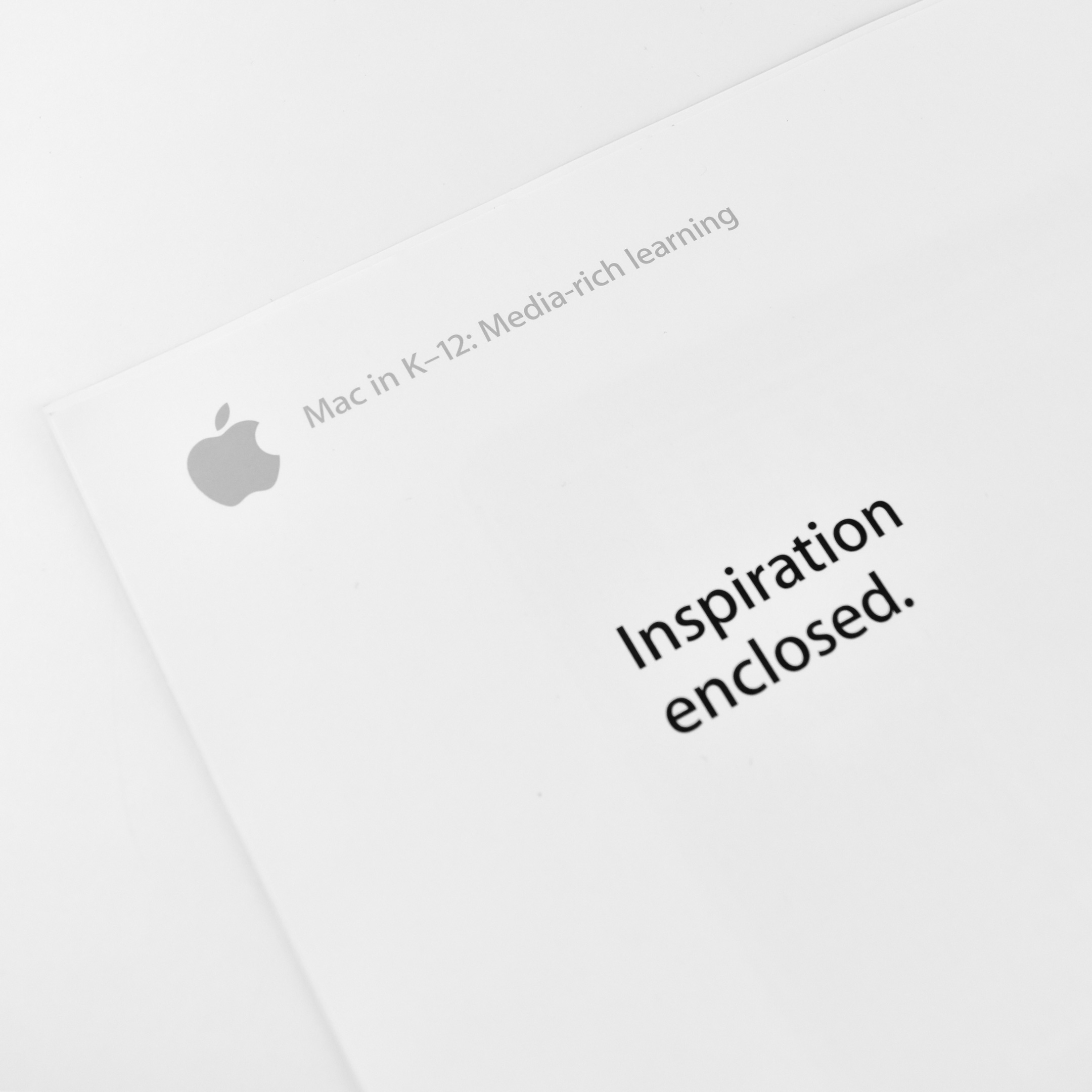
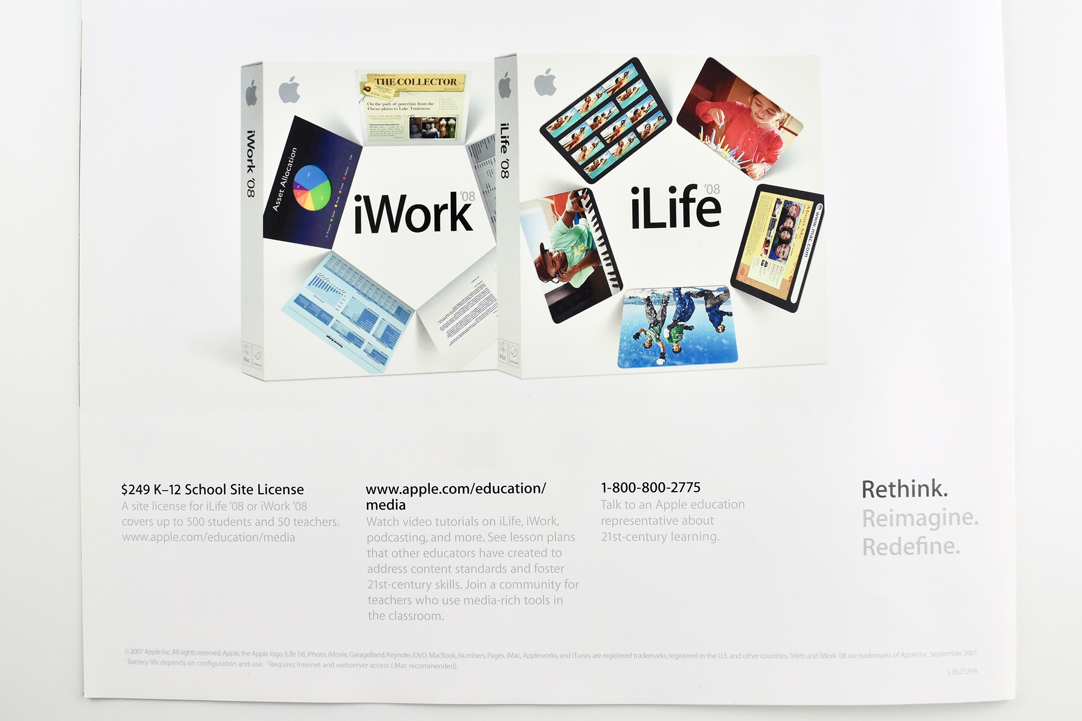
The back of the brochure uses the headline “Inspiration enclosed.” It features product boxes of iWork ’08 and iLife ’08 and includes Site License pricing and contact information.
Shortly after I received my iPhone 13 Pro that included several new impressive camera upgrades, I wondered if the iPhone camera system had yet improved to the point that it could meet or exceed my Nikon D3500 for my Apple collection photography. While I am by no means a professional-level photographer, I have captured tens of thousands photos of my Apple hardware and collectibles over the past few years, and then edited and posted the results here on my Apple Collection website and blog.
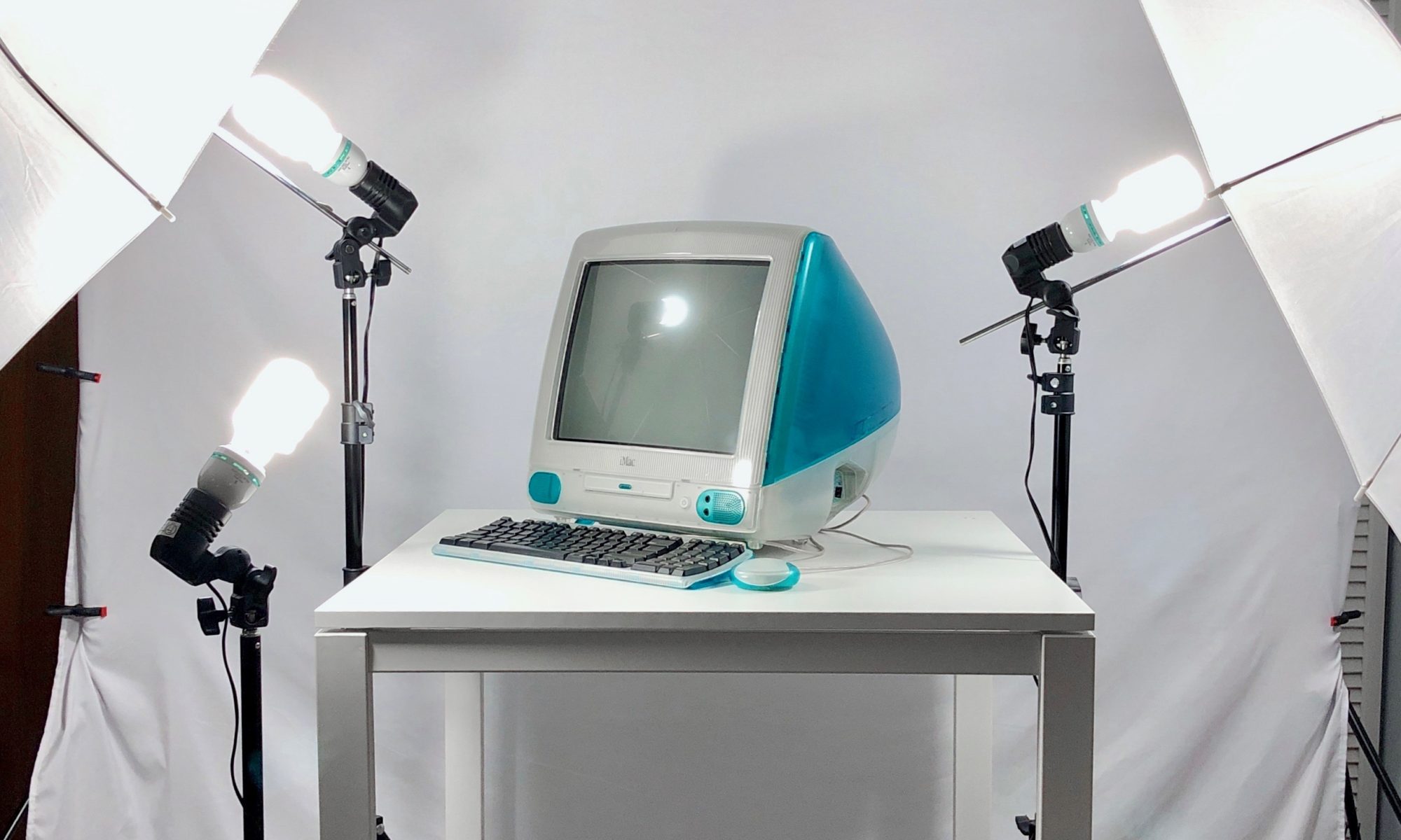
Nearly all the photos on this website were captured with a Nikon D3500 with a basic lens. In fact, it took me about a year to learn how to use this camera—my first Digital SLR. I consulted several websites, a book, and YouTube videos to learn the many methods I now use regularly. I shoot the photos in my relatively low-cost home photography studio. While I originally set out to spend less than $100 on the lighting, backdrop, and table, I upgraded my lighting after two years to bring the total investment to about $150.
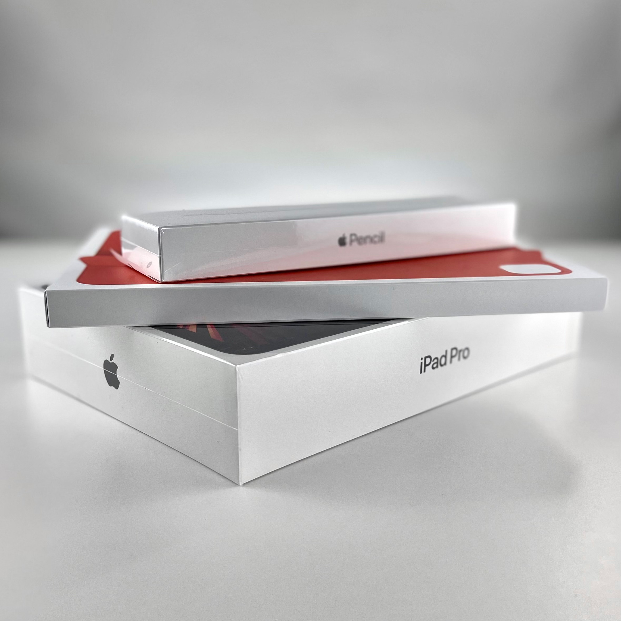
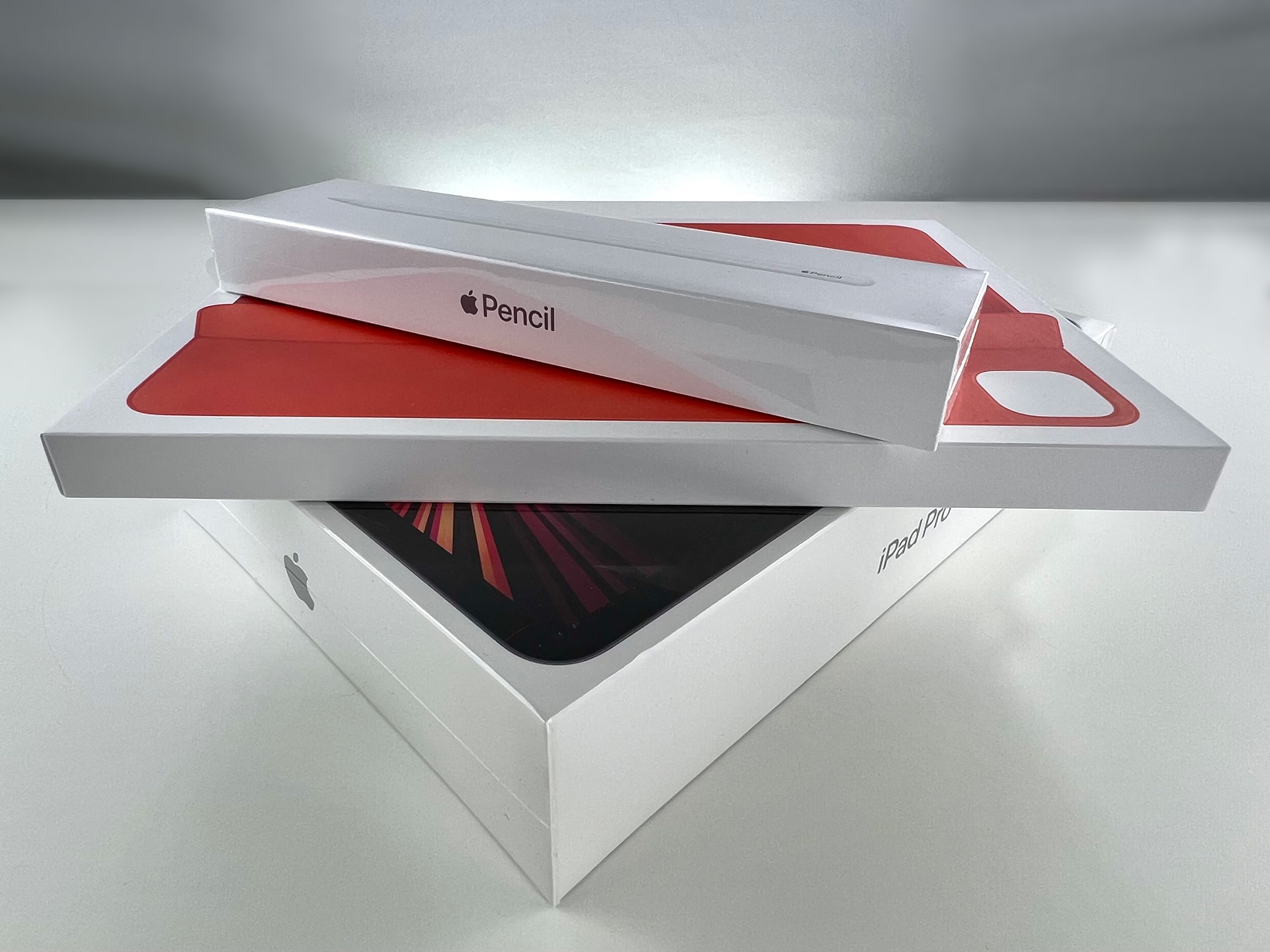
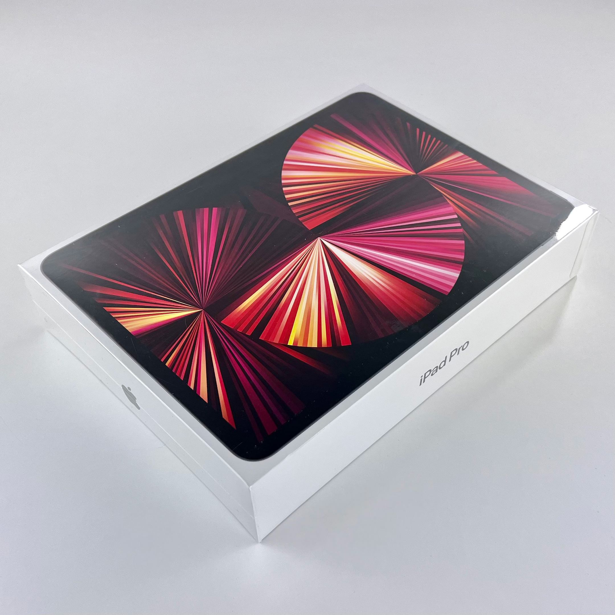
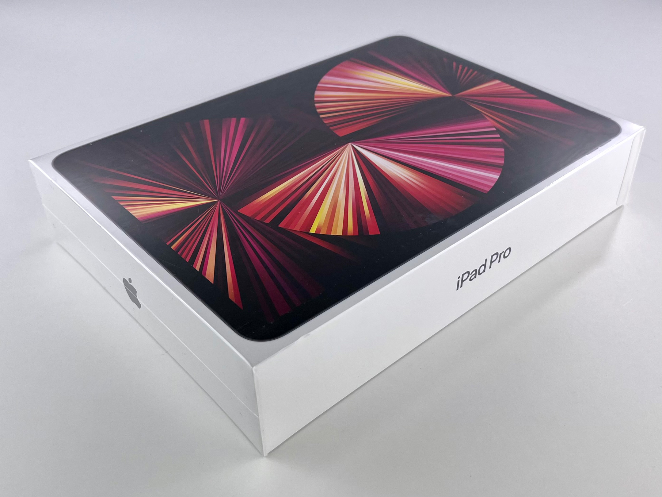
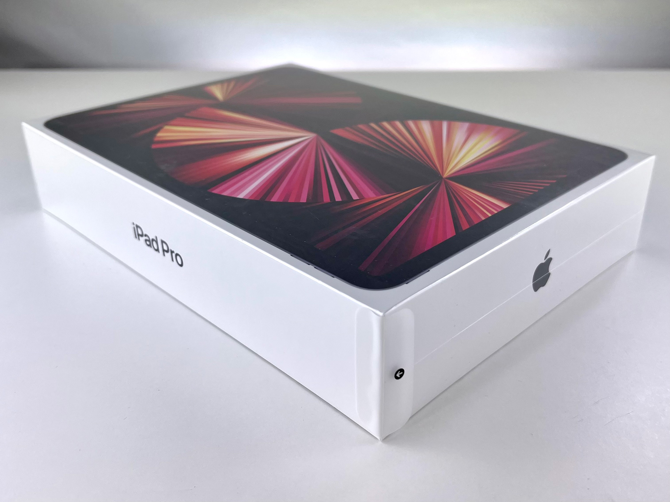
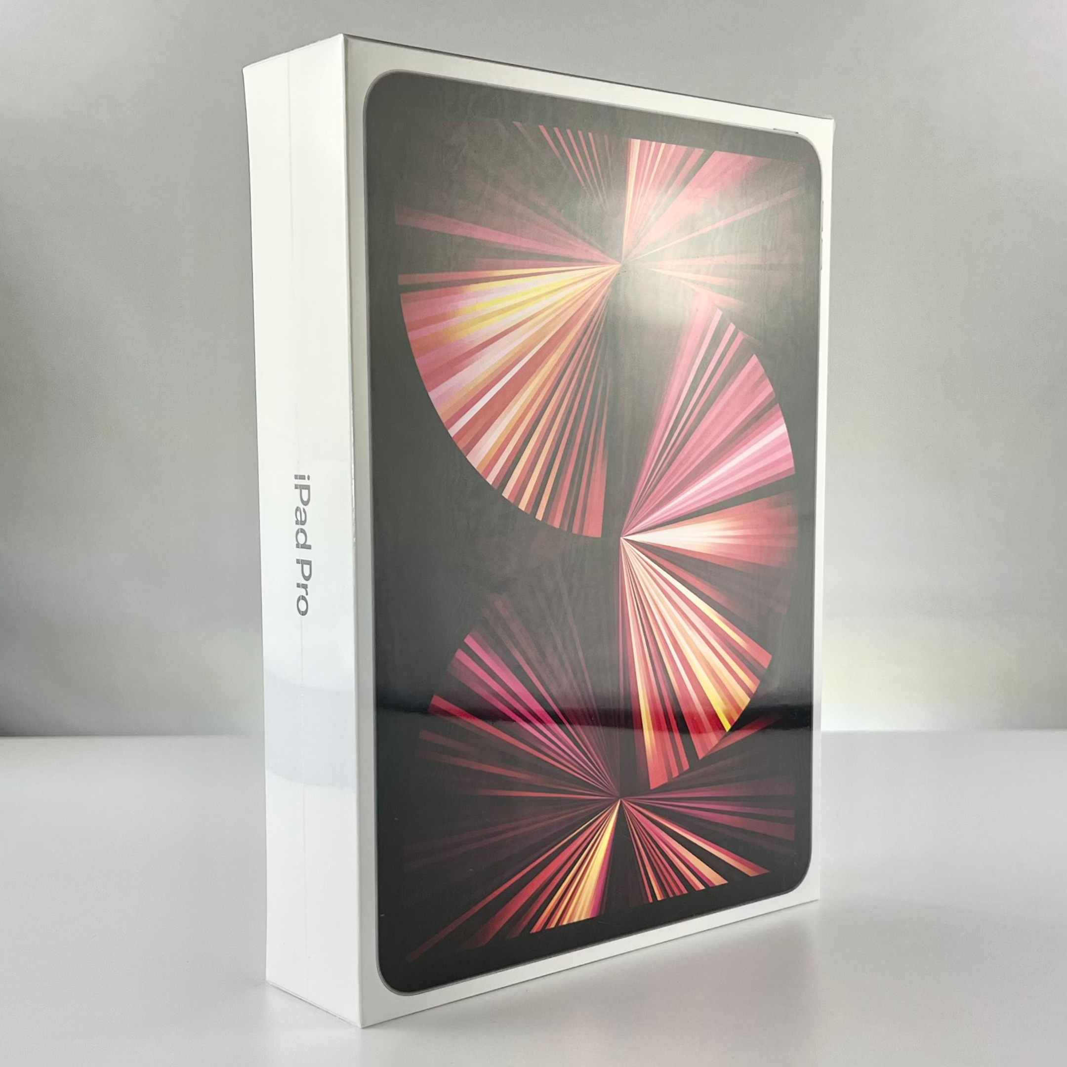
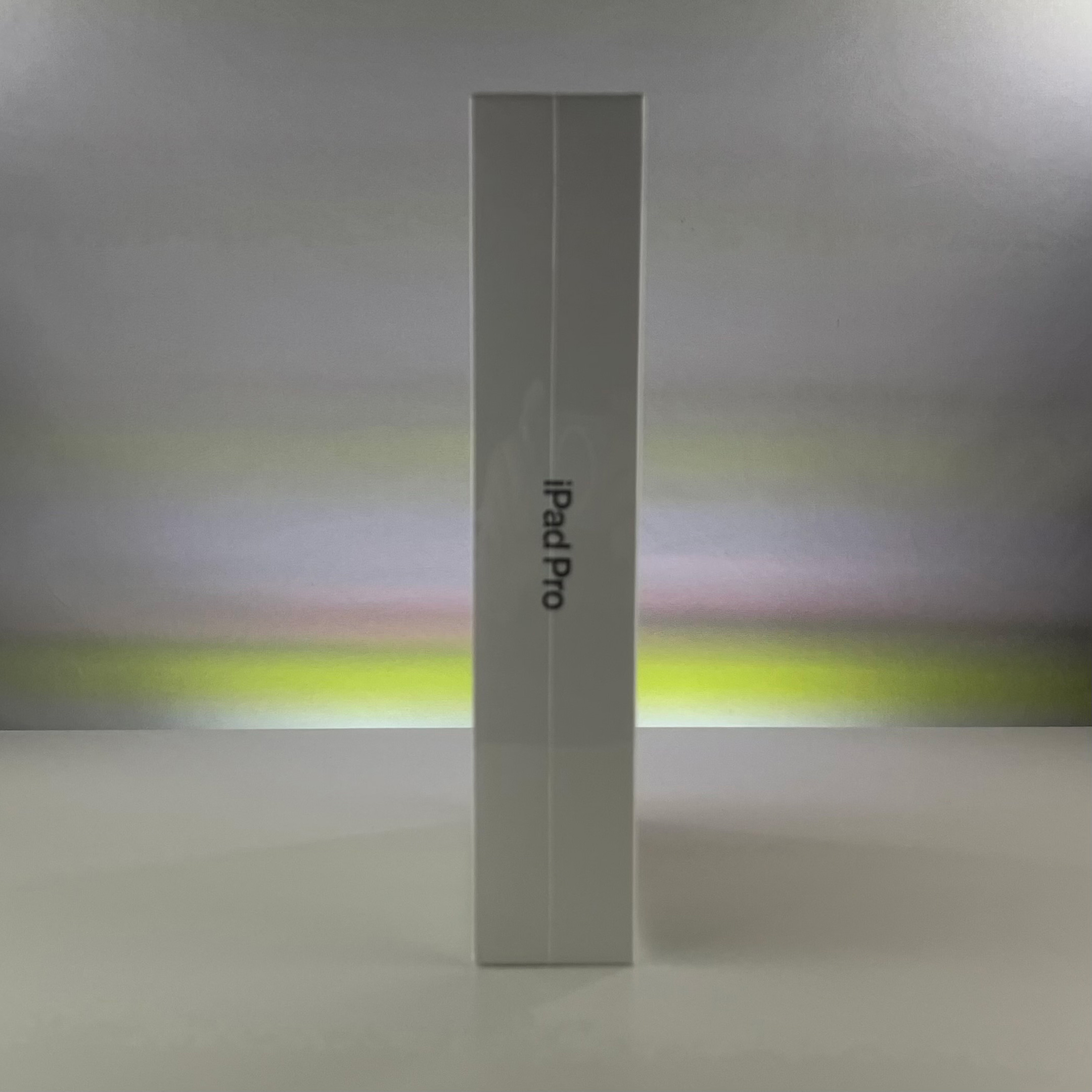
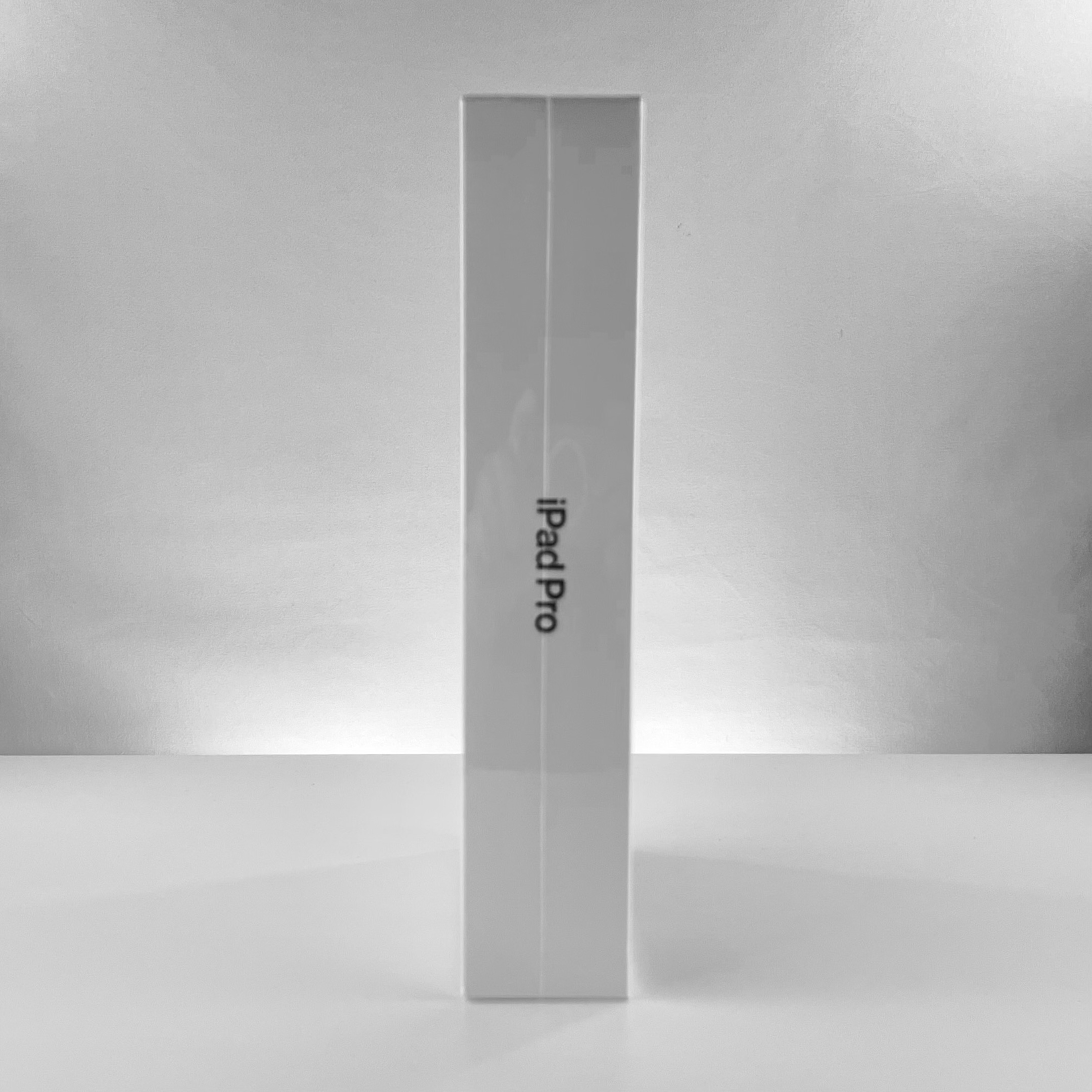
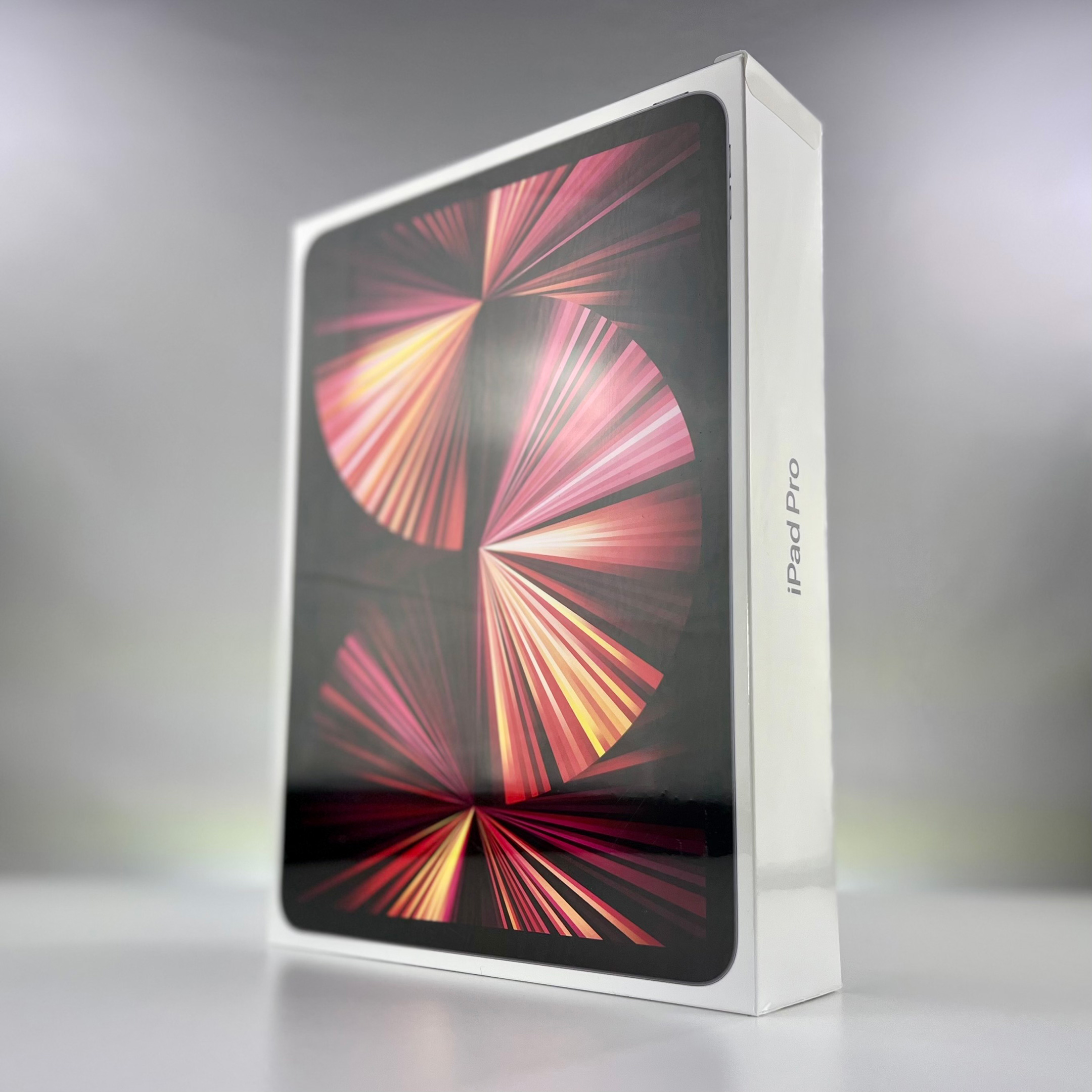
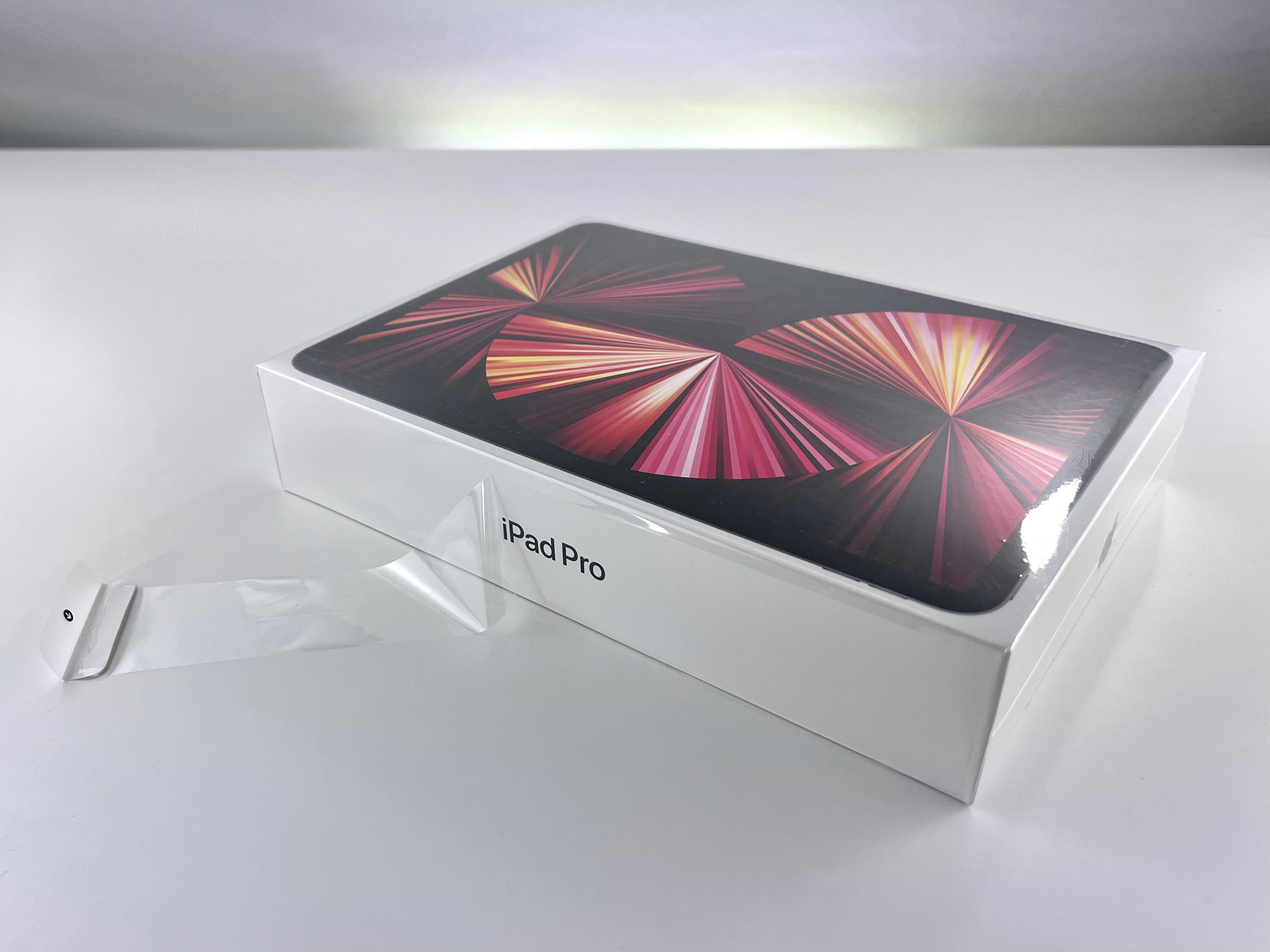
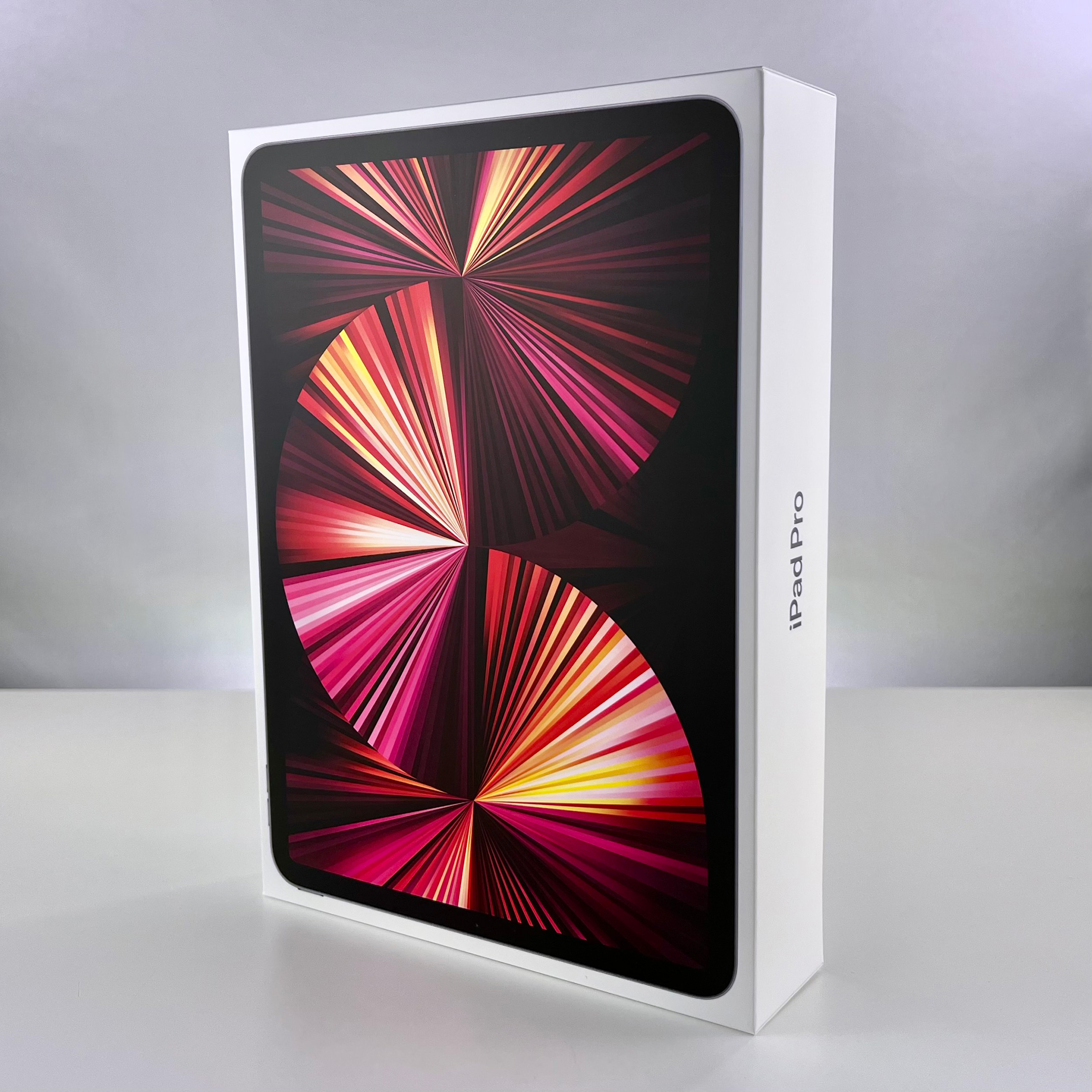
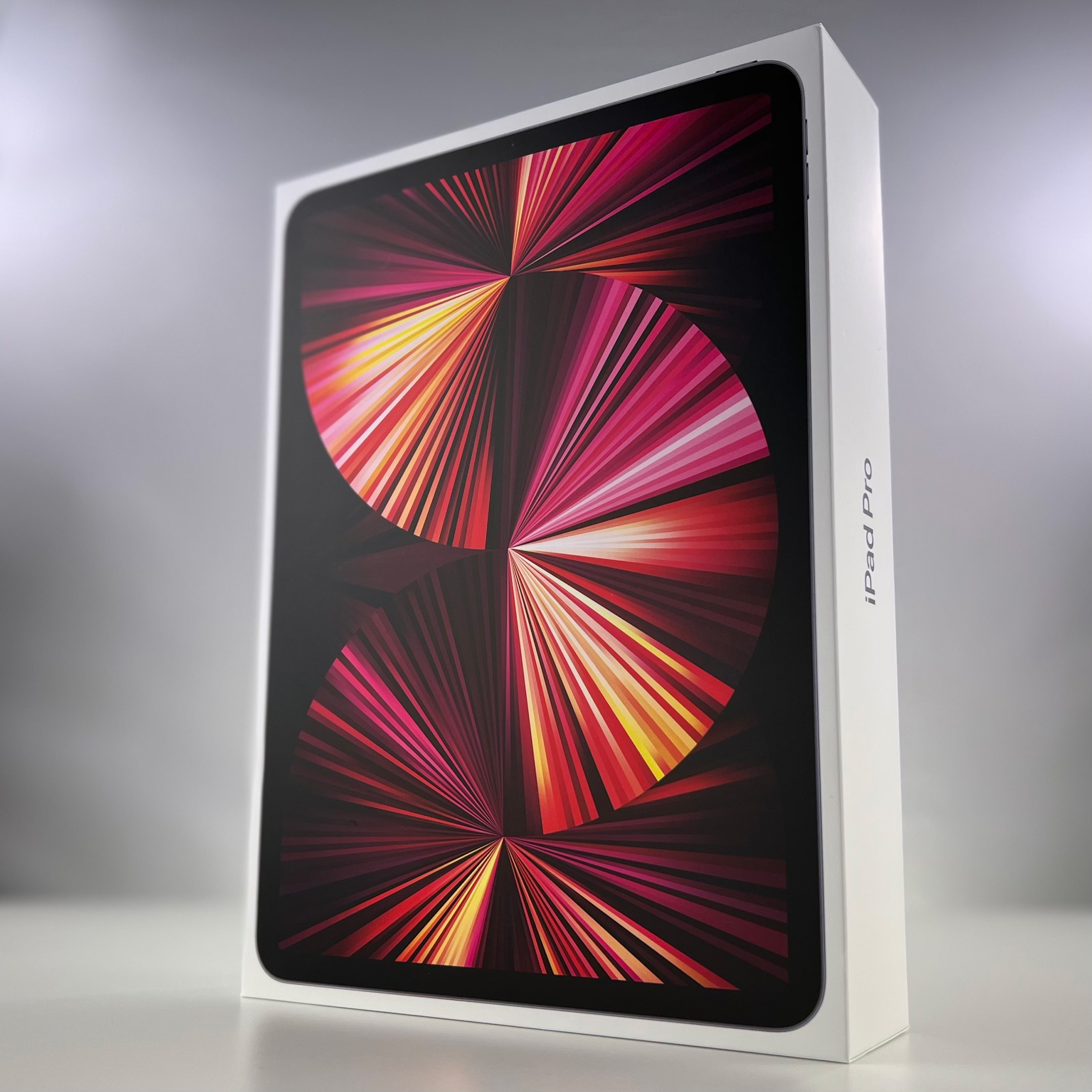
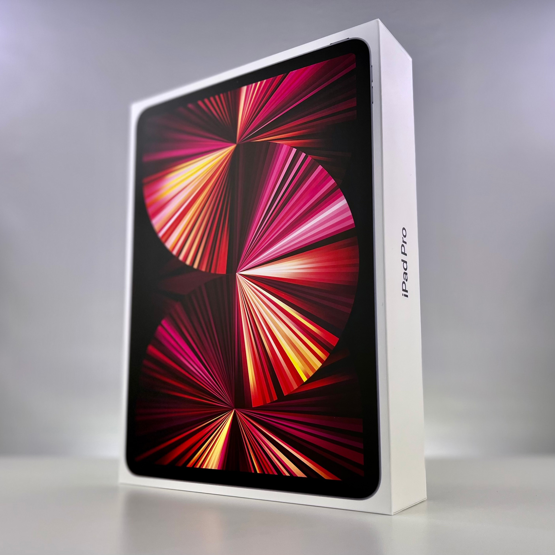
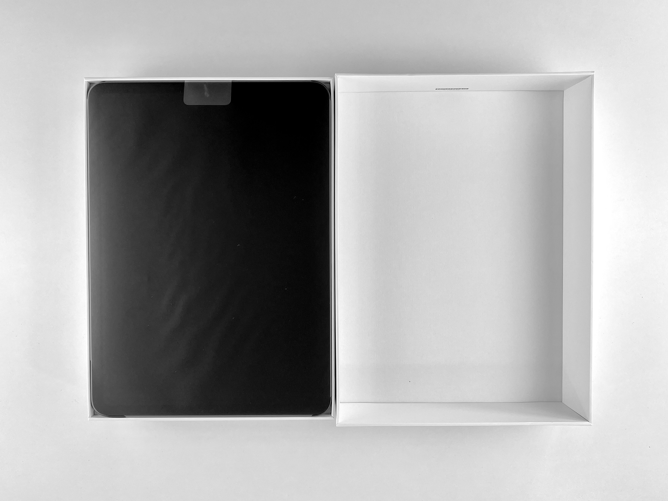
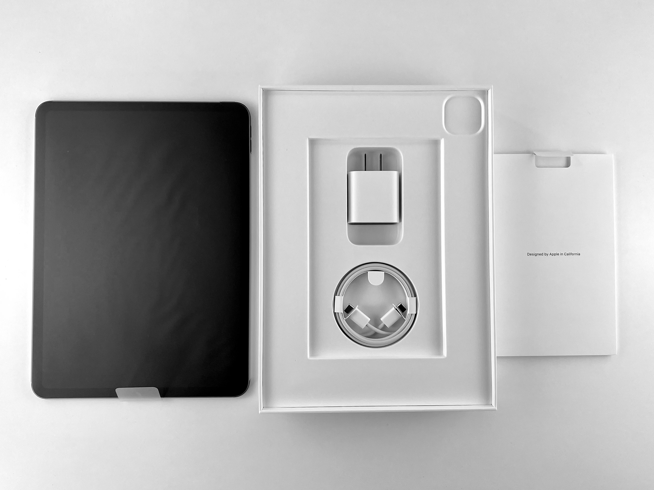
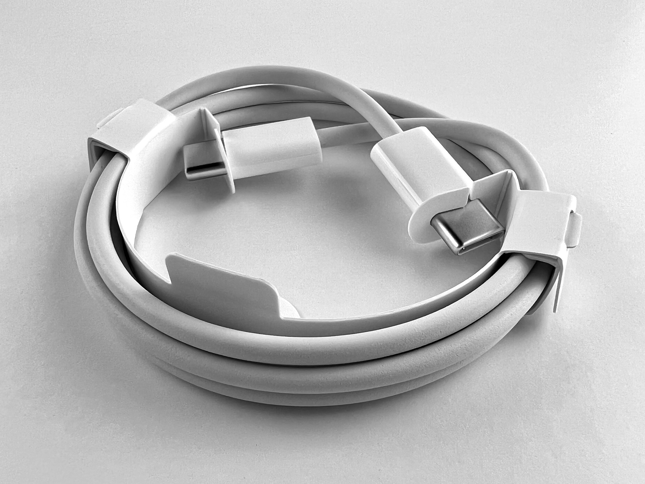
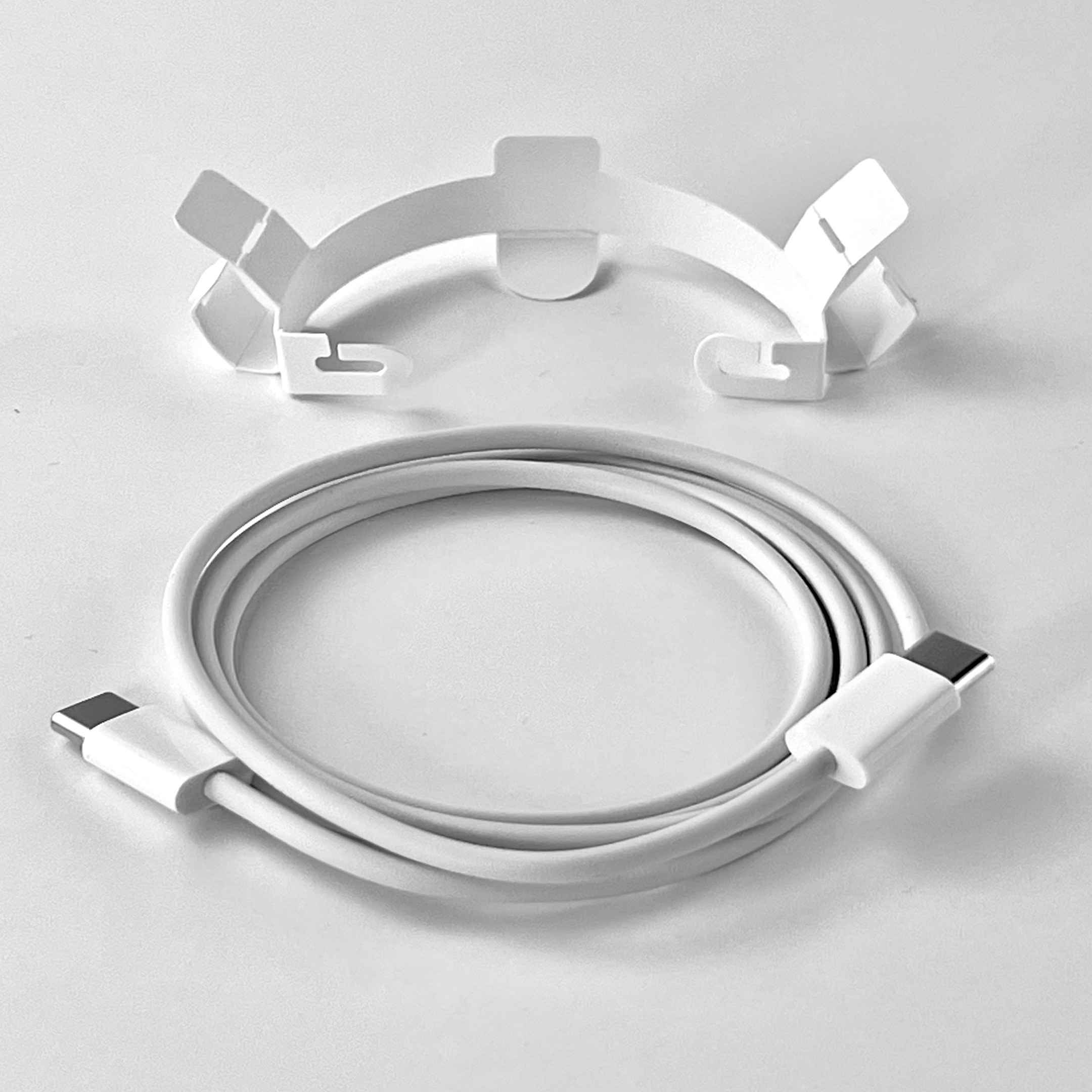
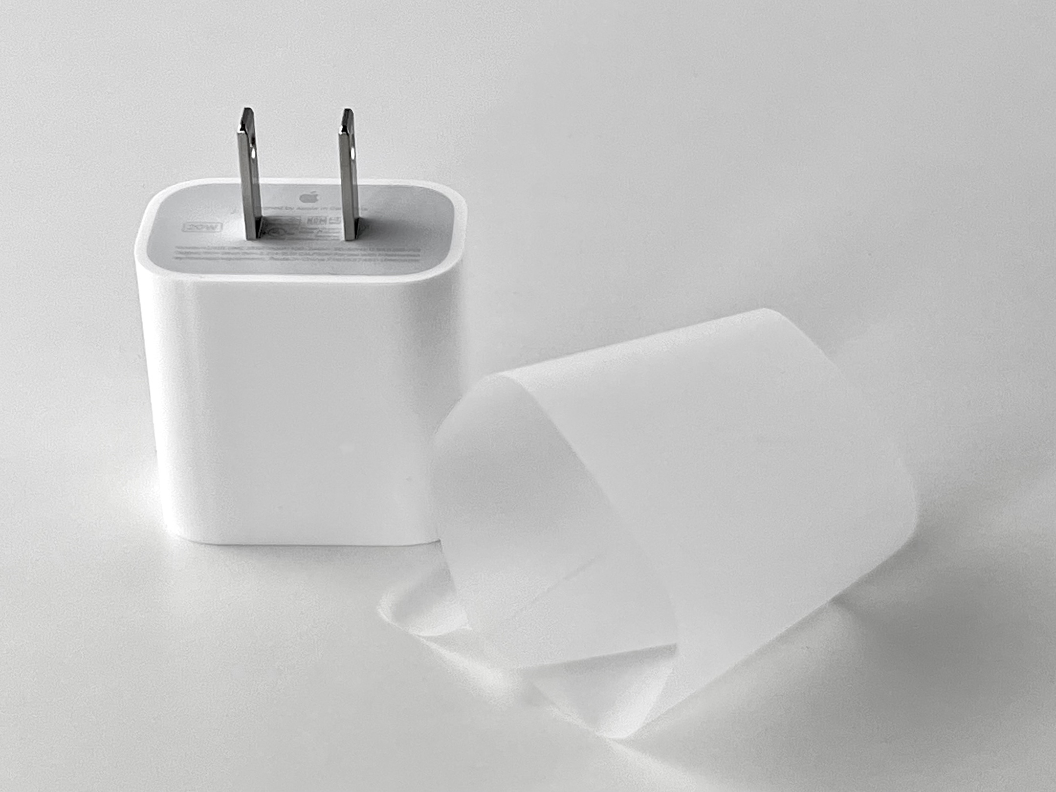
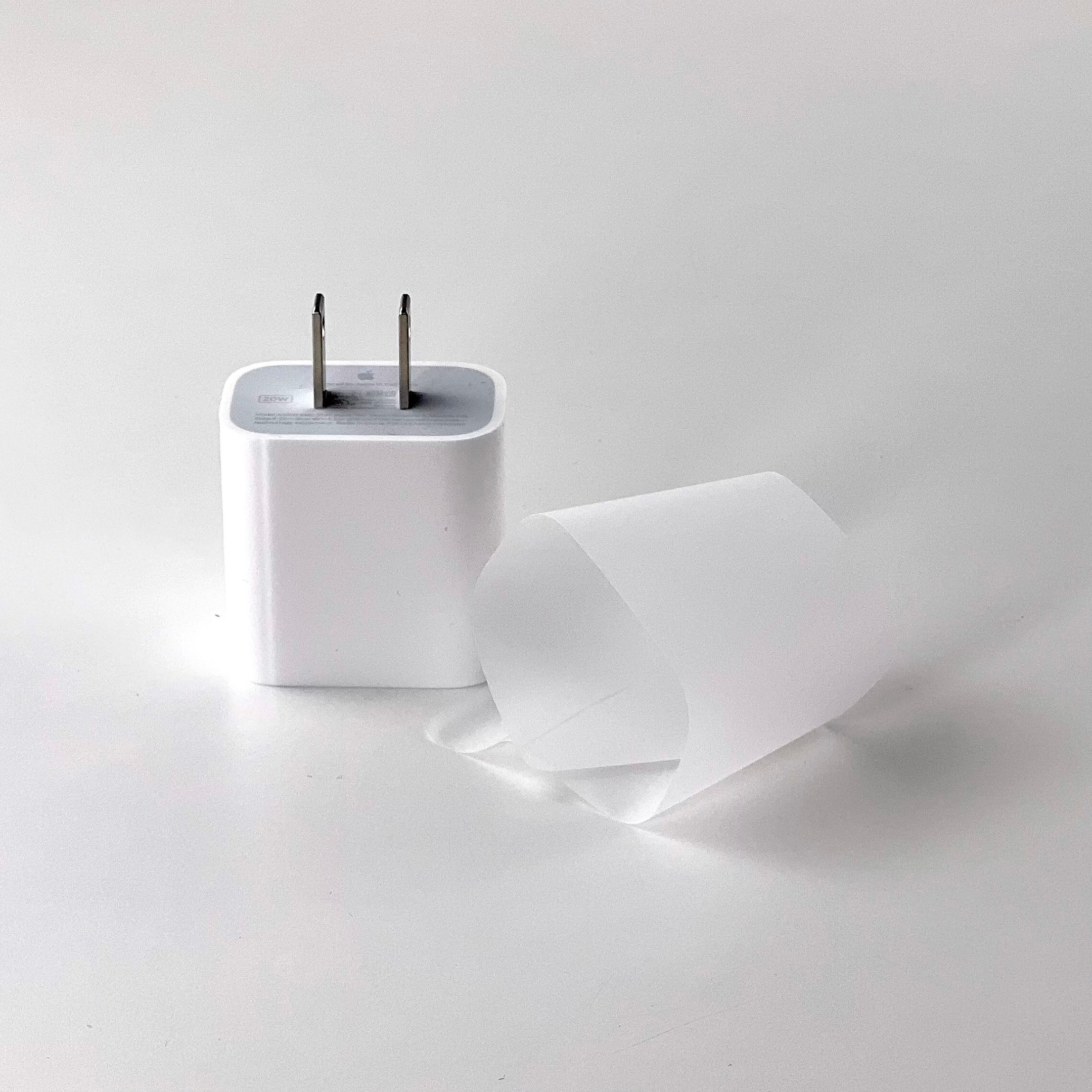
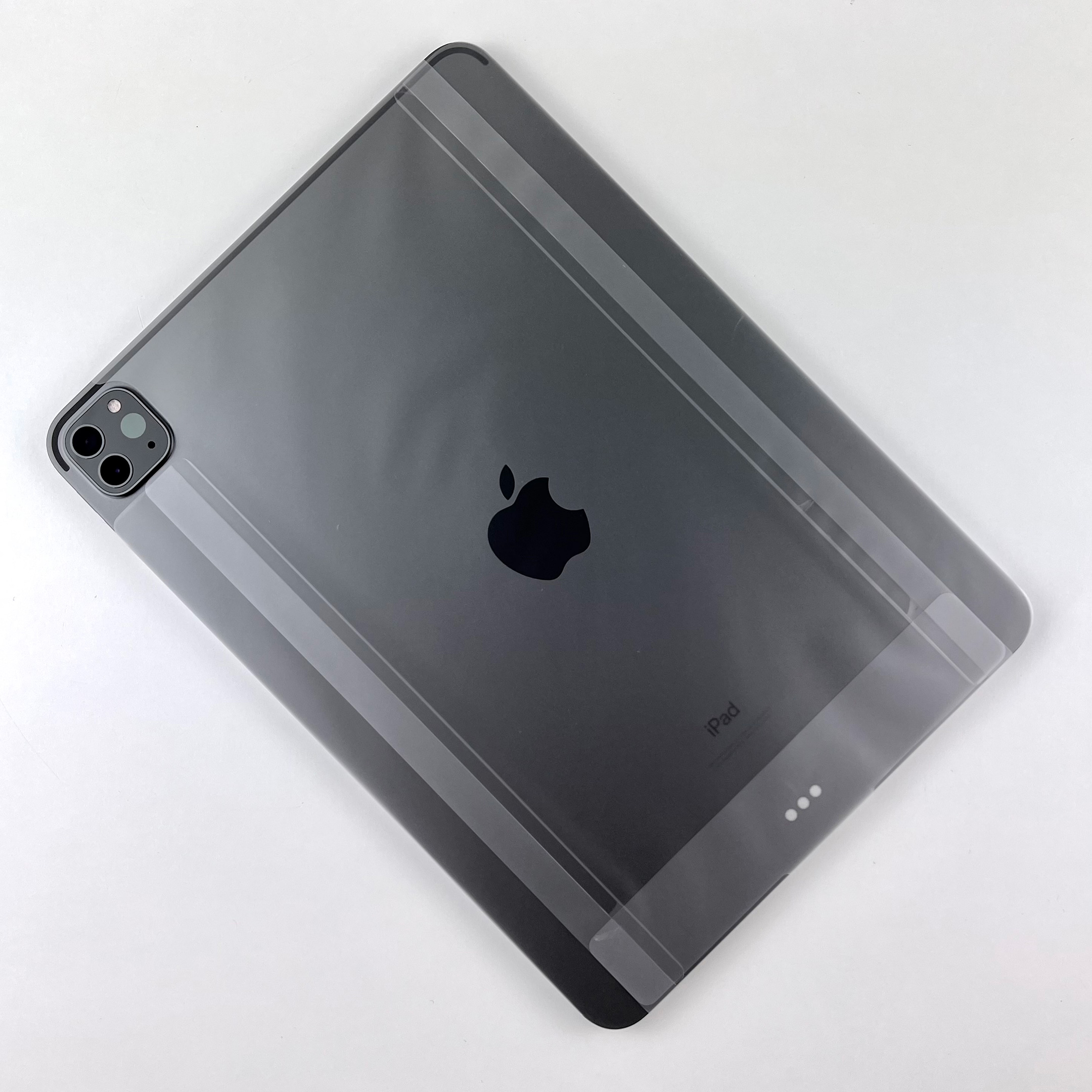
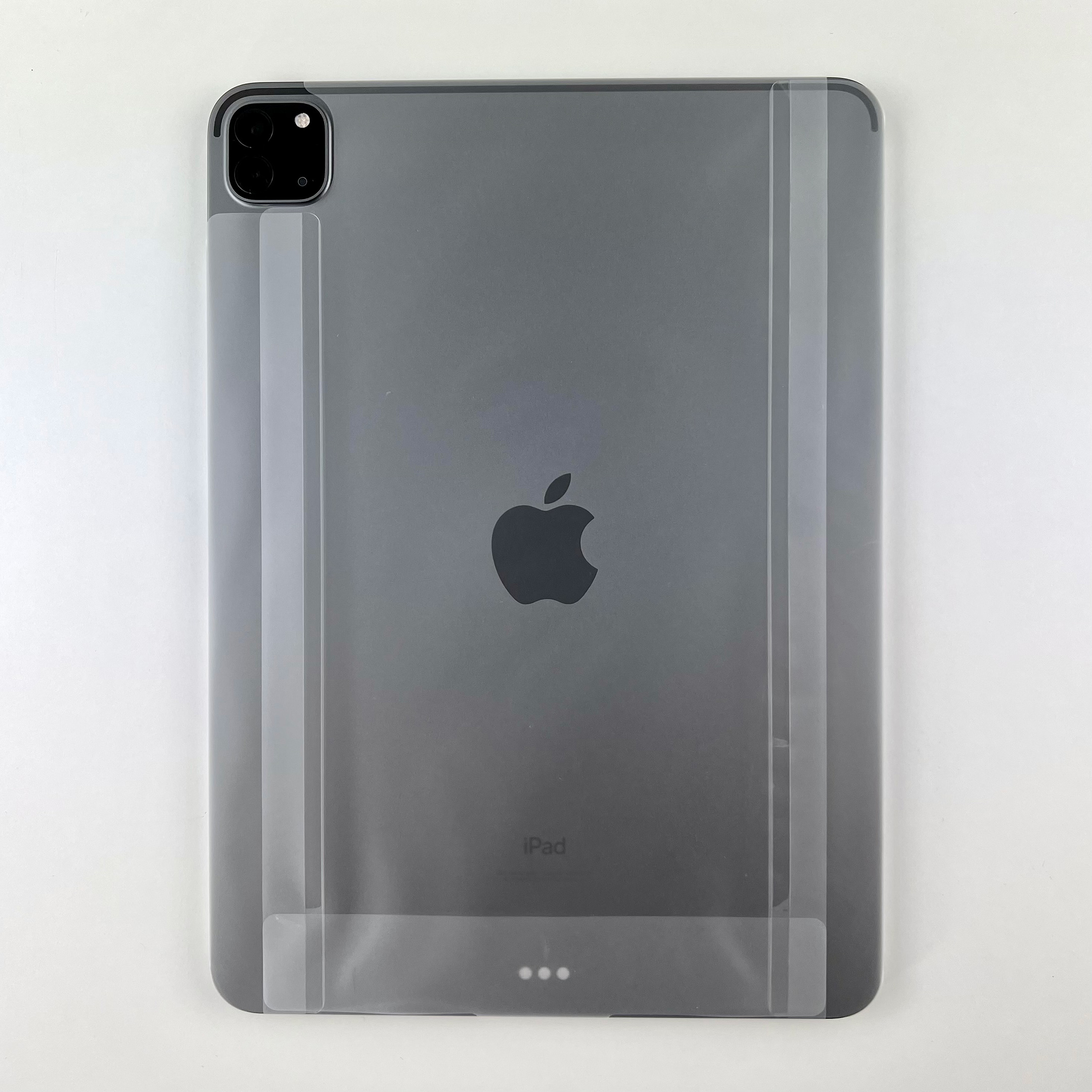
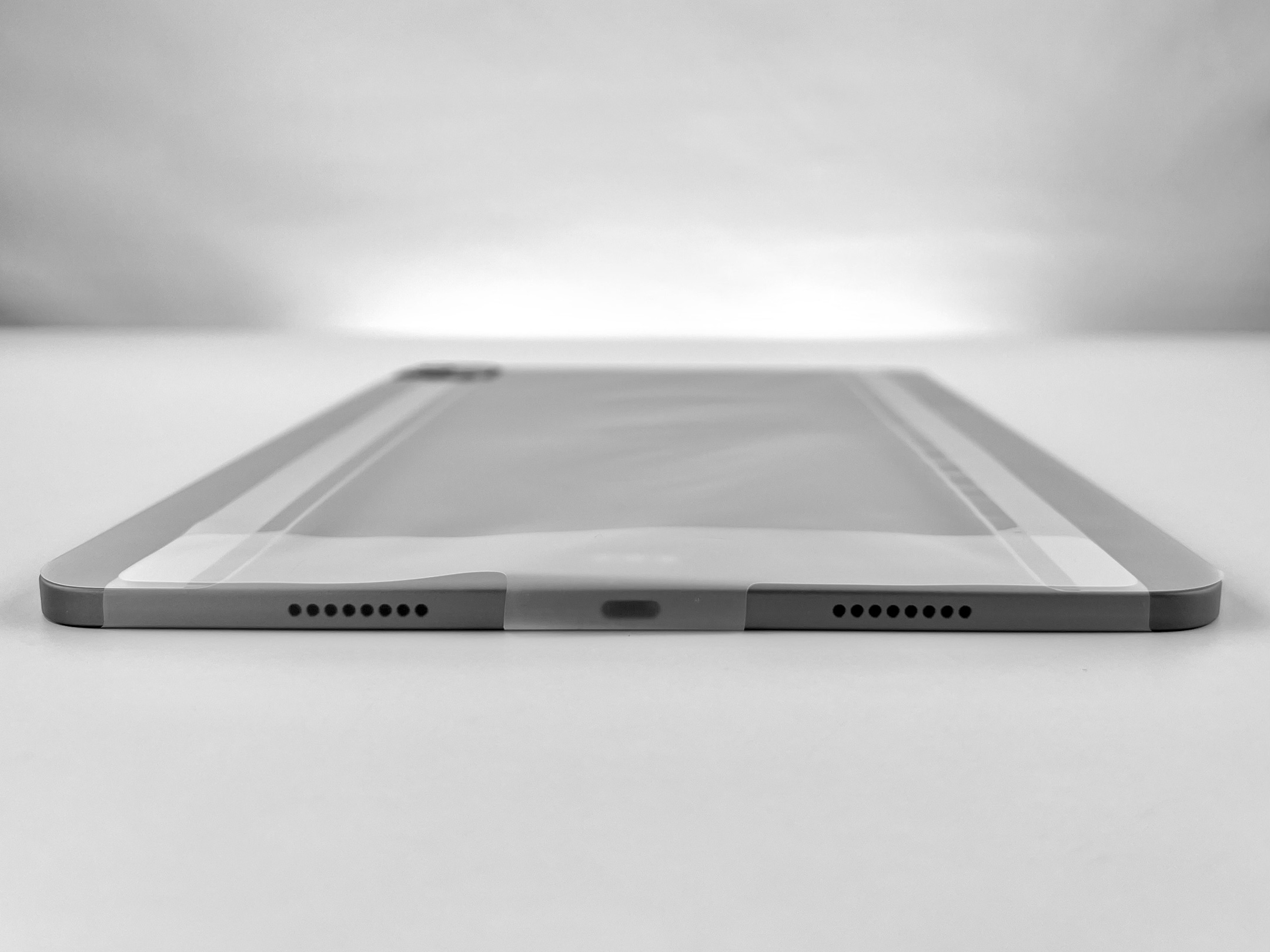
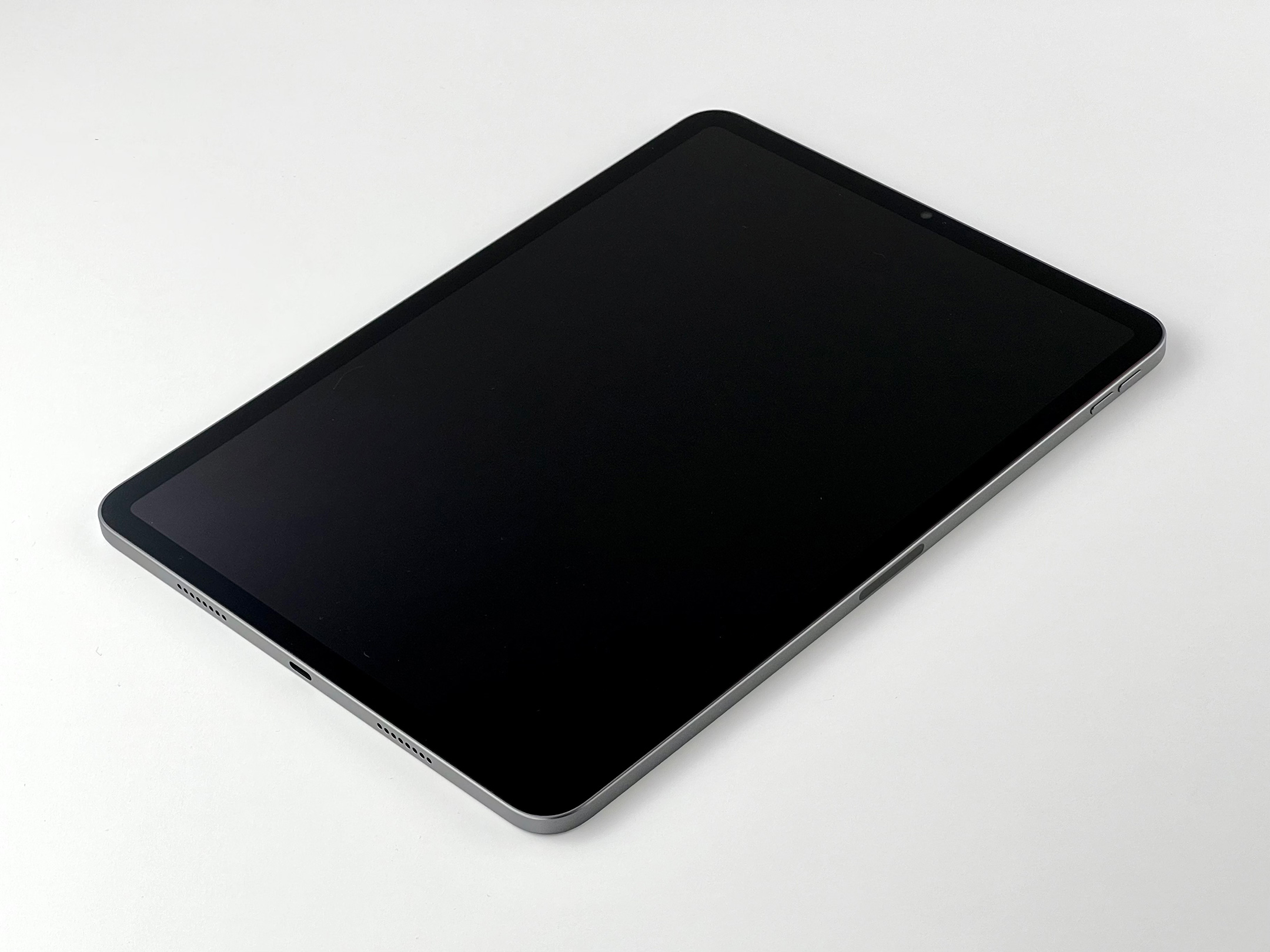
As an Apple Collector, I find the idea attractive to use an Apple camera to capture my Apple collection, but this has never been a goal. I decided to shoot photos of one collection item with both the iPhone 13 Pro and the Nikon D3500. The item selected was my recently purchased iPad Pro 11-inch with the M1 chip. The photo session includes the unboxing and the device.
Here’s what I learned.
Device Flexibility
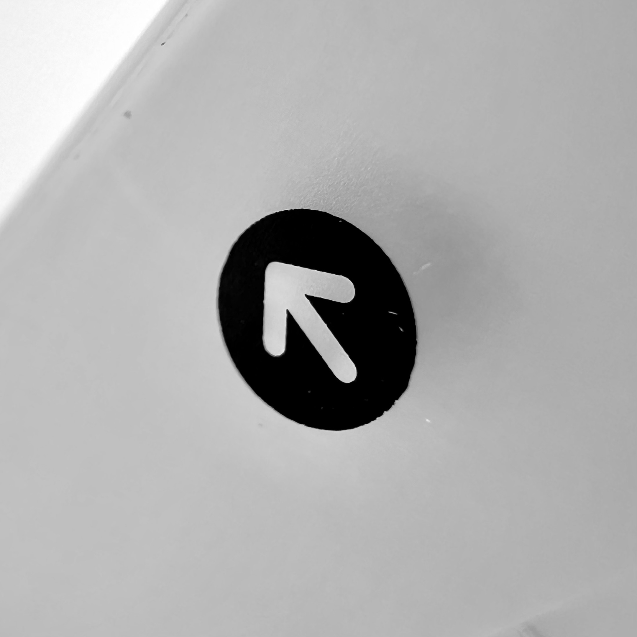
At first, using the iPhone 13 Pro seemed more liberating than the Nikon D3500 because shooting with a phone seemed a bit more nimble than the larger camera. The iPhone screen is considerably larger than the Nikon’s viewfinder and display—and the iPhone shows a better representation of the subject in real time, especially when viewing the depth of field effects rendered with the iPhone 13 Pro.
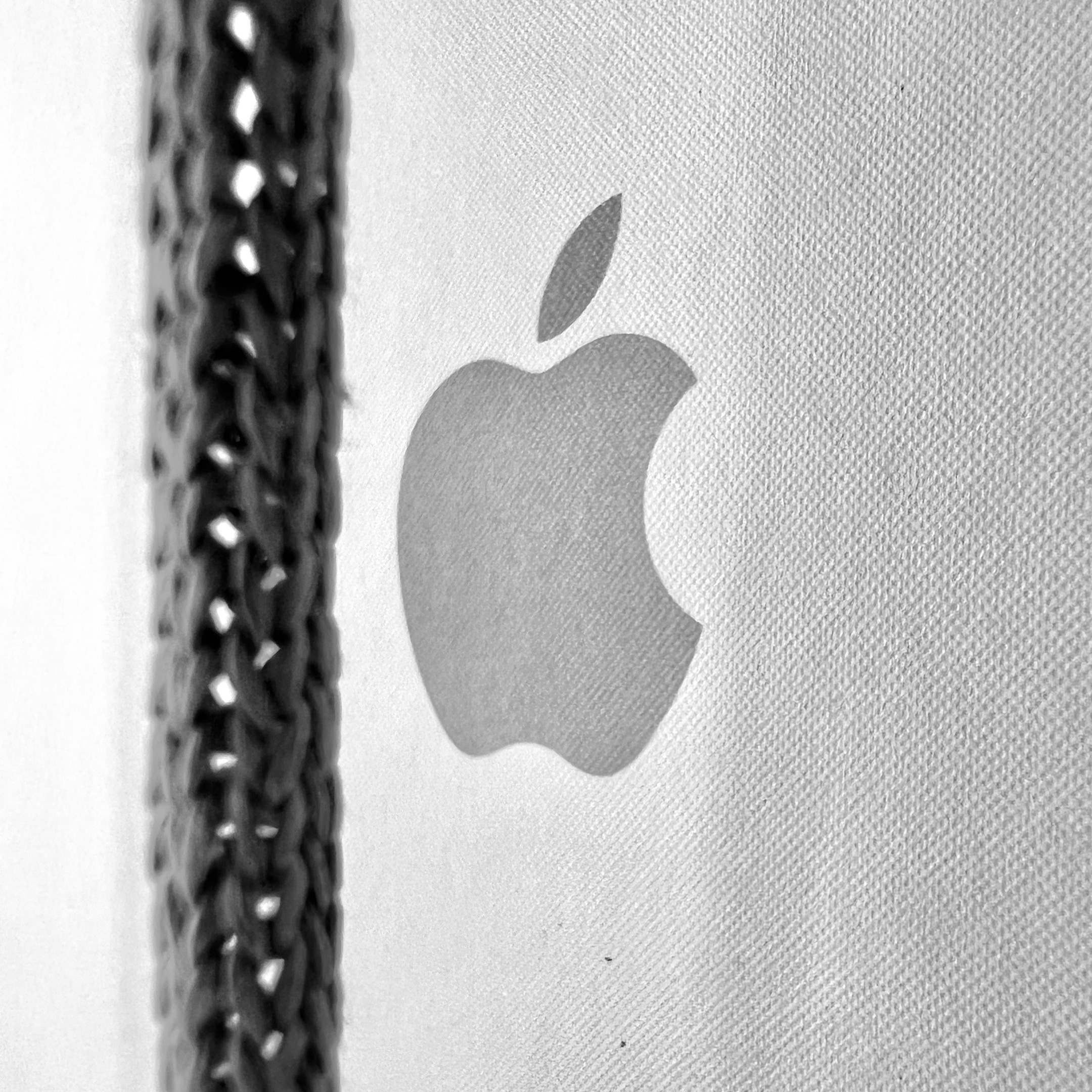
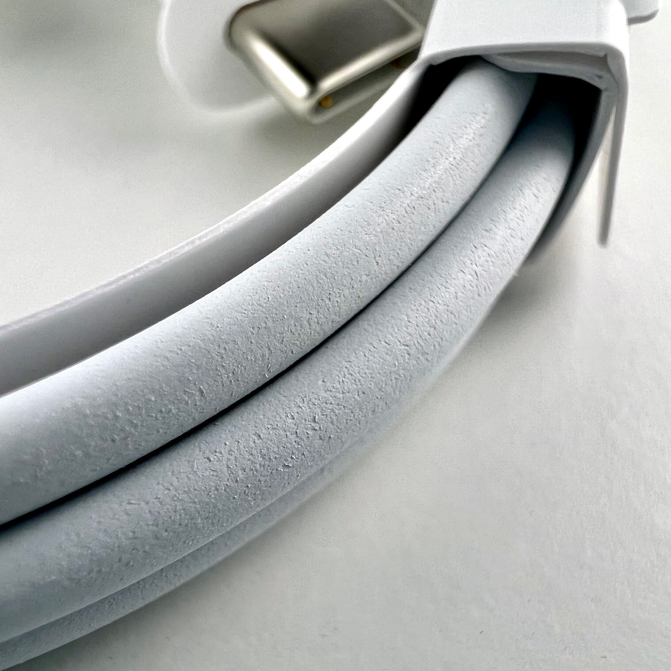
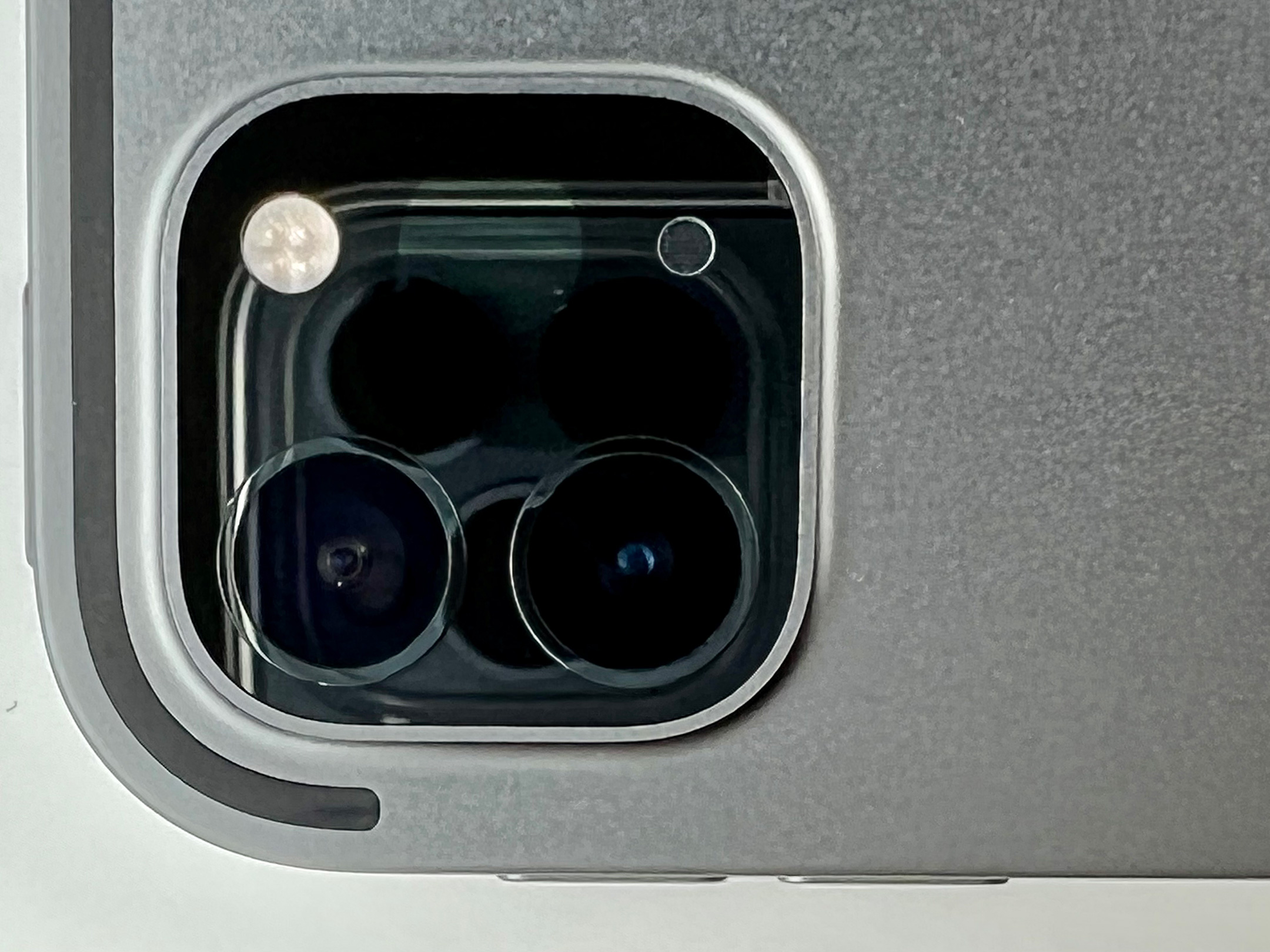
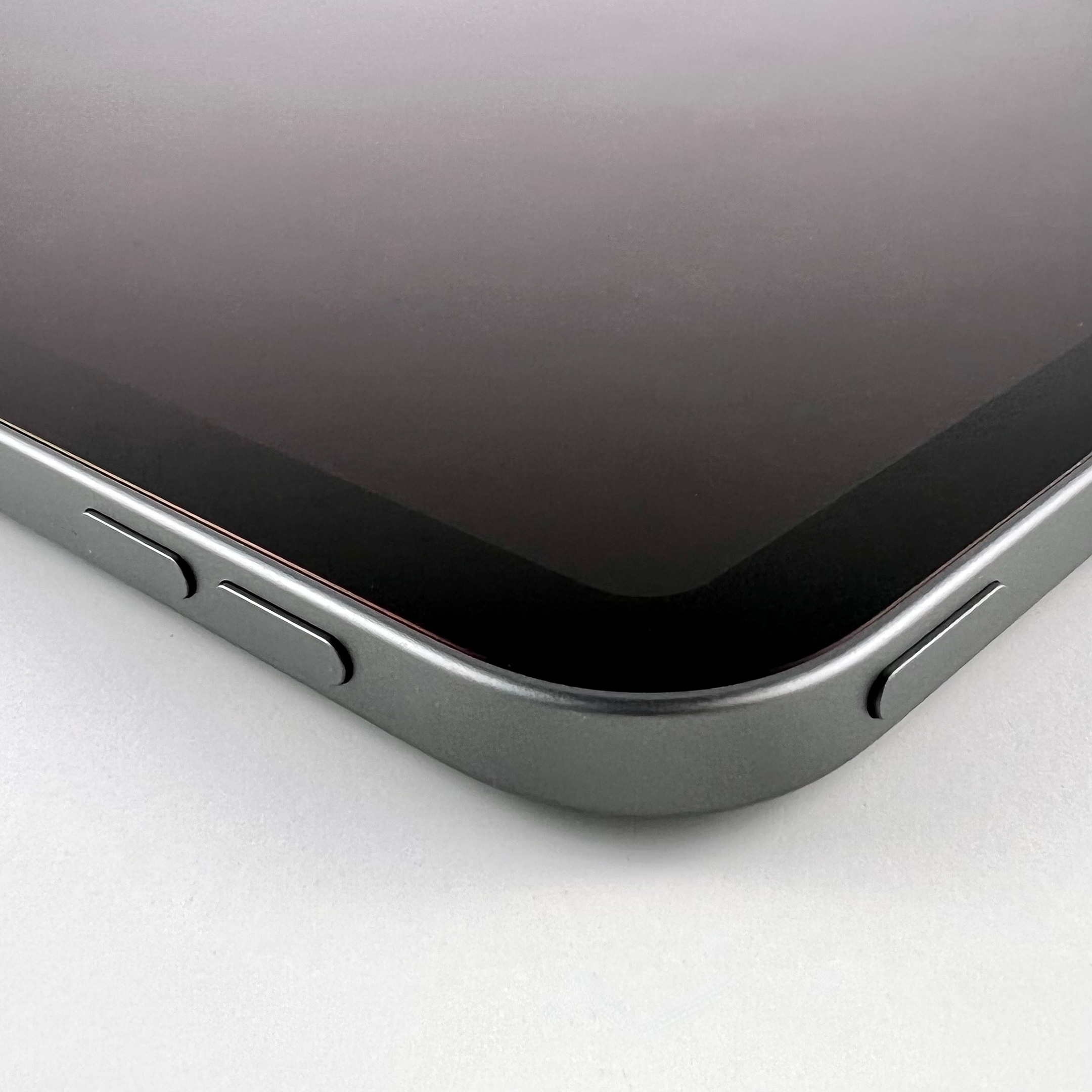
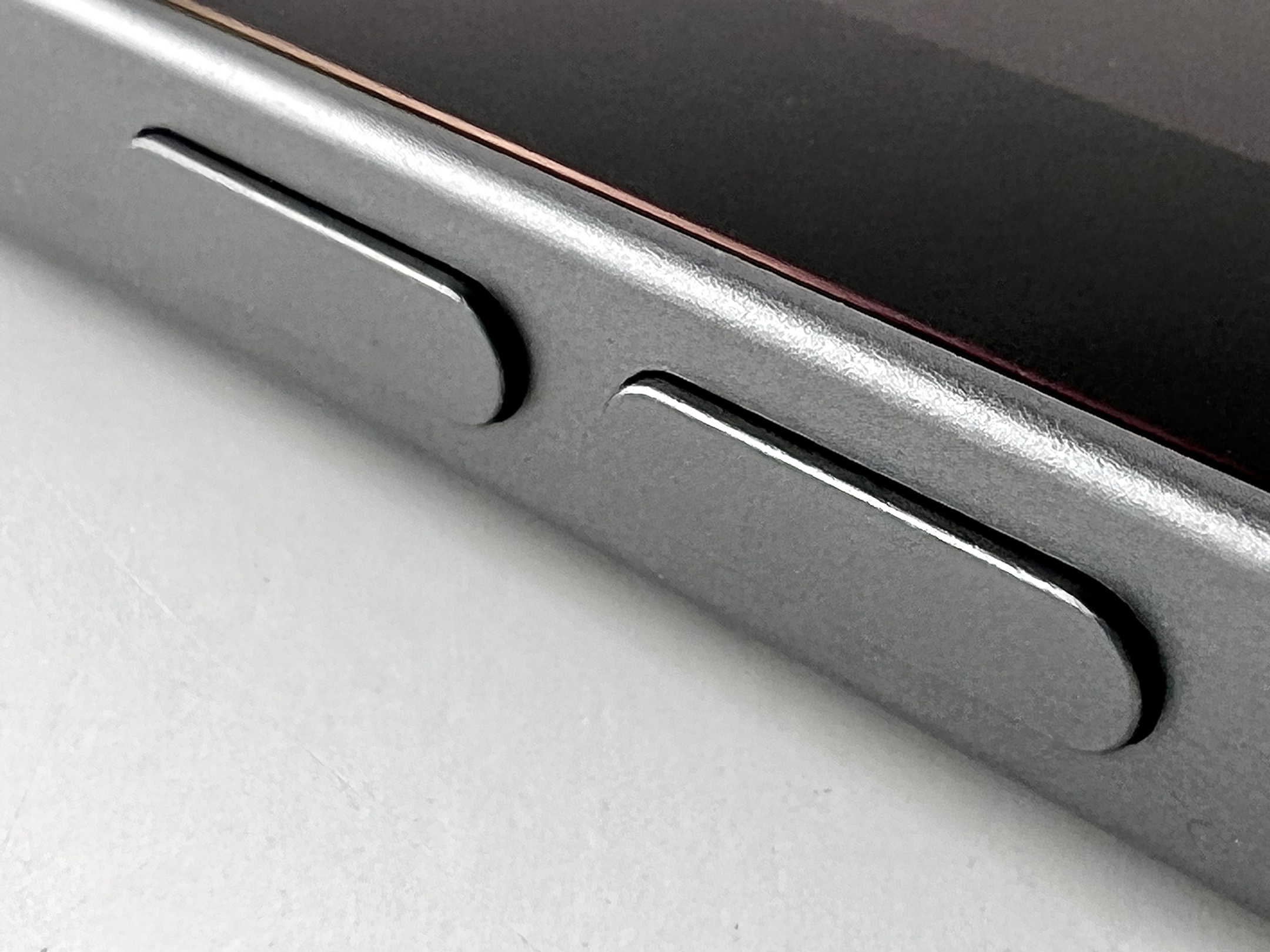
I changed my mind when I started using the iPhone 13 Pro’s touted Macro features. As it turns out, when you get close to an object with the iPhone 13 Pro, the phone casts a shadow from the studio lights, making the photos nearly unusable without readjusting all my lighting. On the Nikon, I just twist to zoom the lens. While I generally don’t capture many Macro shots, I’d definitely consider adding more if it was easy to do so.
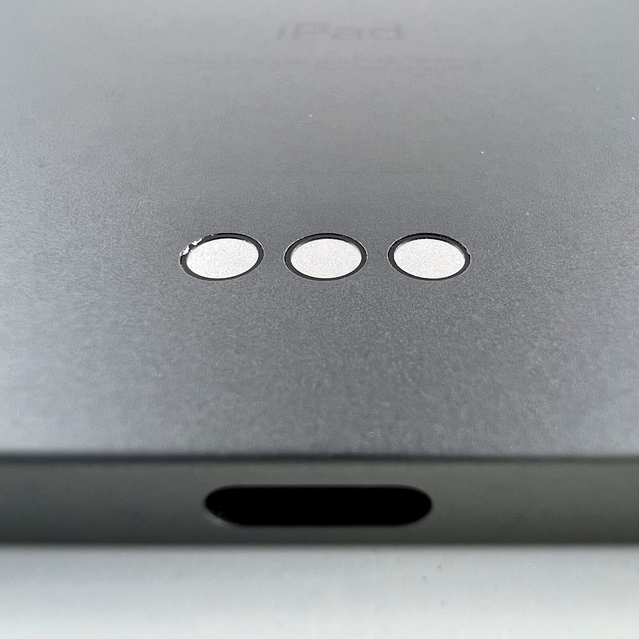
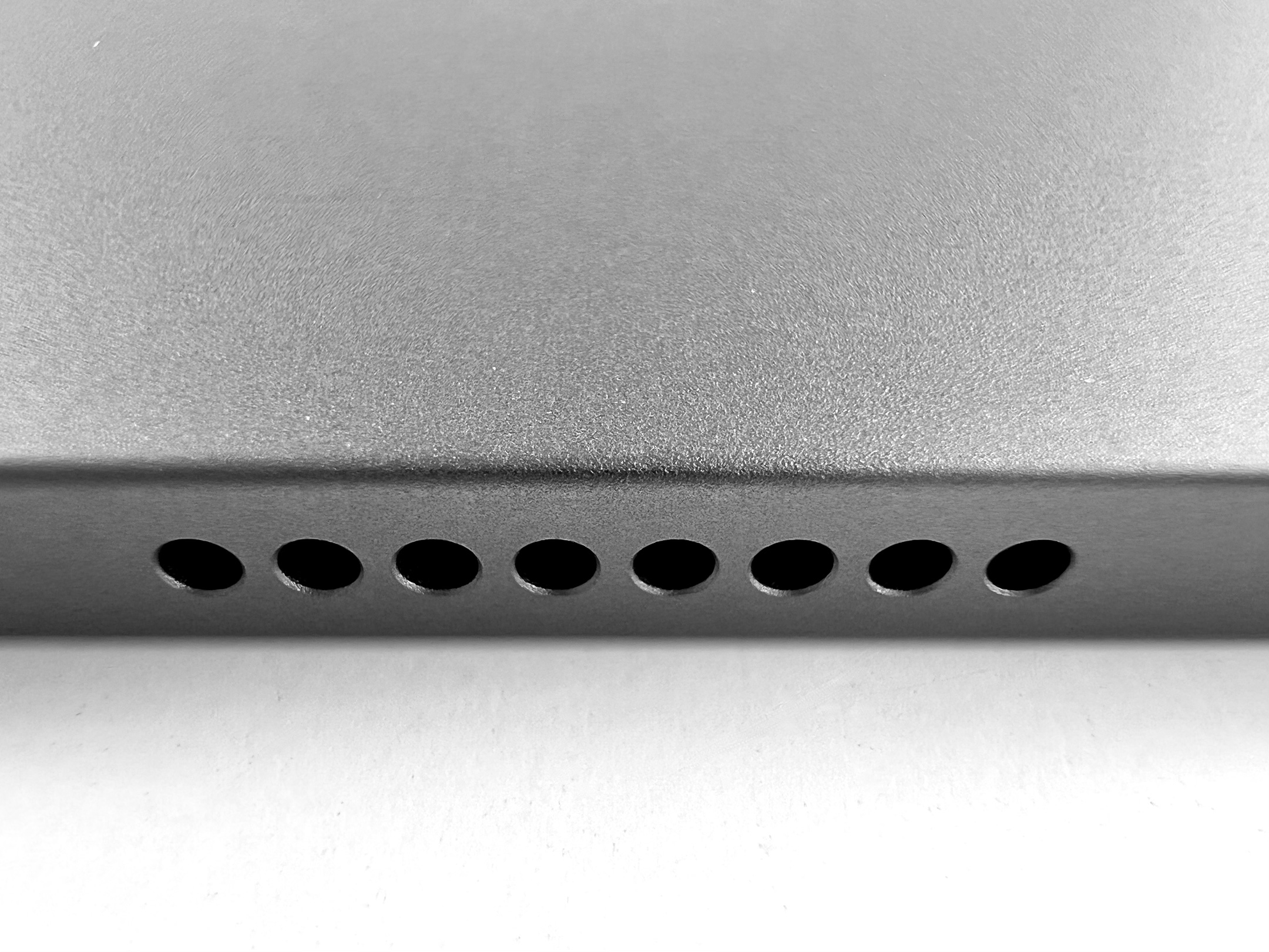
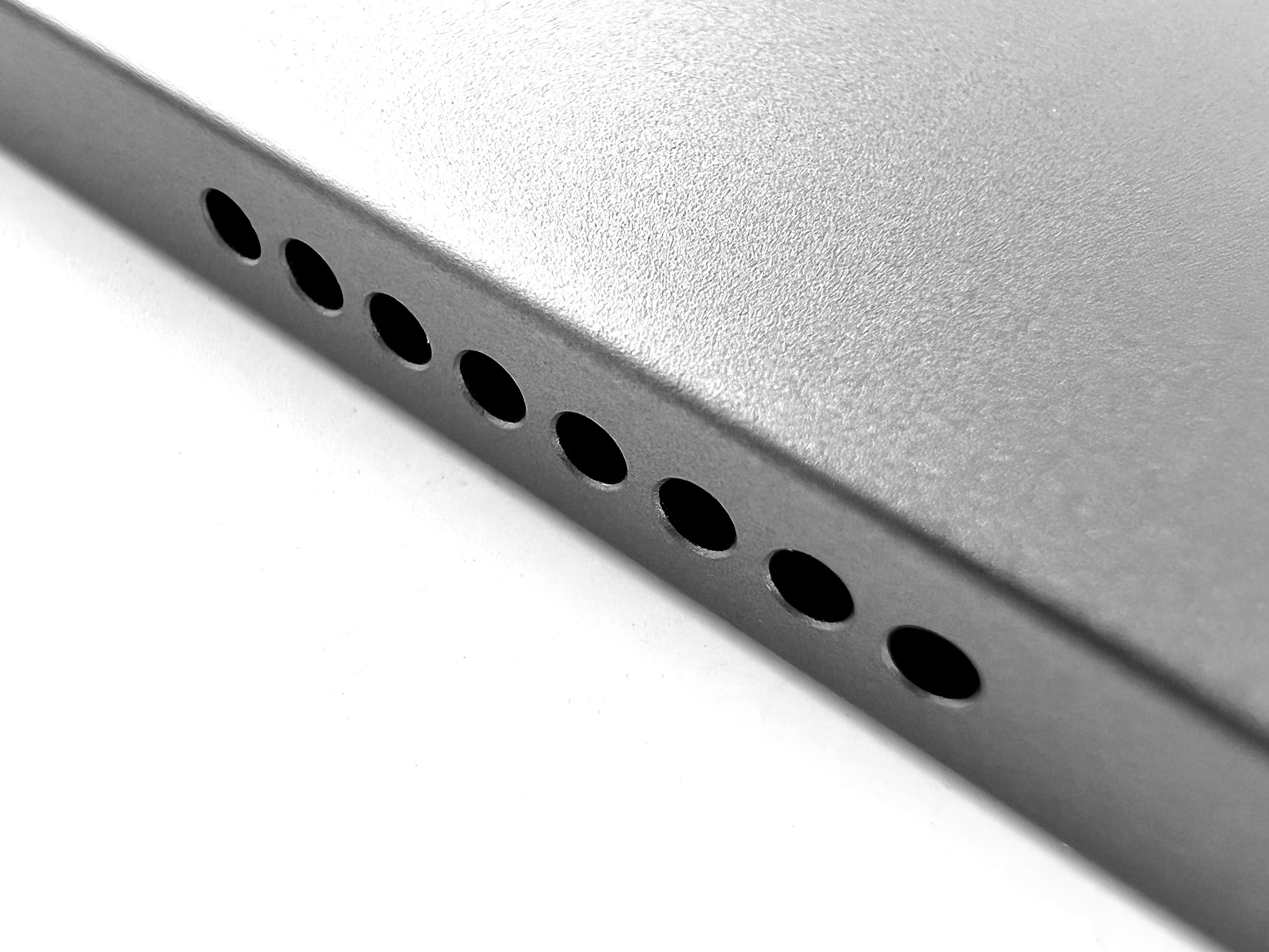
That being said, a few of the Macro shots I captured from the iPhone 13 Pro were impressive after a bit of light fussing.
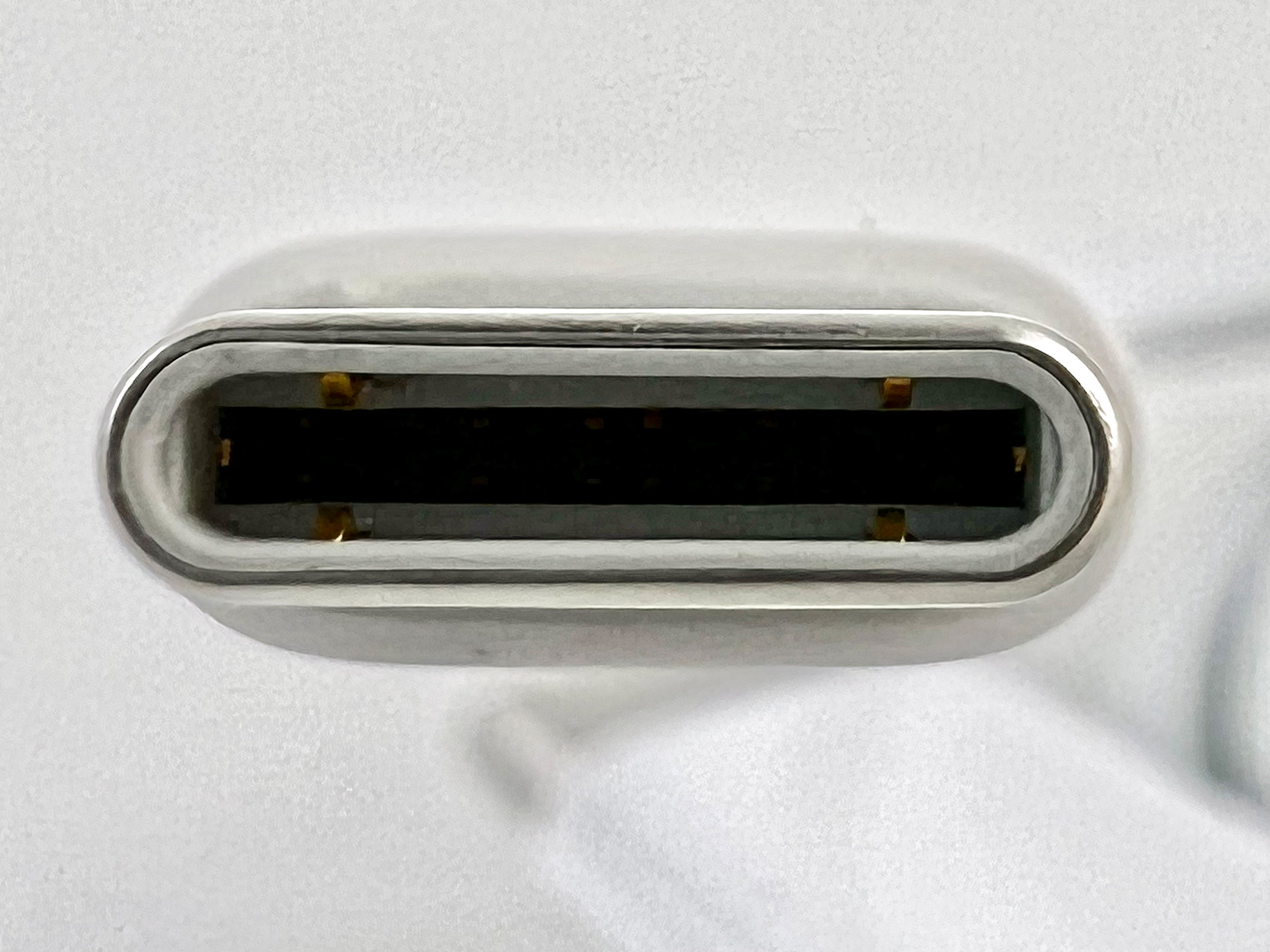
Macro Lens Issue
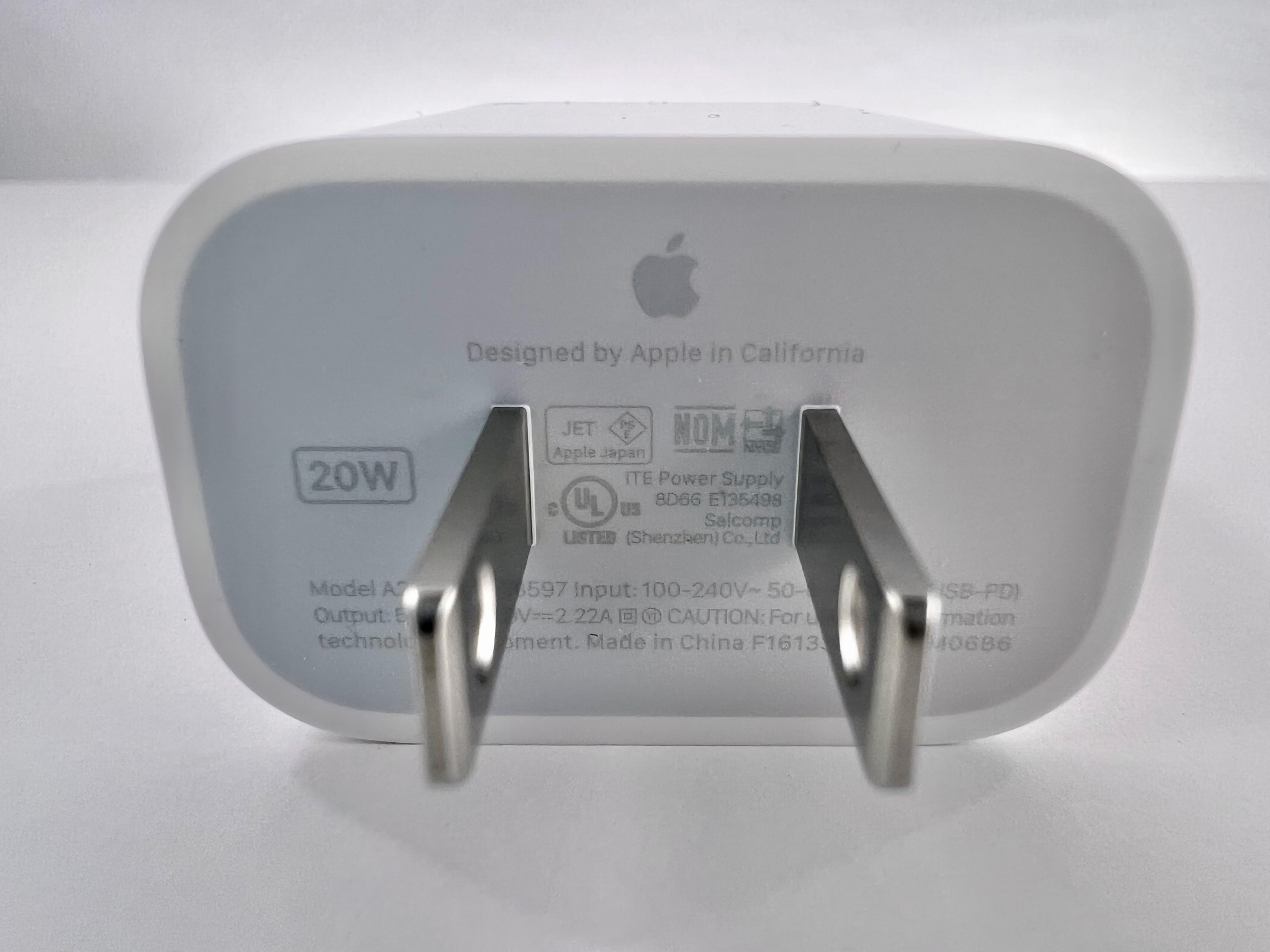
When the initial reviews for the iPhone 13 Pro started getting posted, I read about one particular problem with incredulity—the issue of the iPhone camera switching frames when moving between the “regular” camera lens and the Macro lens. Very often, reviewers over-state issues as major problems that turn out to be very minor annoyances. Unfortunately, this is not one of those times.
Reviewer Raymond Wong for inputmag.com states the issue well: “…if you have your iPhone 13 Pro camera set to the 1x wide camera and place an object or a subject within 14 centimeters (5.5 inches) of it, the viewfinder will maintain the 1x framing/composition but use the ultrawide’s close-range autofocusing in tandem. You can literally see the viewfinder flicker/pop and ‘switch’ to this hybrid viewfinder.”
In my experience, Mr. Wong may have understated this problem. When I attempted to frame my Macro shots, I moved the lens to the 2cm zone where I expected the Macro feature to engage, and the iPhone not only reframed my shot, but when the lens changed, I was unable to re-locate the part of the subject I wanted to capture.
How does this happen, you might ask?
If you are shooting, for instance, the overall texture of a surface, getting 2cm from the surface and having the camera system switch to a different lens is not much an issue since the surface you are shooting covers the area still viewable by all the camera lenses. However, if you are attempting to photograph a detail that’s just a few millimeters wide, getting the lens within 2cm and then having then lens switch to a different lens that’s about 2cm away, you have now lost your subject! Most of the time, I couldn’t find the subject again—AND the lenses kept switching as I was attempting to re-locate the subject.
IT WAS INFURIATING, but Apple claims to have a fix for this coming.
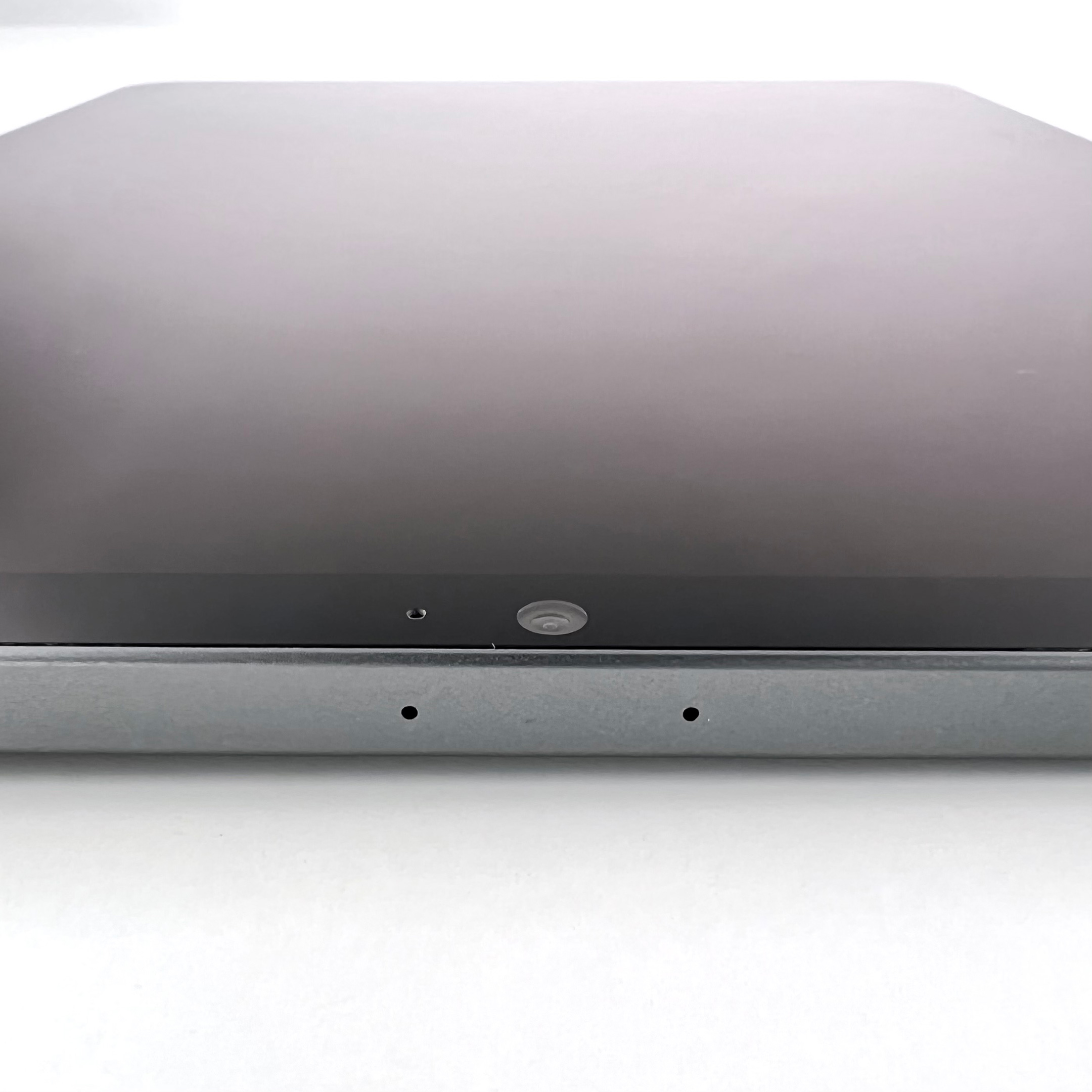
Lighting
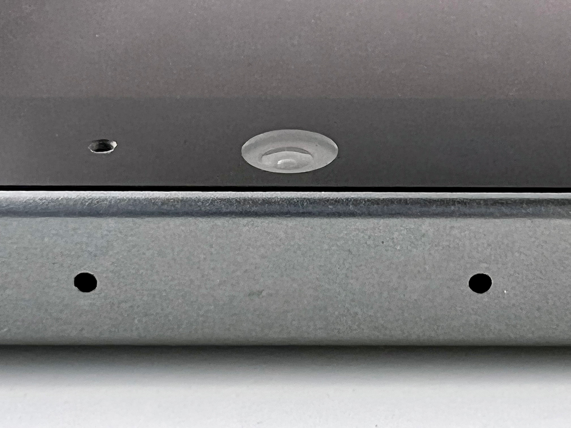
For both photo shoots, I used the exact same lighting comprised of my three lighting sources: two bright daylight CFL studio lighting bulbs behind a filter (the primary lighting source), two non-filtered daylight CFL studio lighting bulbs providing mostly indirect lighting on the white backdrop, and two LED bulbs providing a “wash” from below my white backdrop. I occasionally use these old LED Philips Hue bulbs to provide a color wash on the backdrop, but they mostly are set to a pure white to match the studio lighting bulbs.
Despite the fact that the lighting was exactly the same for both cameras, the iPhone 12 Pro photos delivered very inconsistent backgrounds compared to the Nikon D3500.
Far more concerning to me, the iPhone 13 Pro captured the light from the Hue bulbs differently in every shot. Although the bulbs are set to pure white, the iPhone somehow captured the cycling individual colors of the LED bulbs. One shot shows this in detail where the background shows color bands of yellow, pink, and blue in distinct stripes of color. At the same time, all lighting looked far darker on the iPhone 13 Pro.
When editing, the only way to remove these odd colorations was to either greatly desaturate the iPhone photos or switch them to black-and-white. To be fair, the Nikon is not blameless in casting odd colors. However, when the D3500 casts color, it is usually yellow—it has never delivered color bands or multiple color casts in the same photo.
Surprise and Delight
When I set out to try the iPhone 13 Pro camera, I was thinking about capturing photos, not using the other features offered by the iPhone 13 Pro and iOS 15. One particular feature truly surprised and delighted me: Live Text.
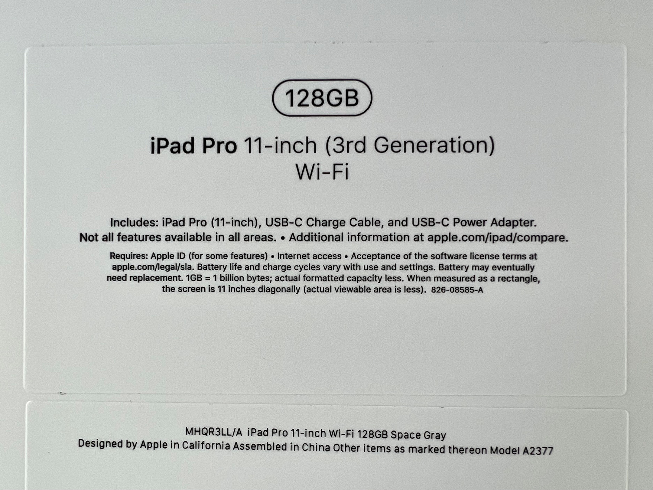
As I shot the packaging for the iPad 11 Pro, the iPhone’s new Live Text feature immediately “read” and displayed the text on the box—and interpreted the printed text perfectly. Since my collection includes mostly old Apple items that may no longer be online (or difficult to find), my sources are sometimes limited to what’s printed on a box or included in a manual. The iOS 15 Live Text feature allows me to capture a photo of any text and instantly have the ability to select, copy, and paste the text from my photo and use it in my accompanying blog post. Live Text will save countless hours in the future when photographing new items when only printed information is available.
Incidentally, Live Text also perfectly interpreted a printed serial number. I capture serial numbers for every item in my collection, and I dread doing so since they are generally difficult to read and prone to transposition errors. This will make the activity far more palatable.
I was not expecting to consider using Live Text, and the feature is exceptionally useful.
Photo Quality
When comparing the photos from the two camera devices, the overall photo quality is the most important aspect of this exercise. I am surprised by the significant differences between the devices.
While the iPhone 13 Pro photos show an impressive sharpness, that sharpness appears unnatural to me. All the photos appear to use a mechanical-looking pixel pattern compared to the more natural look of the Nikon. The unnatural pixelation is especially obvious in the Macro shots.
Overall, my opinion is that the Nikon D3500 photos look better than the iPhone 13 Pro photos.
Verdict
I will continue to use the Nikon D3500 for my primary Apple Collection photography.
That being said, I will definitely reach for the iPhone 13 Pro when I want a Macro shot to add to my blog post. Similarly, when shooting older product packaging and/or manuals, I will use the iPhone’s Live Text features to grab the text so I don’t have to retype it.
Overall, this verdict is neither surprising nor disappointing to me. I have always had a “pick the right tool for the job” mindset, and this situation is no different.
To see the “official” photo shoot for the iPad Pro 11 (2021) in my collection, please see this post. The photos I captured with the iPhone 13 Pro are shown below in this post.
Thanks
Sincere thanks to my friend Sid for suggesting this comparison! I learned a lot here.
I began collecting Apple computers, accessories, and collectibles in the 1990s. When iPod, iPhone, iPad, and Apple Watch devices were introduced, I began to collect those items as well. About twenty-five years later, I have an extensive collection of all things Apple.
Beginning in late 2018, I began to document and catalog my collection. I use a Nikon D3500 (with 18–35mm lens), iPhone 12 Pro Max, a basic lighting setup, and a white IKEA table. Blog entries include information, photos, and personal commentary. My Instagram account that features highlights from this collection.