Skip to content

mattjfuller.com

ed tech | design | music

  • mattjfuller.com
  • Résumé
  • Sketchnotes
  • Music
  • Shows
  • Apple Collection

Tag: logo

Posted on January 1, 2026

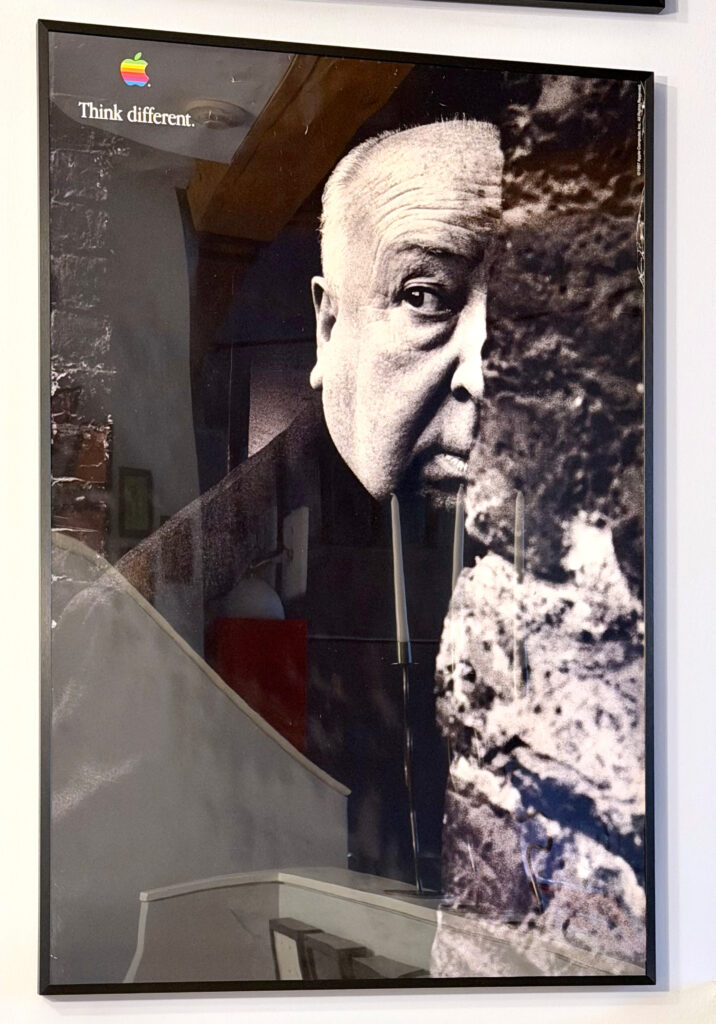
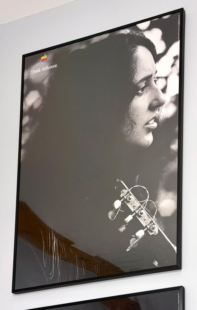
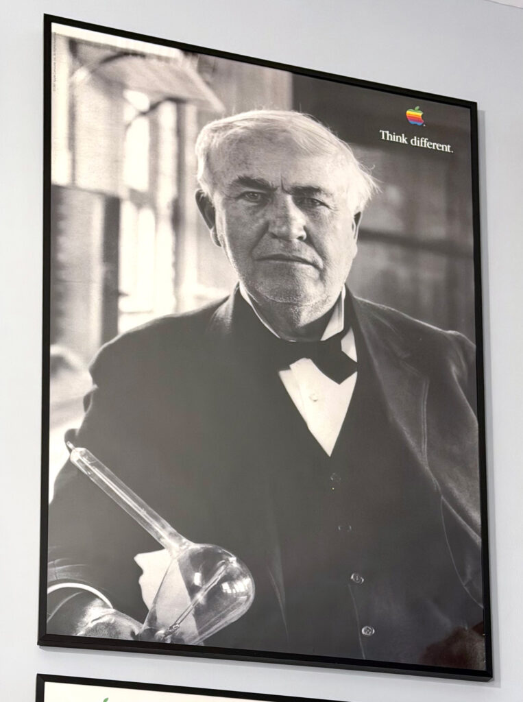
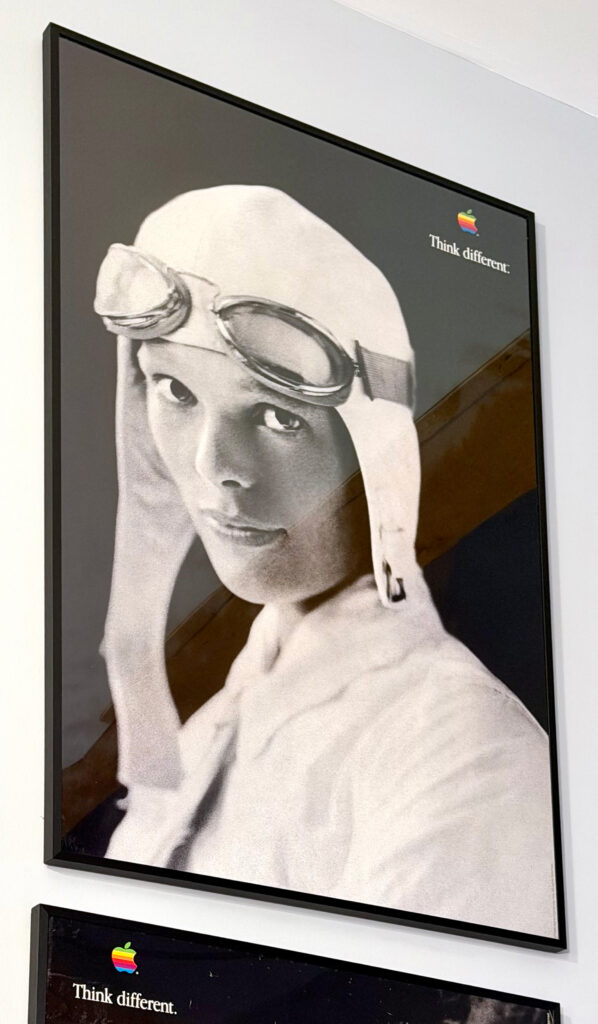
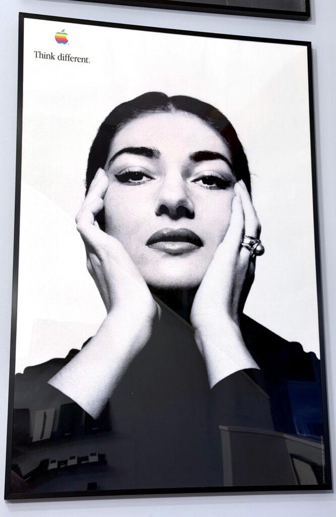
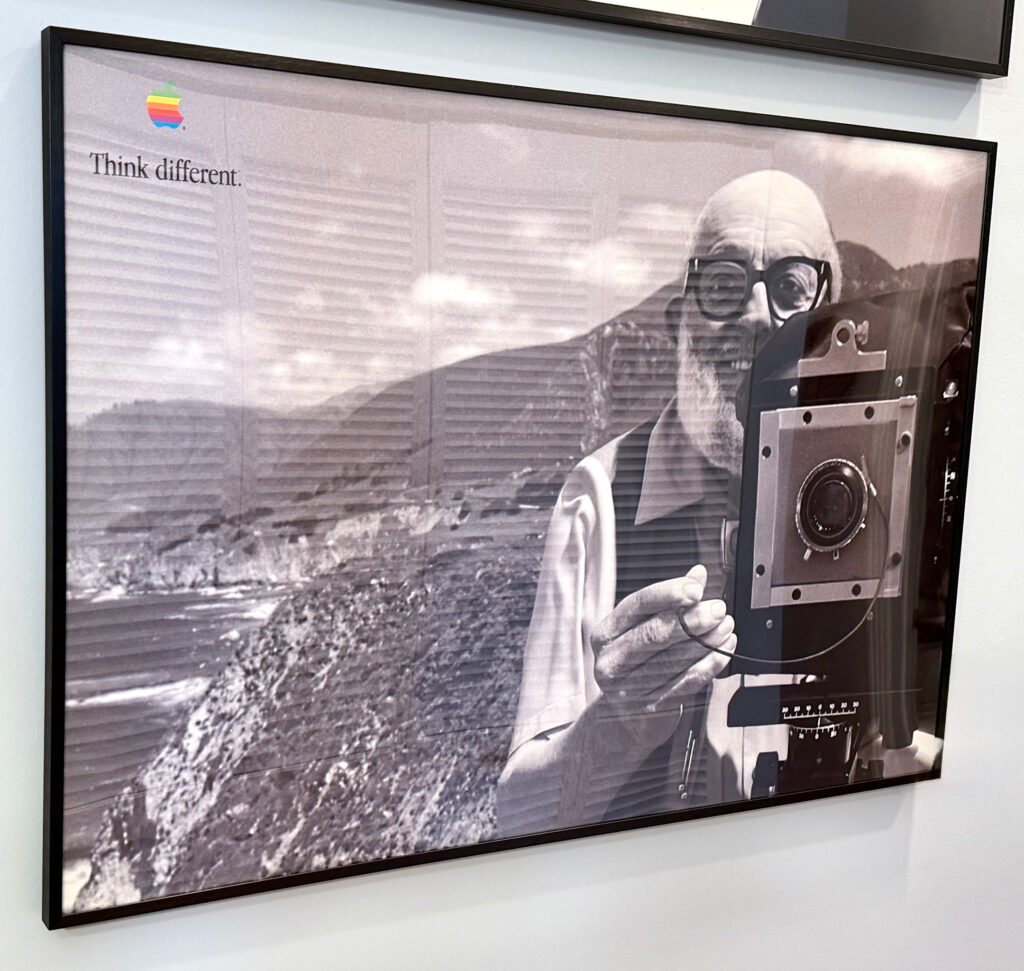
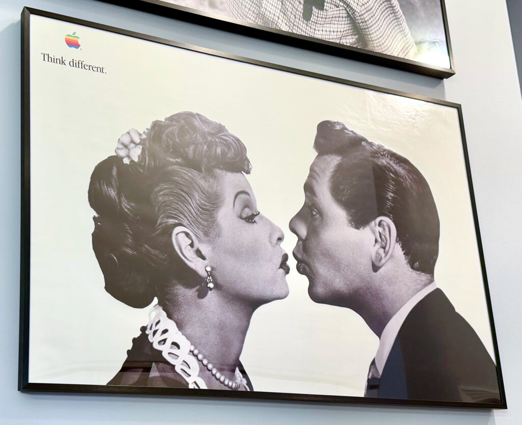
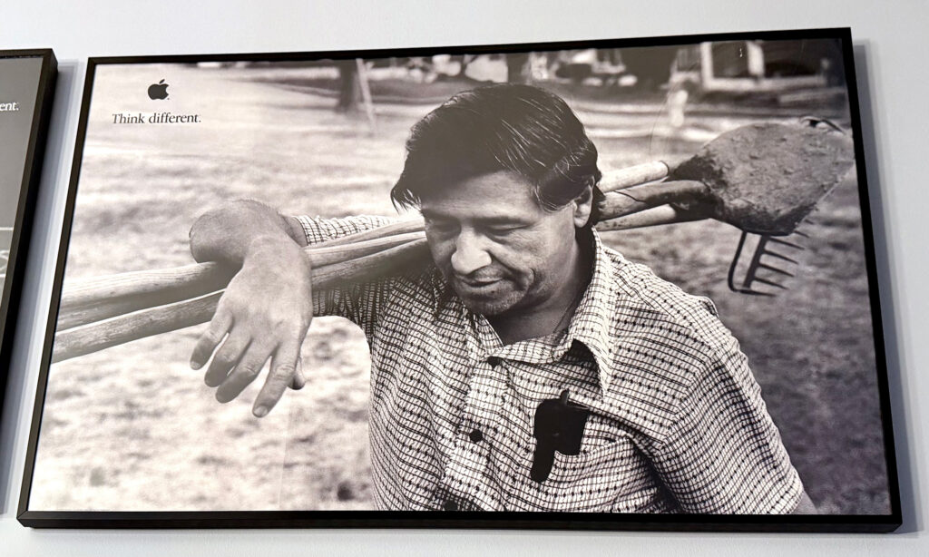
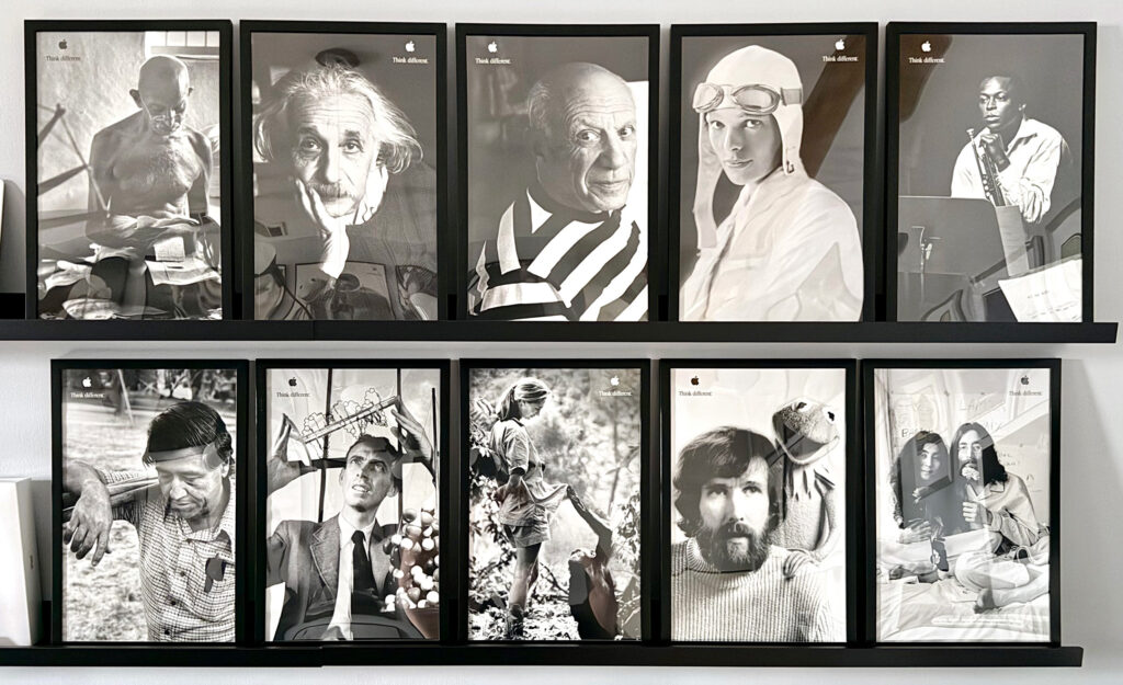
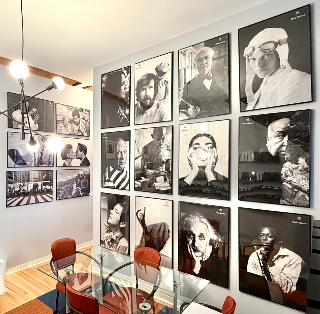
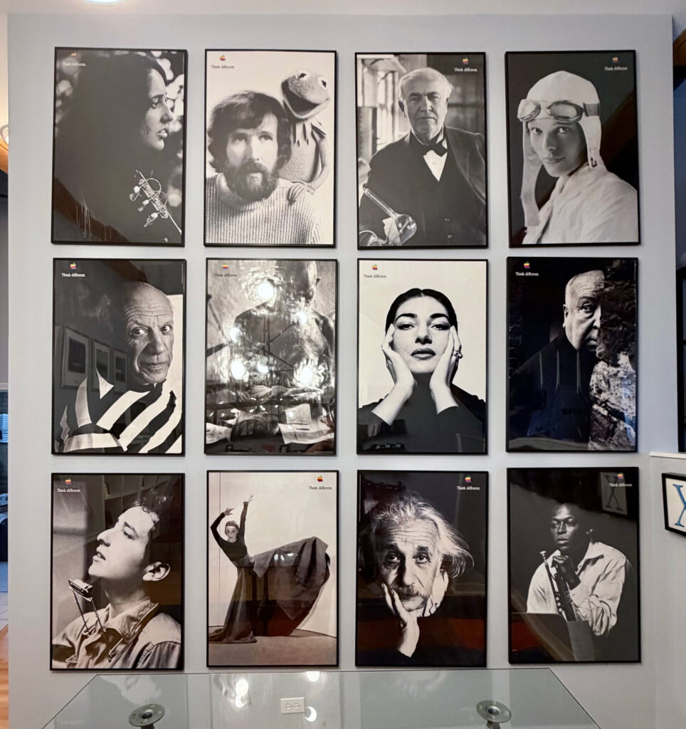
Think Different poster set of 18 (24 x 36 inches, portrait & landscape orientations, 1997, 1998, 1999)

“Think different” was the slogan used by Apple in an advertising campaign during the years 1997–2002, and is still used in rare circumstances as of 2025. The Think different concept was created by advertising agency TBWA\Chiat\Day while working with Apple and Steve Jobs. Think different was first rolled out as a TV commercial and was followed by additional TV commercials, print/digital ads, and as part of Apple’s product packaging.

Posters in this set include:

  • Joan Baez (24 x 36 inches, 1997). From poster set 2.
  • Jim Henson with Kermit the Frog (24 x 36 inches, 1998). From poster set 3.
  • Thomas Edison (24 x 36 inches, 1997). From poster set 1.
  • Amelia Earhart (24 x 36 inches, 1998). From poster set 1.
  • Picasso [side facing] (24 x 36 inches, 1997). From poster set 1.
  • Gandhi (24 x 36 inches, 1997). From poster set 1.
  • Maria Callas (24 x 36 inches, 1998). From poster set 2.
  • Alfred Hitchcock (24 x 36 inches, 1997). From poster set 1.
  • Bob Dylan (24 x 36 inches, 1998). From poster set 3.
  • Martha Graham (24 x 36 inches, 1997). From poster set 2.
  • Albert Einstein (24 x 36 inches, 1997).
  • Miles Davis (24 x 36 inches, 1998). From poster set 3.
  • Richard Feynmann (36 x 24 inches, 1999). From poster set 4.
  • Cesar Chavez (36 x 24 inches, 1998). From poster set 4.
  • Frank Sinatra (36 x 24 inches, 1999). From poster set 4. [Print faded]
  • Lucille Ball & Desi Arnaz (36 x 24 inches, 1954/1998). From poster set 3.
  • Ansel Adams (36 x 24 inches, 1998). From poster set 3.
  • Rosa Parks bus (36 x 24, 1998). Education poster.

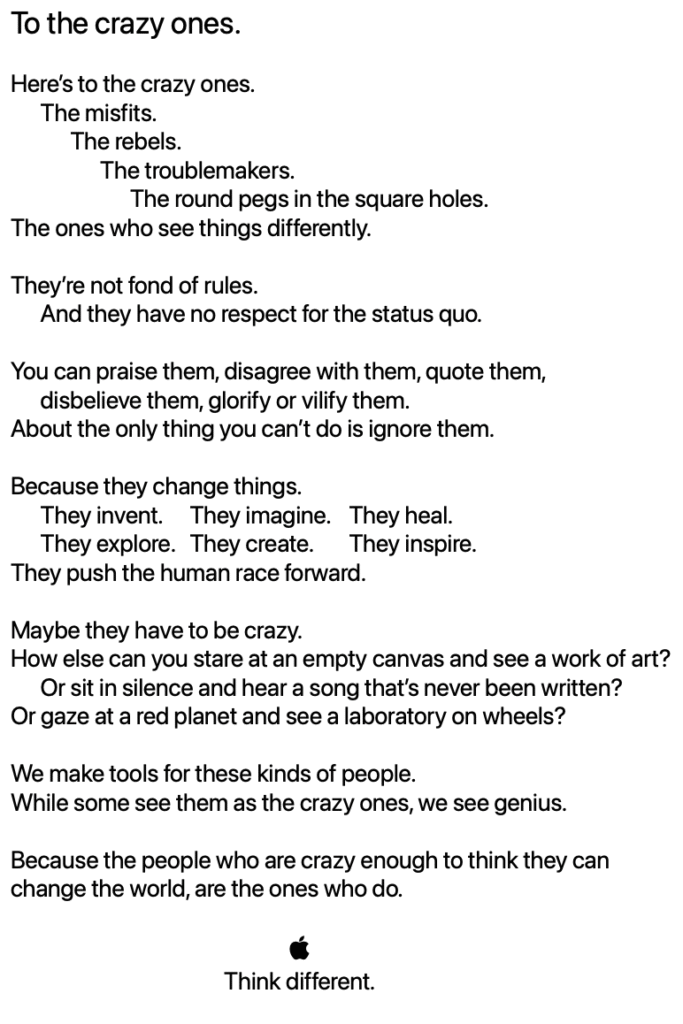
This advertising campaign was notable because it did not include imagery or mentions of any Apple products. The Think different idea was based upon a “manifesto” that began famously with “Here’s to the crazy ones.”

During the original TV commercial, voiced by Richard Dreyfuss, black-and-white film footage of iconic figures served as visuals to accompany the voiceover of a shortened version of the manifesto. Luminaries in the commercial included Albert Einstein, Bob Dylan, Martin Luther King Jr., Thomas Edison, Muhammad Ali, Gandhi, Amelia Earhart, Alfred Hitchcock, Jim Henson, Pablo Picasso, and others. The commercial ended with the multi-color Apple logo on a black background with white text (in the Apple Garamond font) Think different.

The print and digital ads also did not feature Apple products, just a black-and-white photo, the multi-color Apple logo, and the words “Think different.” One of the creative team members who worked on the campaign described the print concept: “The rainbow-colored logo served as stark contrast to the black and white photography, and, to me, it seemed to make the ‘Think Different’ statement all the more bold.”

In her 2011 book Design by Nature: Using Universal Forms and Principles in Design, Maggie Macnab described the concept of the Think different campaign:

“By identifying Apple’s core philosophy with the rebels and geniuses that changed the world by ‘thinking differently,’ the campaign established Apple as the ideology of the future. Apple was perceived as saving the day by making technology accessible to anyone. This move repositioned it well above its competition and far beyond the status of ‘product’ by connecting the user into a world of possibility.”

From the debut of Think different, the grammar of the slogan has been debated. Would-be grammarians cited the adverbial rule and admonished the slogan stating that “standard” English grammar dictates that adverbs must modify verbs—making “think differently” the “correct” usage. However as in this case, “different” can be used as an adjective that modifies the object “think”—suggesting a command to think in a different way. Thus, the slogan is parallel to other uses, such as “think big,” where “big” is used as an adjective. Using this logic, “think big” cannot be corrected to “think bigly,” just as “think different” could not be changed to “think differently” without changing its meaning.

In the United States, four sets of 24 x 36 inch Think different posters were released. Set 1 included Amelia Earhart, Alfred Hitchcock, Pablo Picasso, Mahatma Gandhi, and Thomas Edison. Set 2 included Maria Callas, Martha Graham, Joan Baez, Ted Turner, and the Fourteenth Dalai Lama (not officially released due to licensing). Set 3 included Miles Davis; Ansel Adams (landscape orientation); Lucille Ball and Desi Arnaz (landscape orientation); and Bob Dylan (not officially released due to licensing). Paul Rand and Jimi Hendrix were part of Set 3, but not included in all sets that were shipped (also likely due to licensing). Set 4 included Frank Sinatra, Richard Feynman, Jackie Robinson, and Cesar Chavez.

An unofficial Set 5 included film directors that was never released, including Charlie Chaplin, Francis Ford Coppola, Orson Welles, Frank Capra, and John Huston.

The 36 x 24 inch Rosa Parks bus poster is unique in this set as it was created and distributed to education customers and not part of a larger set. Further, the poster is a color photo of a black-and-white photo on the side of a New York City bus.

I have collected many of Apple’s Think different posters, print ads, and other materials, including a set of 10 posters that measure 11 x 17 each and were distributed to educators. Some designs in this Think different education set are cropped versions of the 24 x 36 posters.

The 24 x 36 posters photographed here are displayed in my dining room on two walls to create a gallery effect. I also included a photo of the 11 x 17 posters on the facing wall. You will note that the photography style of this entry is very different from my typical posts. These photos were captured with iPhone 17 Pro in situ with inconsistent lighting, angles, and reflections.
Sources: Wikipedia, Forbes

Posted on January 1, 2026

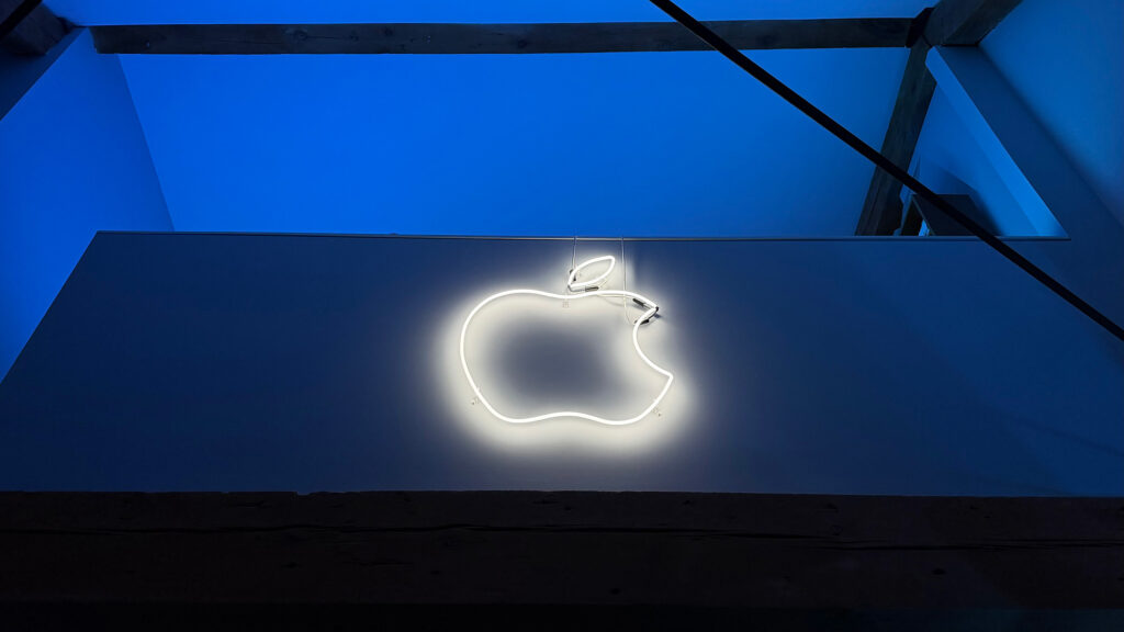
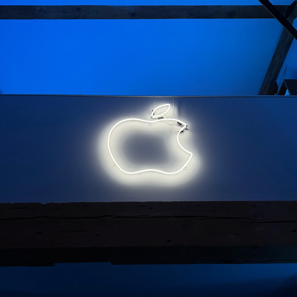
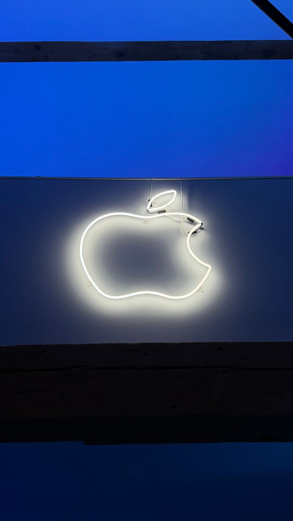
Neon Apple Logo (October 2014)

Back in 2014, I contacted Neon Shop Fishtail, a well-known neon shop in Chicago, and inquired about the possibility of fabricating a neon Apple logo for my home.

I contacted the general email address on the website and quickly received a response from Tom Brickler, whom I later learned is the owner of the shop. I sent a Photoshop mockup of the idea I was envisioning. He told me that he liked the project and that he could start it later that week. 

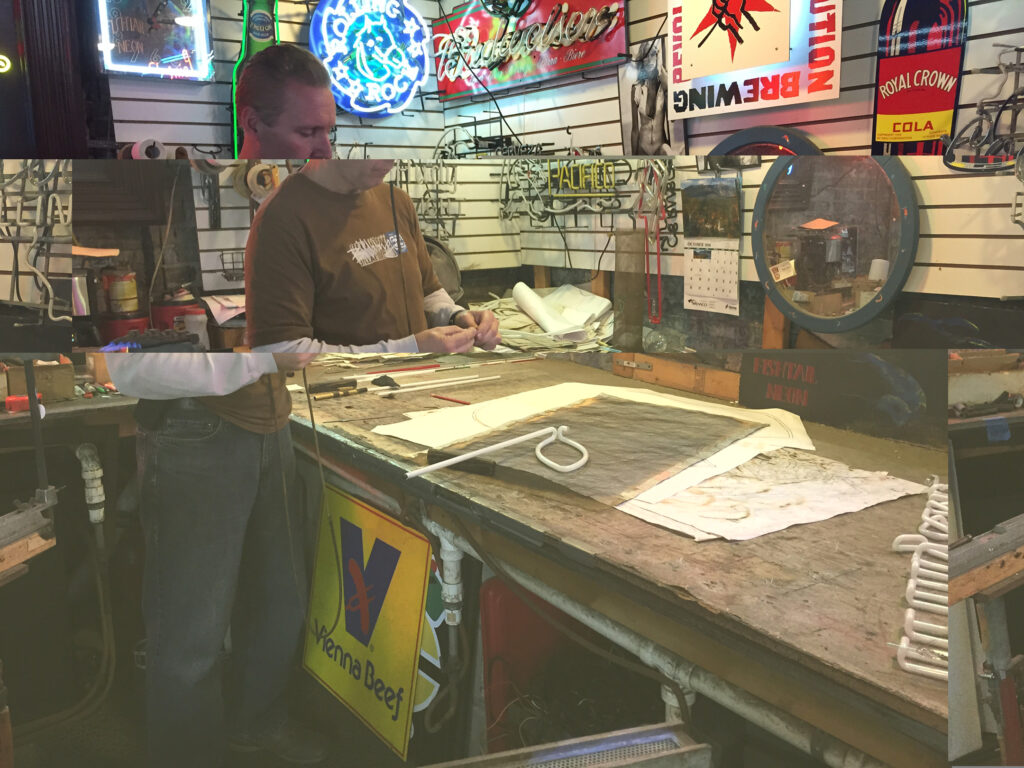
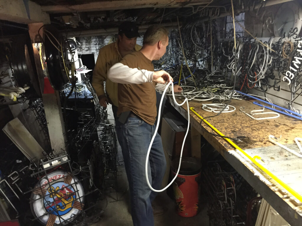
On a whim, I asked if the shop allowed customers to watch the fabrication of projects. I was very surprised when he invited me the next Friday afternoon. They not only allowed me to watch the fabrication, but they very generously allowed me to take photos and video, all captured on my iPhone 6—my personal iPhone at the time.

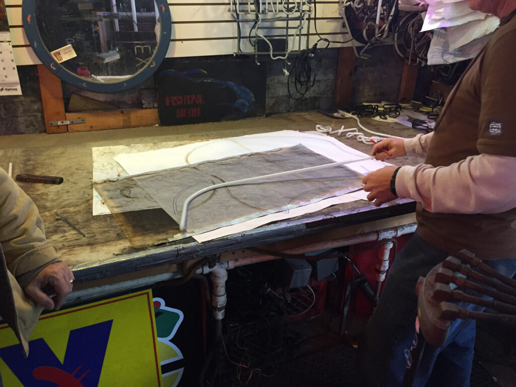
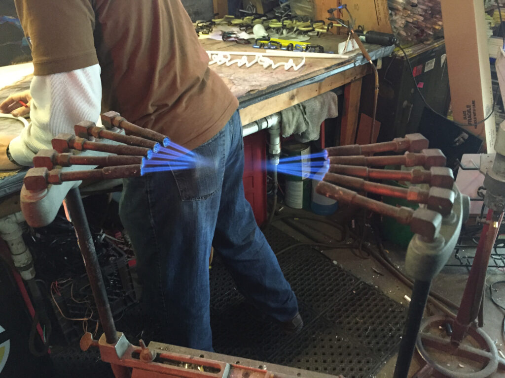
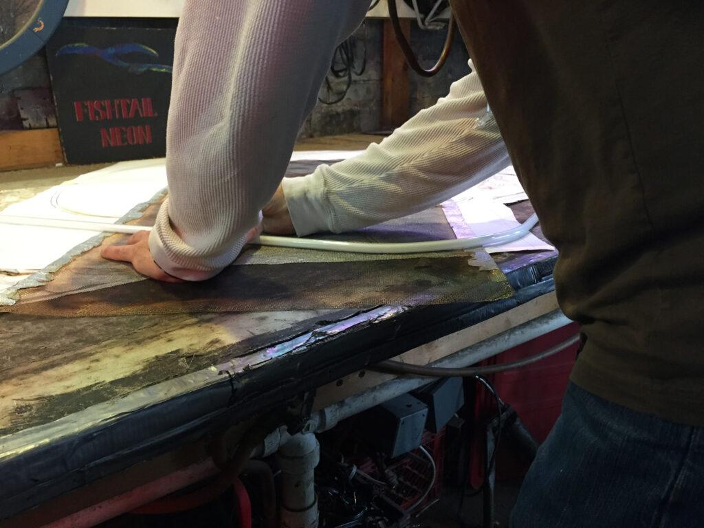
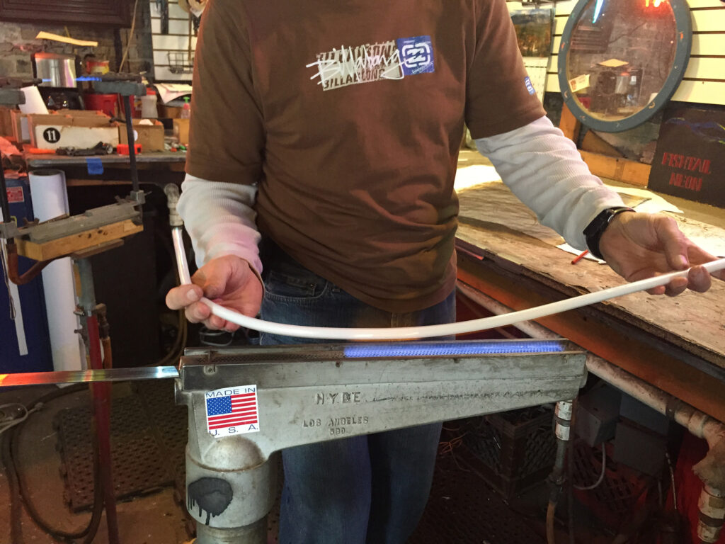
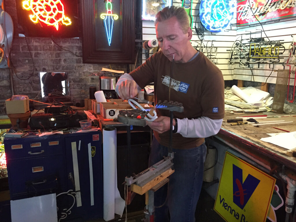
The experience was fascinating to watch, and it became immediately clear that the three men involved in the project were extremely skilled craftsmen. Before I arrived, neon artist John Noga had already shaped three pieces of the logo, but he had not yet fused them together. I was able to watch him create the leaf part of the logo from a straight white glass tube. He then trimmed and joined the larger pieces to form the lower apple part of the logo with the top, bottom, and “bite.”

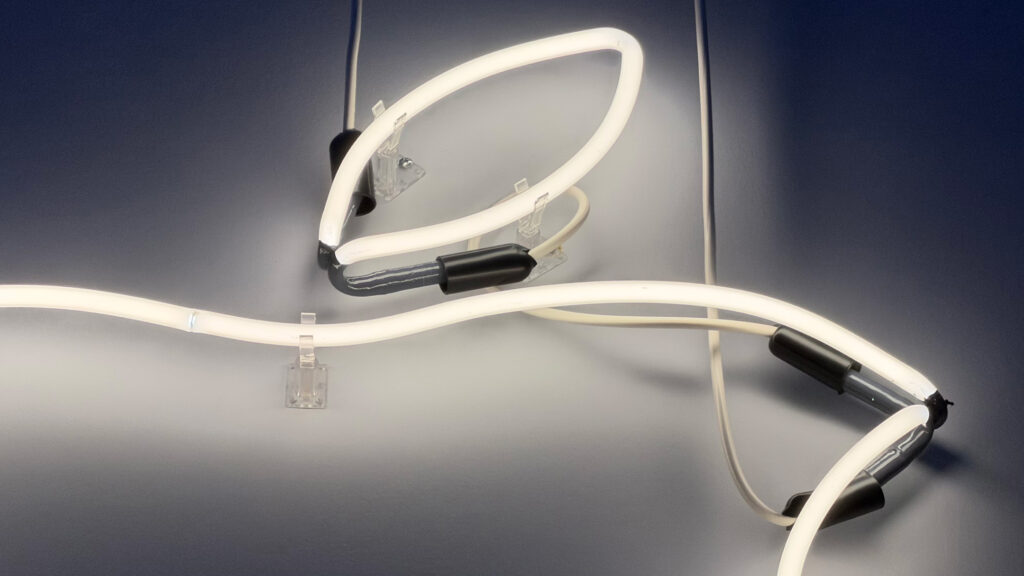
The next step was to bring the project to the shop basement where the two pieces were electrified with 15,000 volts of electricity, heating them to 550˚F to burn out the impurities inside the glass. The white tubes were then pressure-filled with argon gas so, when electrified, the piece would produce a white glow. 

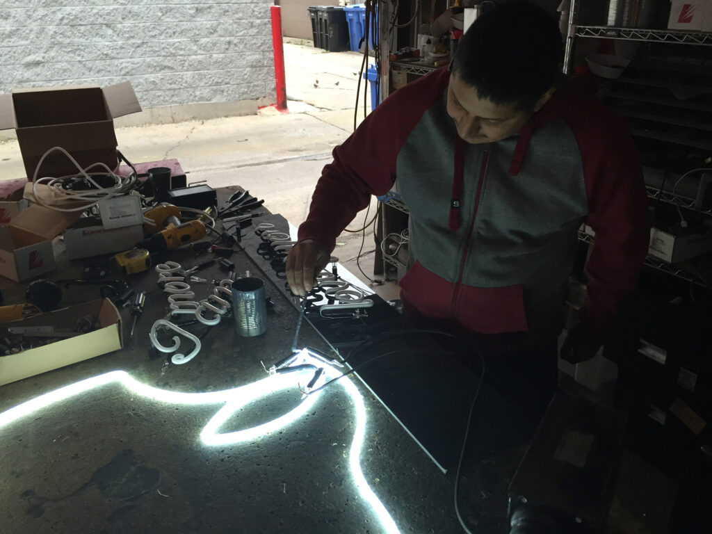
The last two steps, completed by Chevo Carreño, included “burning in” the tubes with electricity so the entire shape would glow evenly. As the burning-in commenced, it was easy to follow the path of the glow getting brighter until the entire piece was even. He finished the project by painting the non-glowing parts of the tubes with a foul-smelling substance that effectively blocked out the light. He let me select the color, and I went with gray. I was also able to select the wire color and chose white. 

I took the logo home that day.

About one month later, I finished the installation with help from my then-neighbor and owner of a painting company, Alex Tenuta. The logo is supported by clear plastic clips attached to the wall, and the wiring is a simple series circuit that attaches to a dimmable transformer that plugs into a standard outlet. The logo is mounted on the half-wall of my loft, about 15 feet up.

Tom Brickler, also known as “Neon Tom,” named Neon Shop Fishtail after a fishtail ribbon burner used for making sweeping curved bends with glass over fire. After nearly 40 years, he describes his business as strong with “work in the major motion picture industry, business signs, custom art for residential, and signage for the industry.” The website adds, “We specialize in making our own signs in the handmade custom way neon is made and take great pride in what we do!”

Neon Shop Fishtail is located at 2247 North Western Avenue on Chicago’s north side, and handmade work can be viewed in the store. Brickler invites anyone to visit, “even if you are not in the market for a neon sign…after coming in, you will now be noticing neon everywhere, and hopefully you will come up with an idea that we can create in light.”

I distinctly remember recording the process at Neon Shop Fishtail, and to this day I very much appreciate that they timed the completion so I could watch and learn part of the process. I still remember how effortless they made process seem and the obvious experience and artistry in every step. I also remember being surprised by the specialized tools and open flames that were burning around the shop in unexpected locations.

Using my many clips, I created a “making of” video back in 2014 and posted it on YouTube. Neon Shop Fishtail has included on the front page of their website since I sent them the link in 2014. Over 10 years later, my video has well over 14,000 views—BY FAR the most views of any video I have ever made!

See the video on YouTube.

Of course, this neon artwork is not an official Apple product, but I consider it among my most prized Apple collection items.

Source: Neon Shop Fishtail

Posted on March 22, 2025March 23, 2025

Hello on Blue (Susan Kare, 17 x 22 inches, 2025)

Susan Kare (born 1954) was the designer who created the icons, graphics, and fonts for the original Macintosh. Kare graduated from New York University with a Ph.D. in fine arts in 1978. After graduating she moved to California and worked at the Fine Arts Museums of San Francisco. Her high school friend and member of the original Macintosh development team, Andy Hertzfeld, called her in 1982 and asked her to draw icons and text elements for the Macintosh project.

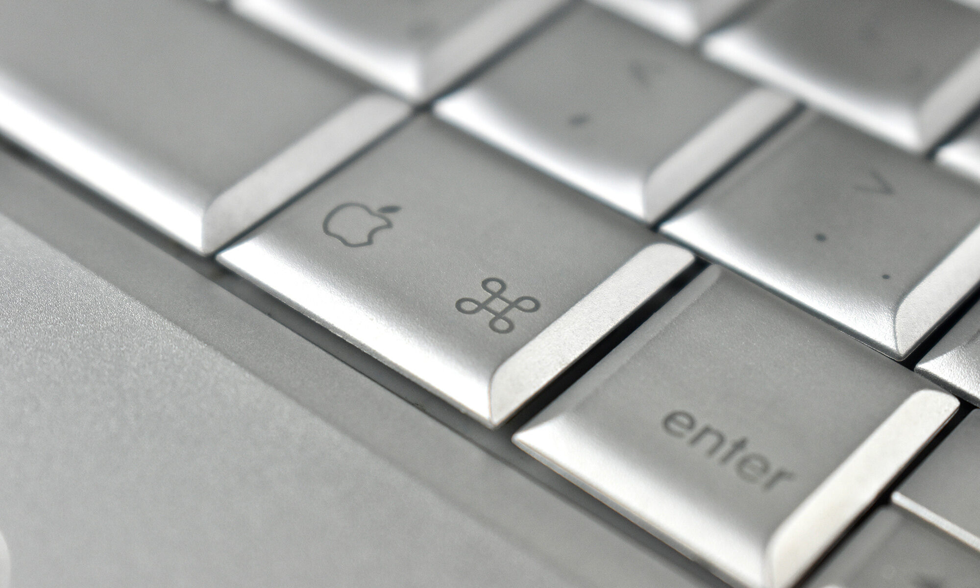
Kare’s original drawings for Apple were created in 32×32-pixel grids. AIGA documented her original work for Apple and acknowledged that Kare “created some of the most recognizable icons, typefaces, and graphic elements in personal computing: the command symbol (⌘), the system-failure bomb, the paintbrush, and, of course, ‘Clarus the Dogcow.’” Her work was characterized as “a canvas of approachable visual metaphors that are instantly recognizable decades later.”

Some of Kare’s work can be found in the Museum of Modern Art in New York City. According to Kare’s website:

“Kare believes that good icons should be more like traffic signs than illustrations; easily comprehensible and not laden with extraneous detail. She has observed that just because millions of colors are available, maximizing their use in an icon does not necessarily improve it. When symbols (icons or logos) are meaningful and well-crafted, they need not be frequently redesigned.”

This print, “Hello on Blue,” is a limited edition, numbered 27/200, and signed and dated by Susan Kare. It is a giclée fine art print that is 25 inches wide x 17 inches tall. The work is printed using archival ink on acid-free Hahnemühle Photo Rag paper. Although this is not an “official” Apple product, I am proud to feature Kare’s work among my Apple collection.

This iconic “hello” cursive script image that was originally designed by Kare has been used by Apple numerous times over the years, beginning with the introduction of the original Macintosh on January 24, 1984 during Apple’s Annual Shareholders Meeting. After Steve Jobs showed the Macintosh live on stage, he played a TV commercial that shows a carrying case being unzipped, the Macintosh lifted onto a table, and the black-and-white screen displayed the “hello” cursive design. A few other uses of the “hello” design include:

  • May 6, 1998: Steve Jobs introduced the original translucent Bondi blue iMac with the screen displaying “hello (again)”—with “hello” in the original cursive script and “(again)” in Apple Garamond.
  • December 2022: During my own visit to Apple Park in Cupertino, visitors to the Apple Briefing Center were greeted with a sculpture approximately 4 feet wide of “hello” that is airbrushed in the colors of Apple’s original multicolor logo.
  • 2023: Apple Developer provided “Hello Developer” online, described as “A monthly guide to the latest developer activities, stories, and news” that features the original “hello” image in different formats in different editions from October 2023–June 2024.
  • October 28, 2024: Apple releases an iMac Announcement video that begins with the cursive script “hello” and then expands to “hellllllo” with each “l” in a different color of the original Apple logo; in the presentation the iMac is updated to the M4 chip and is available in “new vibrant colors.”
  • October 29, 2024: The Mac mini is updated in a video announcement using the “hello” image stylized with the Apple Intelligence logo, emoji, the Jolly Roger flag (a nod to the original Macintosh team), and a 3D wire frame.

Sources: Fast Company, Internet Archive (AIGA), MoMA, Susan Kare, Internet Archive (Apple), Apple Special Event October 2016, iMac Announcement 10-28-21, Mac mini Announcement 10-29-24, Hello Developer

Posted on November 30, 2024November 30, 2024

Apple Logo Lapel Pin (Violet, Apple Distinguished School, 2024)

Apple describes the Distinguished Schools program:

“Apple Distinguished Schools are centers of leadership and educational excellence ​that demonstrate Apple’s vision for learning with technology — and we believe they are some of the most innovative schools in the world.”

As of November 2024, Apple reported that there were 889 Apple Distinguished Schools in 37 countries. The district where I serve as an educational technology leader is proud to have three Apple Distinguished Schools.

This Apple logo lapel pin is violet, a shade of purple matching one of the stripes on Apple’s classic six-color logo. The pin package is wrapped in clear plastic and attached to a 3 x 3-inch black cardboard backing that is printed in white with the words [Apple logo] Distinguished School.

The pin is made from metal with a polished chrome finish. The pin is approximately 2 mm thick, 3/4-inch across, and 7/8-inch tall. The pin is held in place from the back by a silver butterfly clutch.

Source: Apple, Wikipedia

Posted on November 2, 2024November 4, 2024

Rainbow Apple Logo T-Shirt (black shirt, multicolor print, 2XL, 2023)

This black T-shirt featured the classic six-color Apple logo. Although Apple referred to the style as “Rainbow,” the six-color Apple logo colors used a different order than the visible light spectrum of a rainbow.

This shirt was purchased at the Apple Store at the Apple Park Visitor Center in Cupertino, CA. The shirt was a size 2XL and unopened in its original box. The white box was printed with a white Apple logo and measured 195mm x 195mm x 35mm. The box indicated that the shirt was 100% cotton and made in Turkey (Türkiye).

Posted on November 2, 2024November 4, 2024

WWDC 2024 bag and swag (2024)

The Apple Worldwide Developers Conference (WWDC) is a meeting held annually in and near Cupertino, California, by Apple. The event gathers thousands of software developers to learn about and discuss the latest software and technologies for Apple operating systems and platforms. Attendees can participate in hands-on labs with Apple engineers and in-depth sessions covering many topics.

Attendees of the 2024 Worldwide Developers Conference expressed their interest to attend by entering an online lottery. Those who were selected and attended were given this canvas bag and some of the items shown in this post.

Canvas Bag

One side of the black canvas bag features a stylized “WW” representing “Worldwide” and printed below are the words “[Apple logo] Worldwide Developers Conference 2024.” The text is printed in light gray in a stylized version of San Francisco, Apple’s Corporate font.

The other side of the bag features the letters “DC” in a bold font representing “Developers Conference.” At the bottom, the location and date of the conference is printed, “Apple Park, June 10–14.”

The upper edge of the bag features a royal blue tag embroidered with “[Apple logo] WWDC24”

The bag measures 15.5 inches tall, 14.75 inches wide, and two loop handles add an additional 9.5 inches to the height of the bag.

Picnic Tarp

Some attendees referred to this item in a cylindrical drawstring bag as a “picnic blanket,” but it is made from a nylon material that more closely resembles a tarp. The cylindrical drawstring carrying bag is dark gray and has the words “Worldwide Developers Conference 2024” printed in black. The bag measures 5 inches tall, 4 inches in diameter, and has a 10-inch drawstring.

Inside the bag is a neatly folded royal blue nylon picnic tarp with a black border, rounded edges, and the designs are printed in black. One side features a single large black WWDC logo and the other side uses the WWDC24 logotype repeated multiple times to create a pattern. Although I did not precisely measure this tarp, I estimate it to be over 6 x 6 feet.

Small Pin Package Folder

The smaller of two matte black cardboard pin packages is printed on the front in glossy black ink “WWDC24,” and on the back with “[Apple logo] Worldwide Developers Conference 2024.” This cardboard folder package measures 2.5 inches wide and 3.25 inches tall.

Inside is a single lapel-style pin with the year “2024” using a font design similar to the WWDC24 logotype. The back of the pin uses a butterfly clutch pin fastener.

Large Pin Package Folder

The larger of two matte black cardboard pin packages is printed on the front in glossy black ink “WWDC24” and on the back with “[Apple logo] Worldwide Developers Conference 2024.” This cardboard folder package measures 3.25 inches wide and 4 7/8 inches tall.

Inside is a collection of six lapel-style pins, all using a butterfly clutch pin fastener on the backs. The pins include:

  • Apple Park—A round silver design in the shape of Apple Park. The center of the pin is black and includes the words “[Apple logo] Park” in Apple’s San Francisco corporate font. This round pin measures 7/8 inches in diameter.
  • Macintosh 40 YEARS—This rectangular design uses a 4-bit depiction of the original beige Macintosh in icon form with a smiling “face” on the screen. In all caps below is printed “40 YEARS” in Apple’s Chicago bitmap font (designed by Susan Kare) used in the original Macintosh user interface. This pin measures 5/8 inch wide x 7/8 inch tall.
  • theFuture = Date.now—This rectangular pin has rounded edges with silver text on a bright orange field. The text can be interpreted as “the future is now,” but written in the Swift coding language as “theFuture = Date.now” using a monospaced version of Apple’s San Francisco font. This pin measures 1 1/8 inches wide x 1/2 inch tall.
  • Dragon Face Memoji—This detailed pin shows a highly stylized and detailed version of the “Dragon Face” Memoji with stars replacing the eyes. This custom-shaped pin measures roughly 7/8 inch wide x 7/8 inch tall.
  • Vintage Apple logotype—This pin is a version of Apple’s logotype from the 1990s using one of Apple’s former corporate fonts, Apple Garamond, used between 1984–2002. Each letter is a different color from Apple’s original 6-color logo (with no red letter). This pin measures 1 1/8 inches wide x 5/8 inch tall.
  • Apple Vision Pro—My favorite of the pins is a depiction of the Apple Vision Pro. The pin shows the front view with a black display with sliver edges. A tiny Digital Crown can be seen in its relative position over the left (facing) lens. This pin measures 1 inch wide x 1/2 inch tall.

The swag bag also included a black water bottle with a white WWDC24 logo, but I do not [yet] have this in my collection.

Sources: Wikipedia (butterfly clutch, Apple typography), 9to5mac, WWDCScholars, Susan Kare

Posted on September 29, 2024October 31, 2024

US Education Sales Mug (black, multicolor logo, 2024)

This black mug features a stylized rainbow logo in colors reminiscent of Apple’s original six-color logo and the words “US Education Sales” printed in white in the Apple Garamond font, Apple’s corporate font from 1984–2003.

The mug was sent to Apple Employees who were part of the United States Apple Education Sales team in 2024.

Source: Wikipedia

Posted on September 29, 2024October 31, 2024

Multicolor Apple logo pin (white packaging, 2023)

This multicolor Apple logo pin is made of lightweight dark gray metal and printed with the classic 6-color Apple logo. The pin is presented on a 7.5 x 7.5 cm piece of white card stock with rounded edges (reminiscent of an iOS icon). The card is printed with a black Apple logo at top-center about half the size of the pin.

The pin is in the shape of Apple’s classic logo and measures 18 mm wide x 23 mm tall. The back of the pin has a protruding pin with a butterfly clutch to secure it.

My collection includes an identical pin in black packaging.

Source: Wikipedia

Posted on September 29, 2024October 31, 2024

Multicolor Apple logo pin (black packaging, 2023)

This multicolor Apple logo pin is made of lightweight dark gray metal and printed with the classic 6-color Apple logo. The pin is presented on a 7.5 x 7.5 cm piece of black card stock with rounded edges (reminiscent of an iOS icon).

The pin is in the shape of Apple’s classic logo and measures 18 mm wide x 23 mm tall. The back of the pin has a protruding pin with a butterfly clutch to secure it.

My collection includes an identical pin in white packaging.

Source: Wikipedia

Posted on December 29, 2023

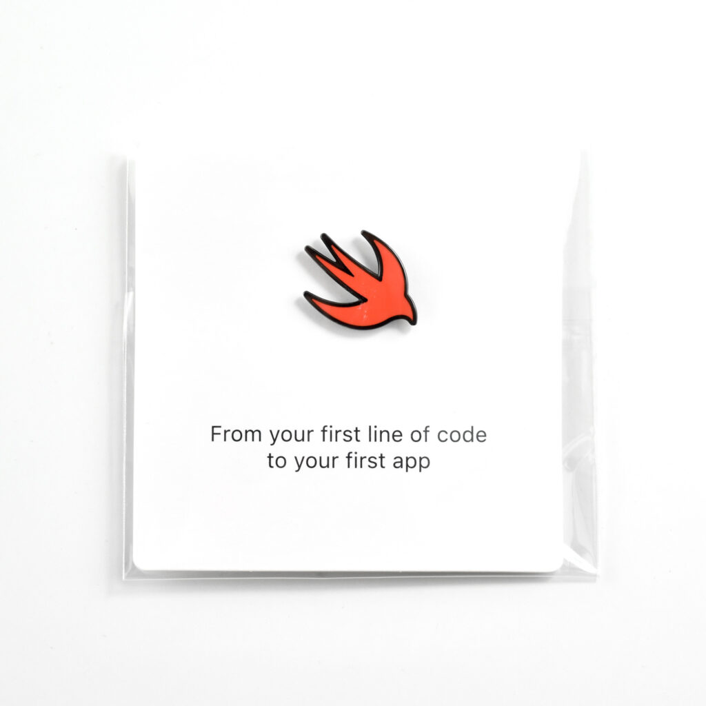
Swift magnetic lapel pin (2022)

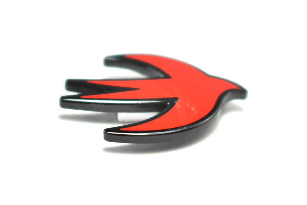
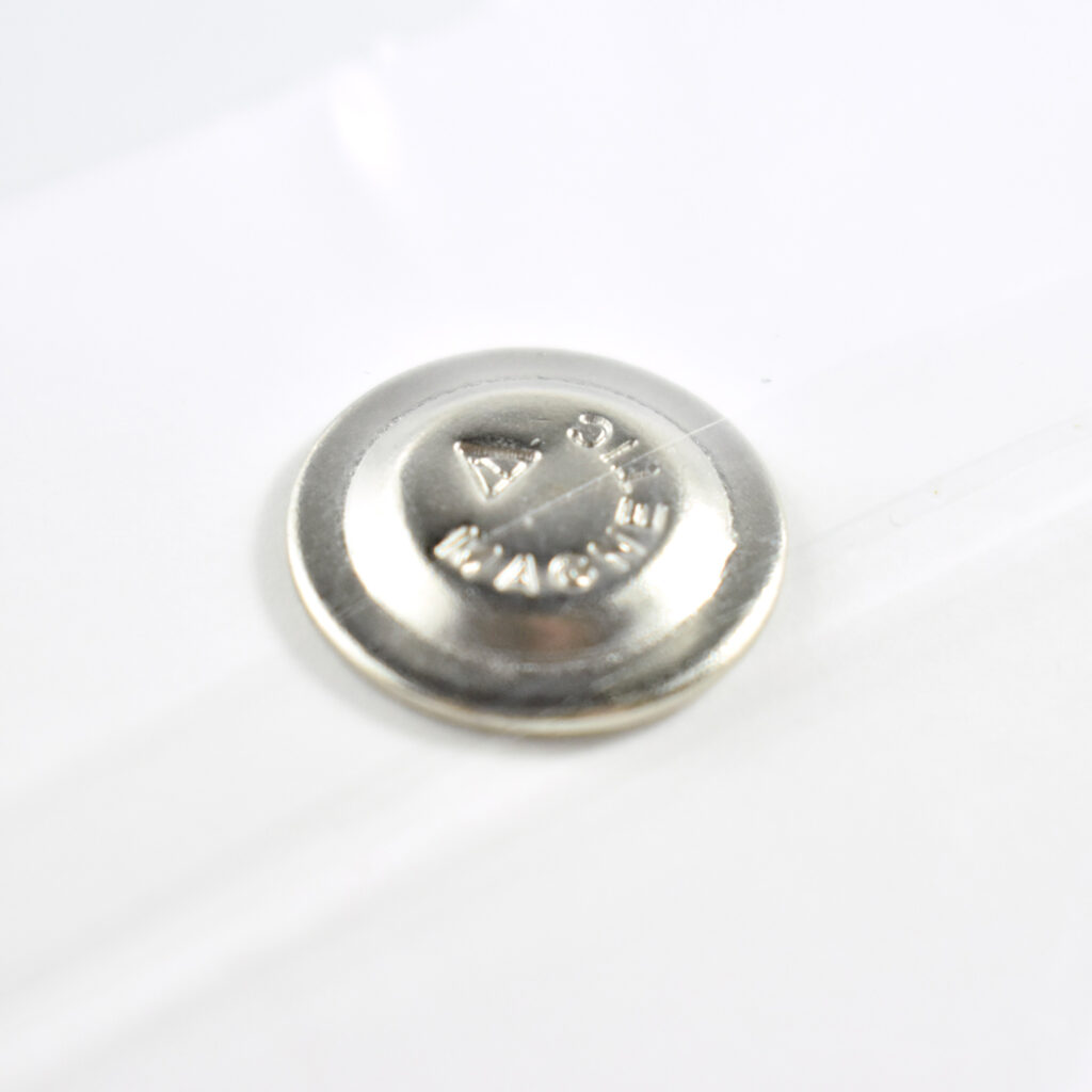
This magnetic lapel “pin” features the Swift programming logo in bright red on a black metal background. Although it looks like a lapel pin, it uses a strong magnet, instead of a pin, to attach.

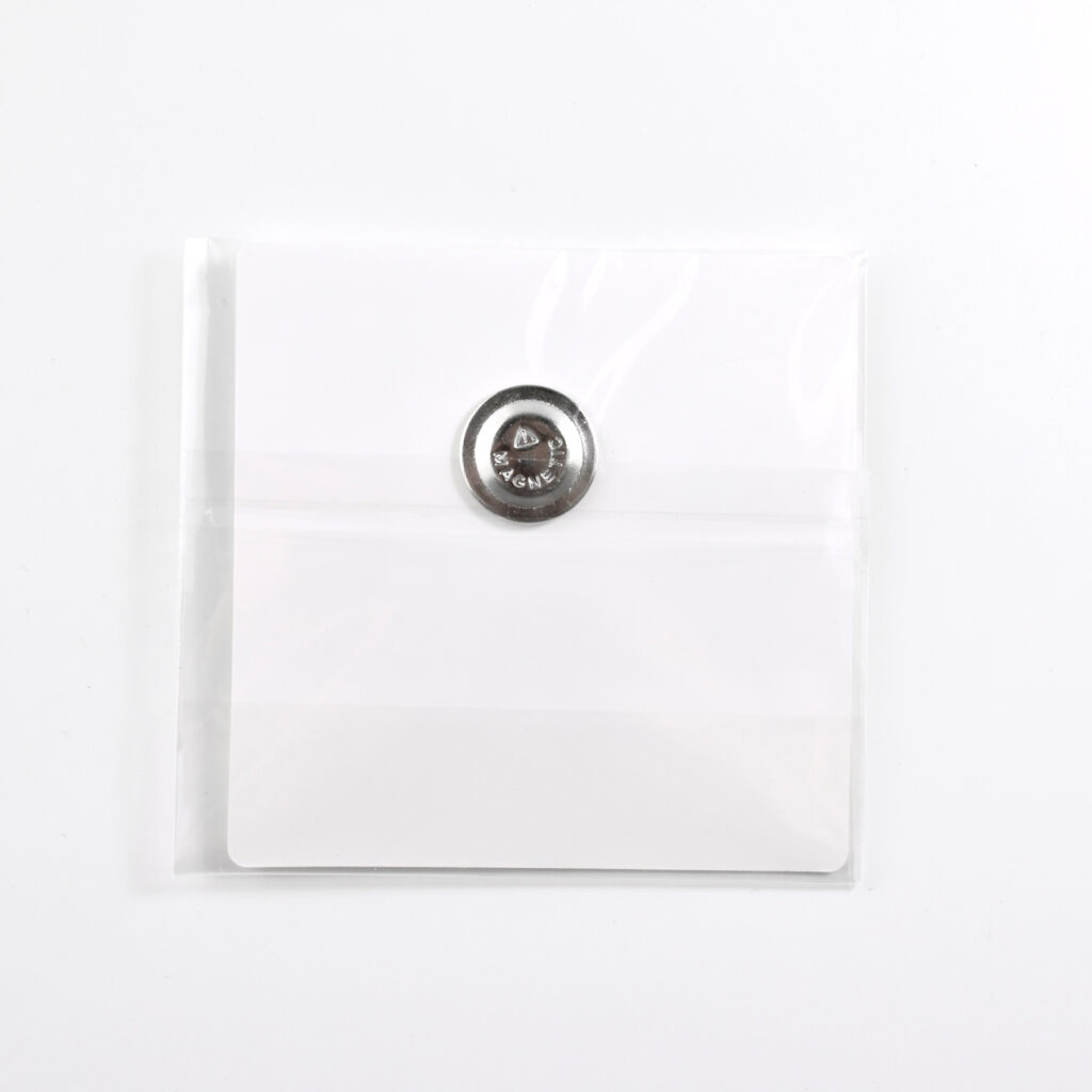
The pin measures 24x17mm and is on a 3-inch white cardboard square in a clear plastic pouch.

Apple describes Swift as “The powerful programming language that’s also easy to learn.” In addition, “Swift is a powerful and intuitive programming language for all Apple platforms. It’s easy to get started using Swift, with a concise-yet-expressive syntax and modern features you’ll love. Swift code is safe by design and produces software that runs lightning-fast.”
This pin was distributed at an Apple Education event that discussed different uses of Swift programming in K–12 school programs.

Source: Apple

Posts pagination

Page 1 Page 2 … Page 13 Next page

Keywords

  • 44mm
  • 45mm
  • 2003
  • 2005
  • 2007
  • 2020
  • 2021
  • 2022
  • 2023
  • aluminum
  • Apple Watch
  • band
  • black
  • blue
  • case
  • CD
  • CD-ROM
  • collectible
  • education
  • Fitted
  • hook-and-loop
  • iMac
  • iPad
  • iPhone
  • iPod
  • jb
  • leather
  • logo
  • Macintosh
  • magnet
  • nylon
  • packaging
  • pen
  • silicone
  • Size 12
  • Solo Loop
  • Sport Loop
  • stainless steel
  • t-shirt
  • ultracomfortable
  • unopened
  • USB
  • watch
  • white
  • Wi-Fi
Proudly powered by WordPress