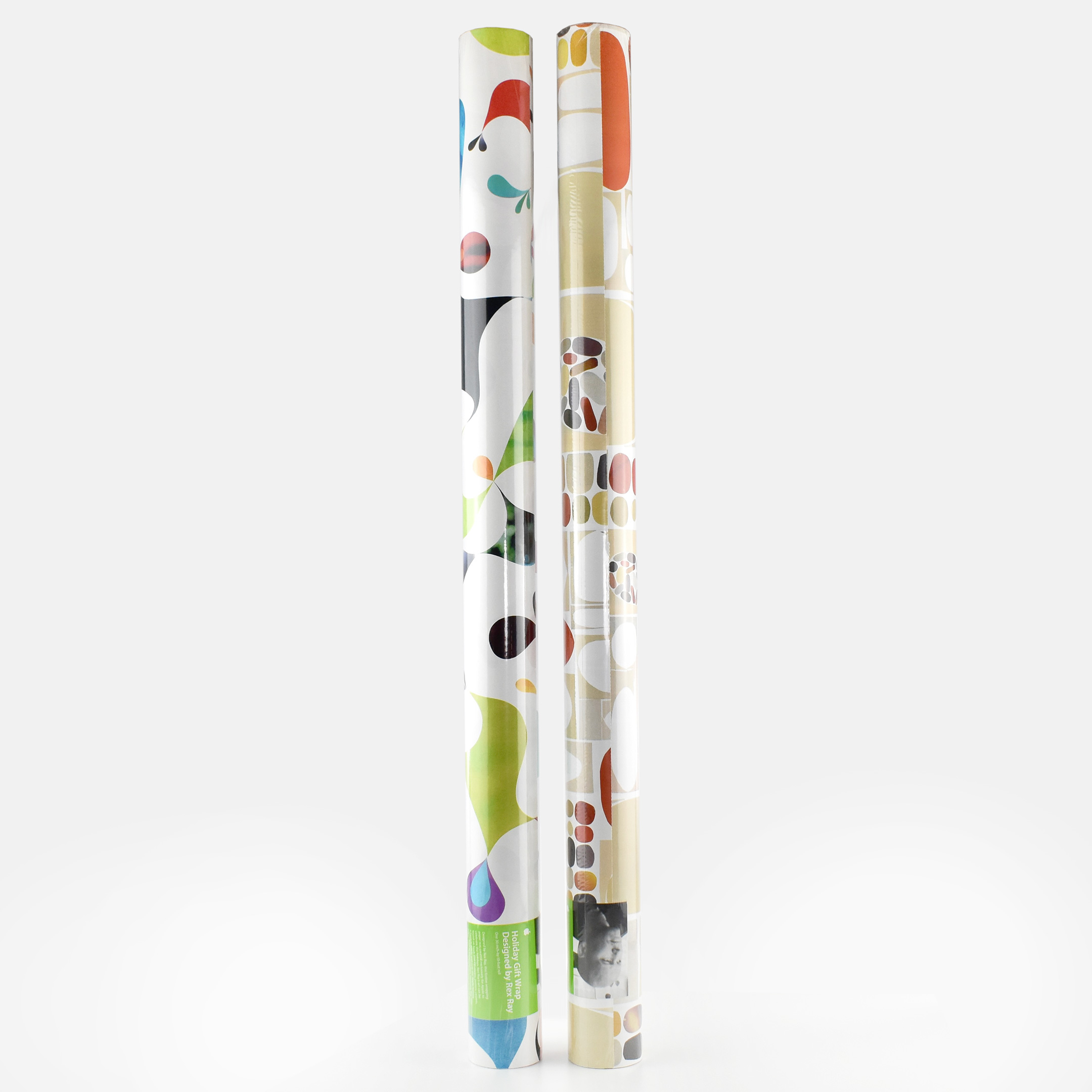
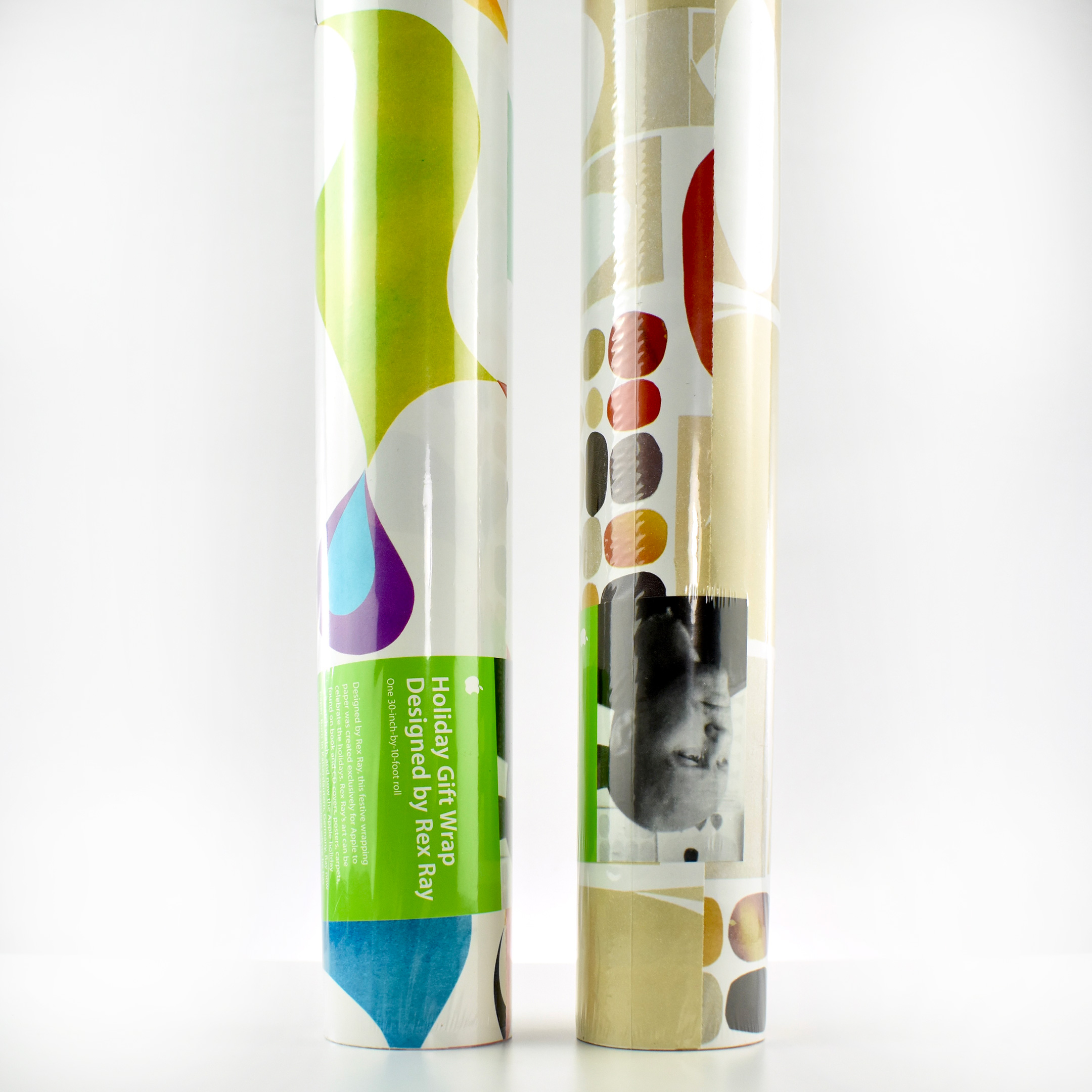
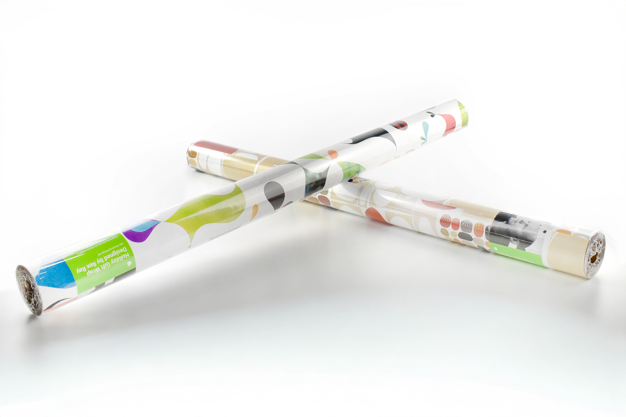
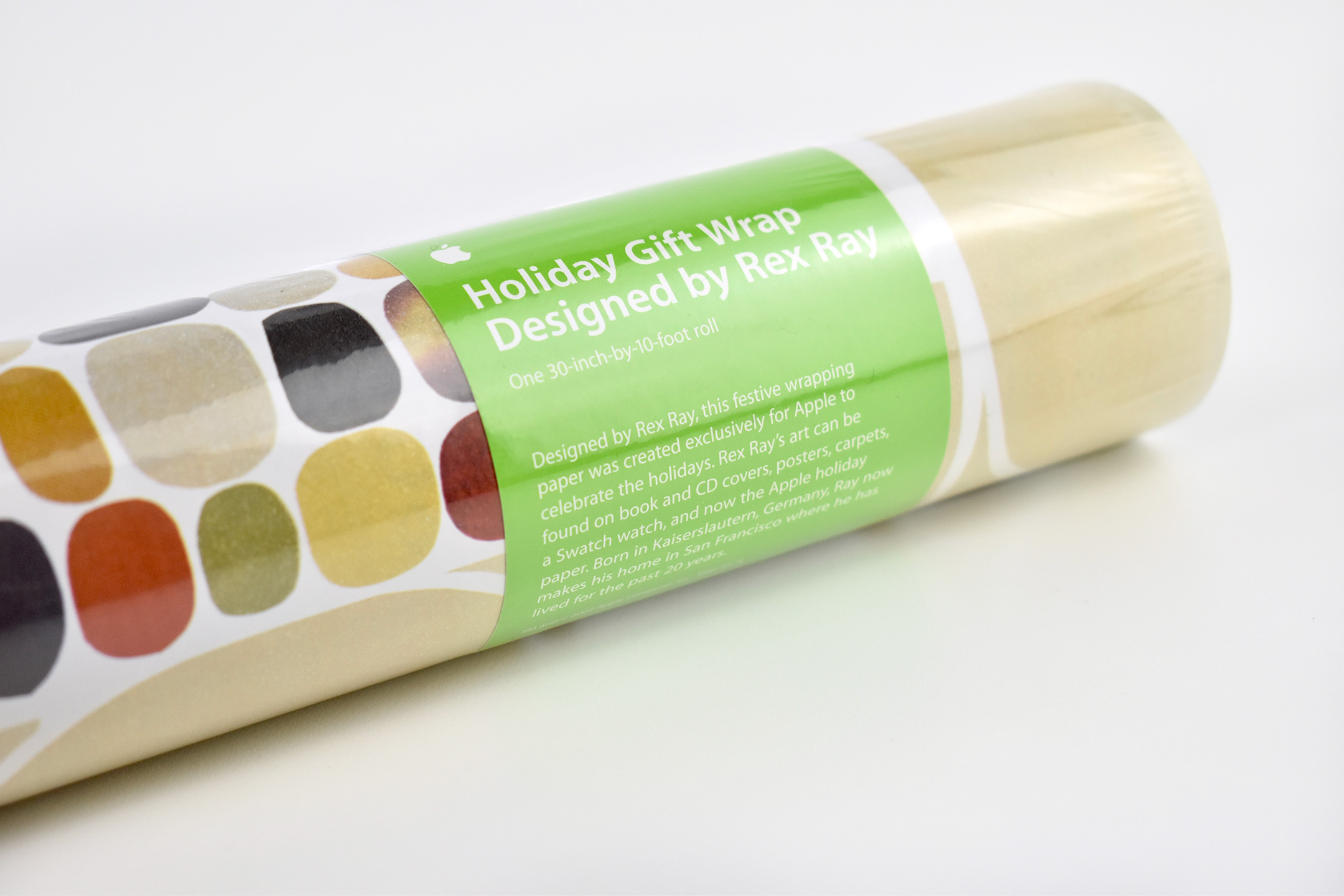
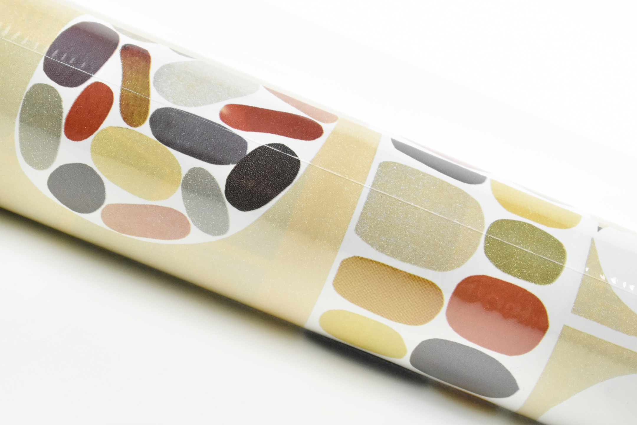
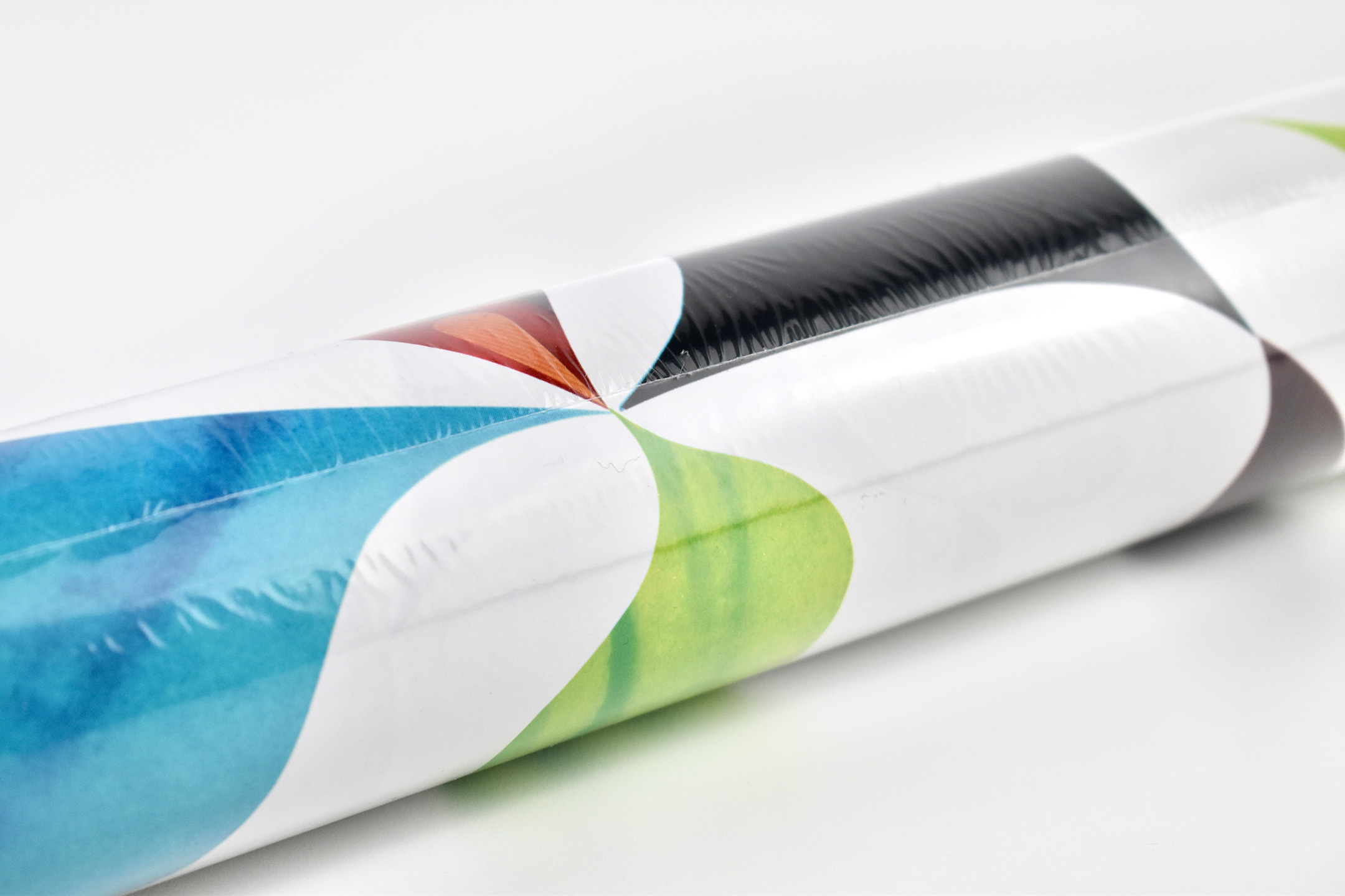
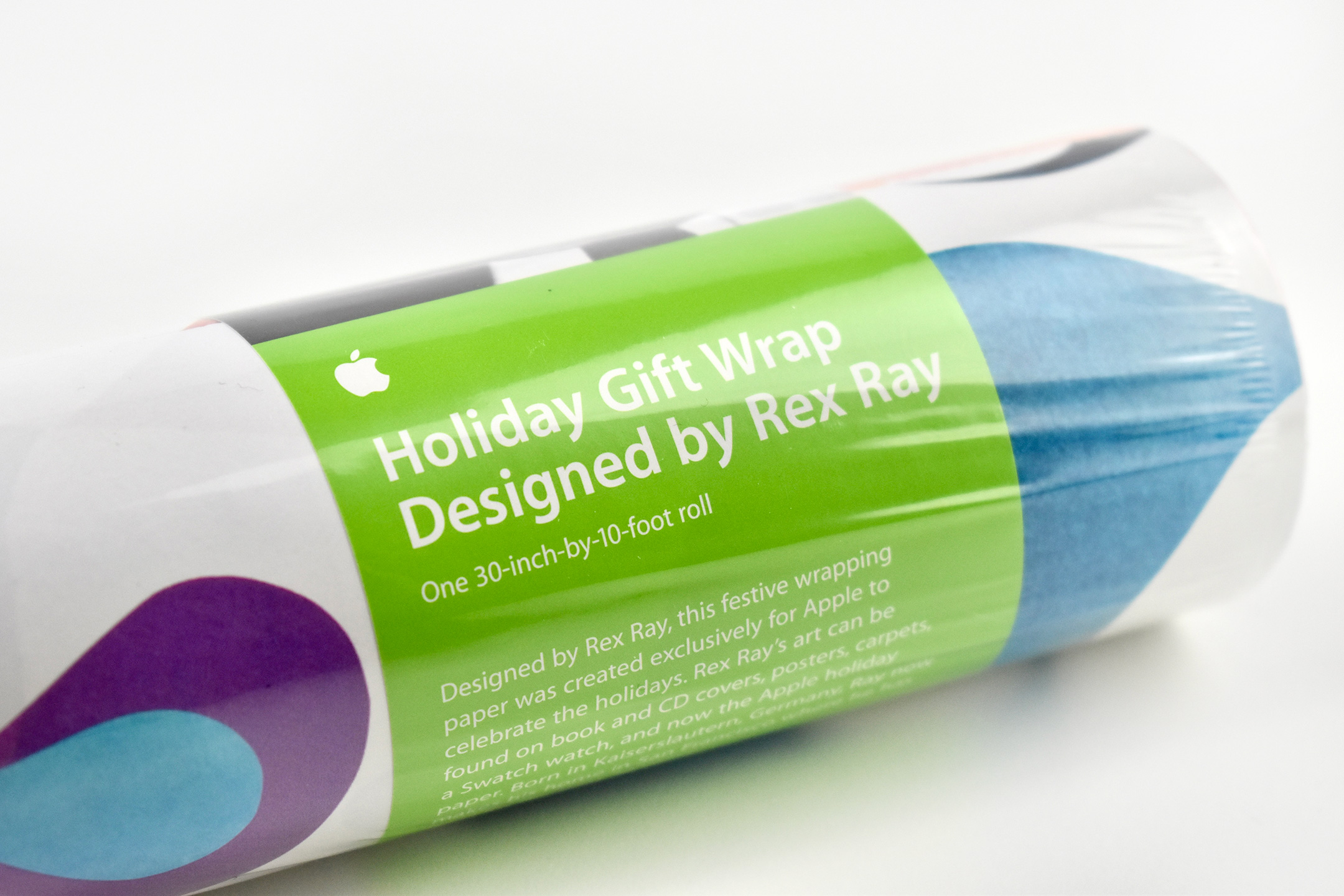
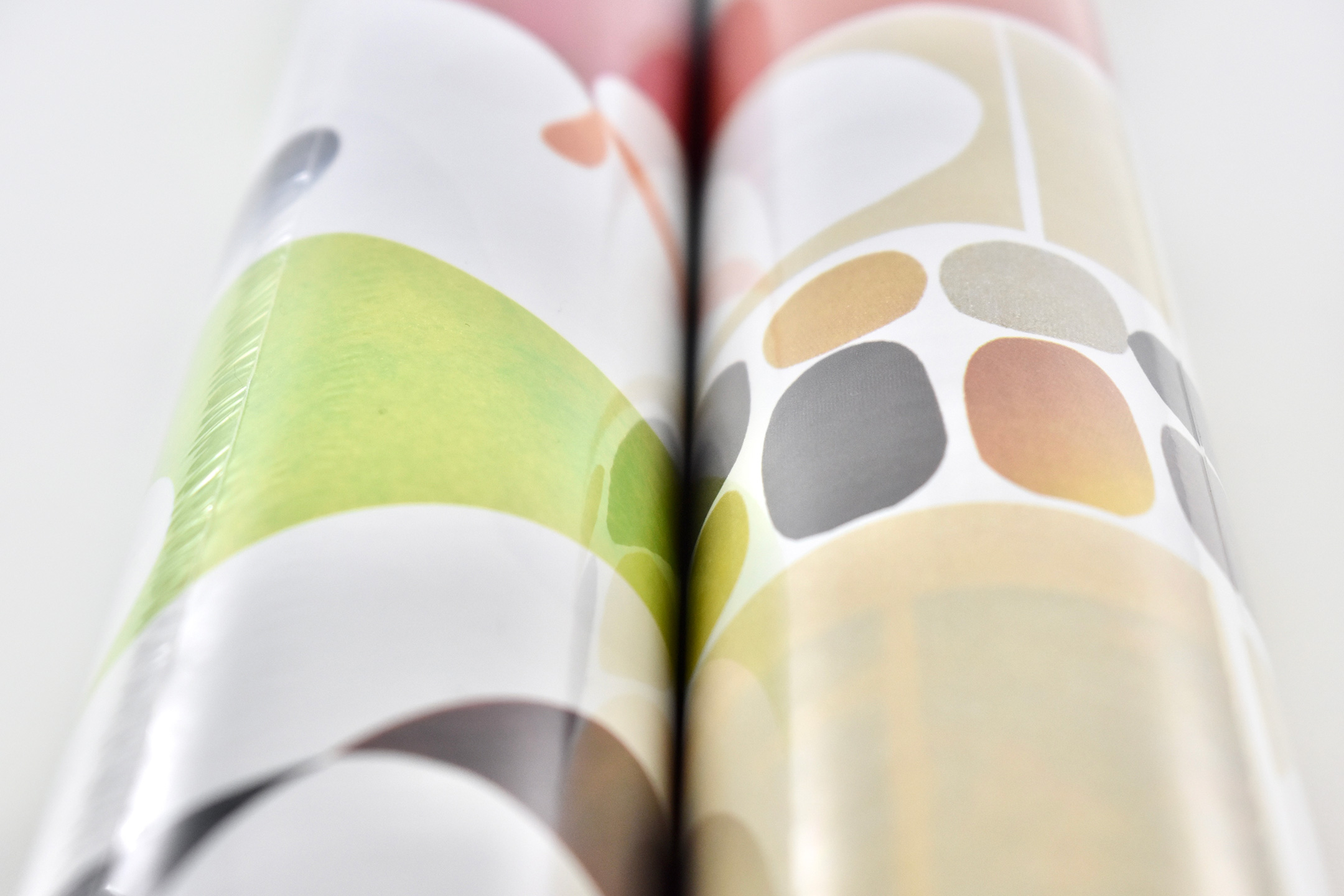
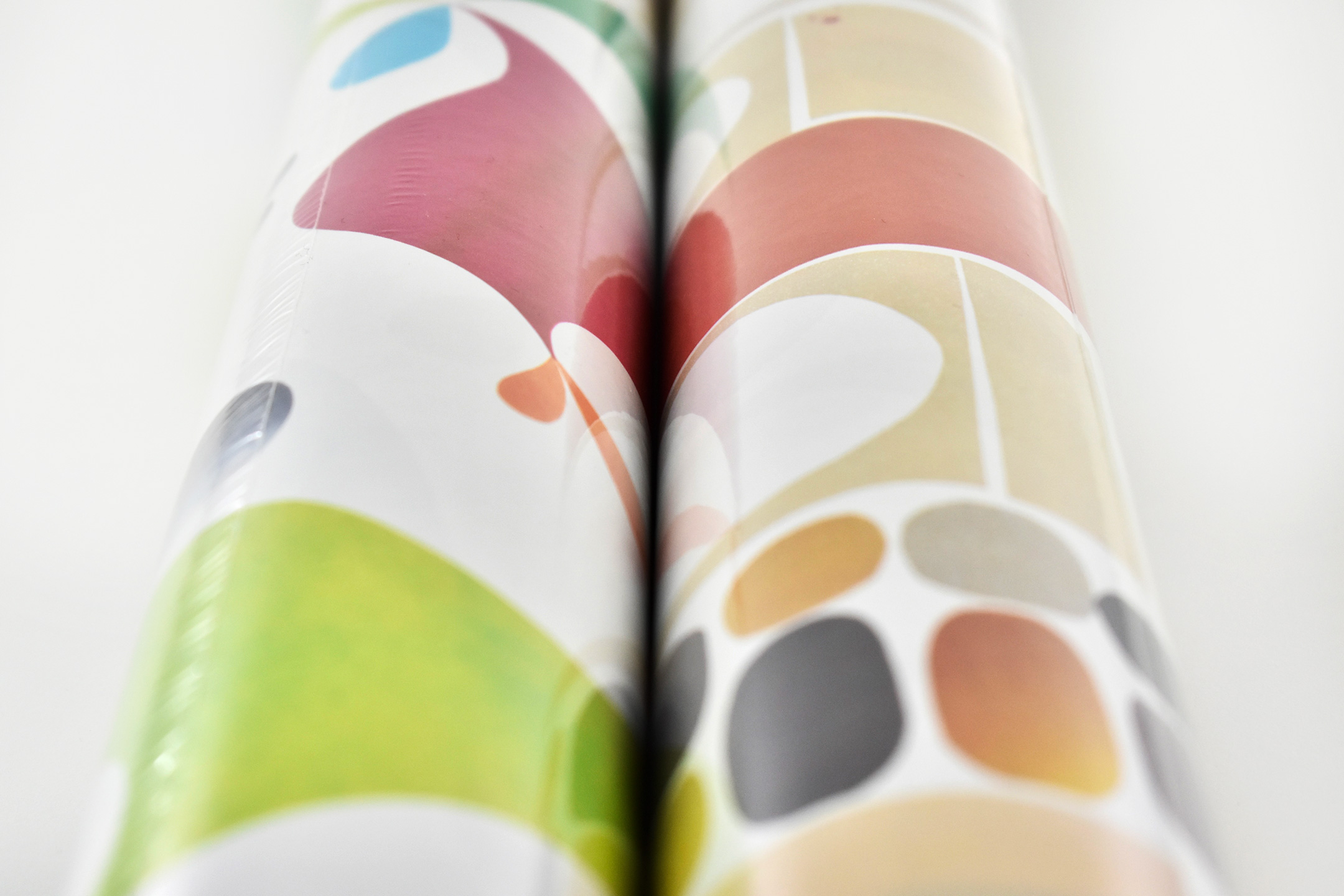
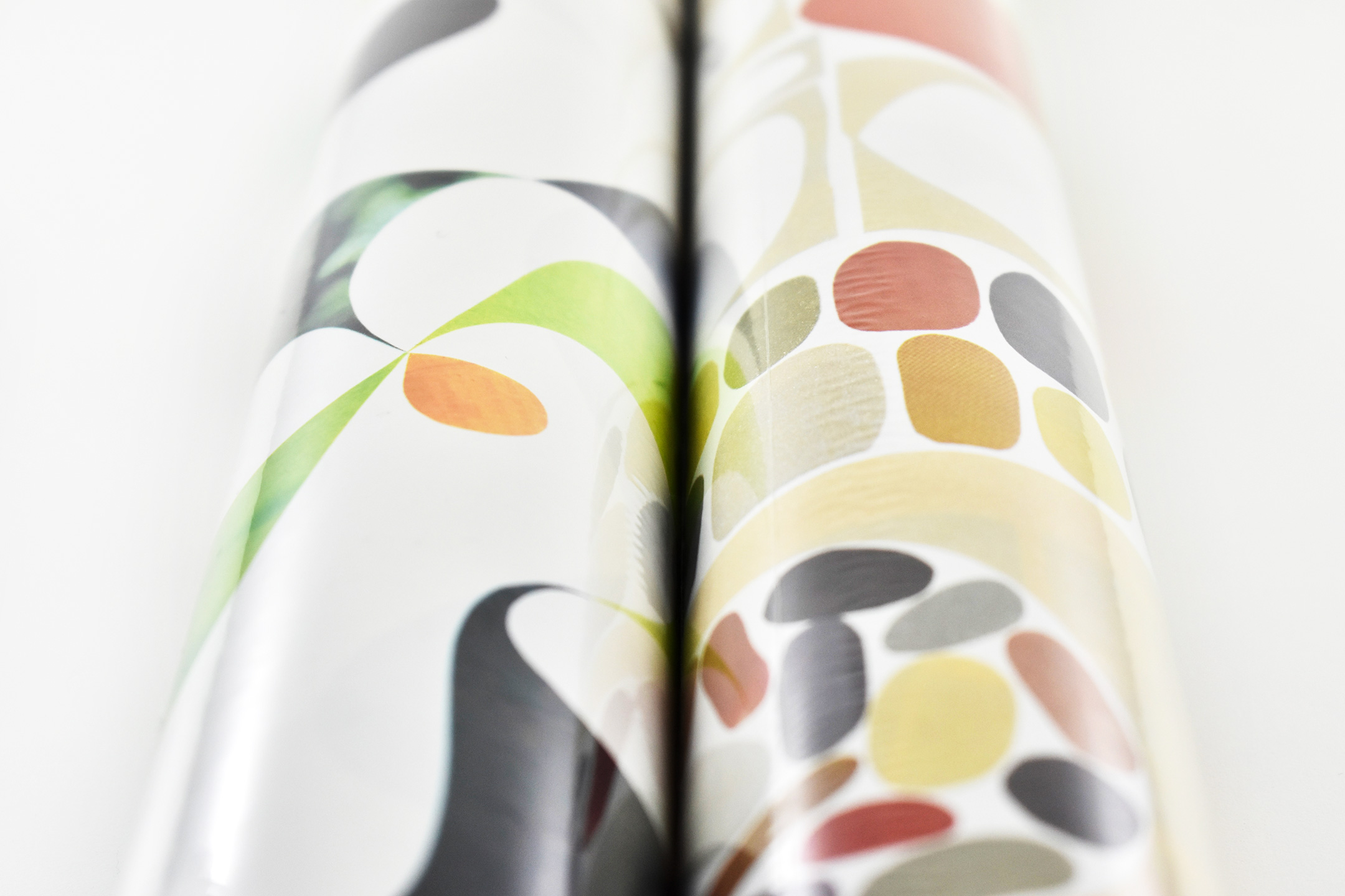
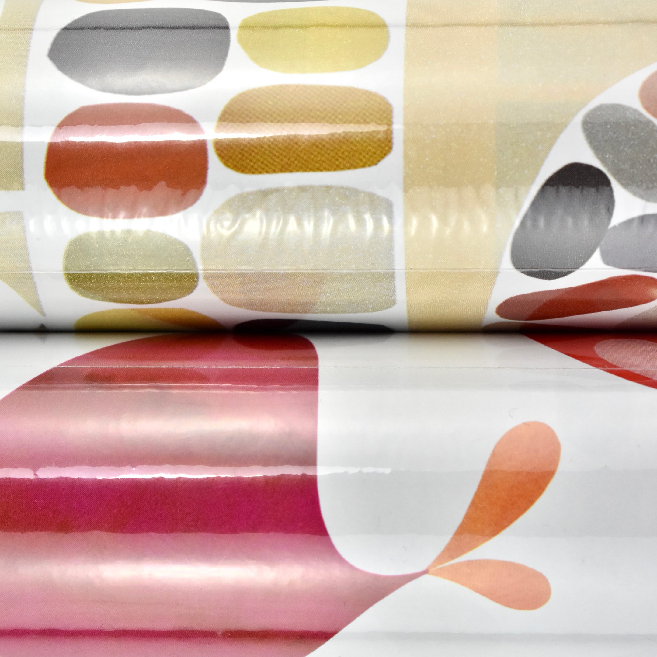
These two gift wrap designs were created for Apple by artist Rex Ray, born September 11, 1956, and died February 9, 2015. He was an “American artist best known for his innovative pop aesthetic in fine and commercial art—on canvases, wood panels, album covers, paper, book jackets, murals, and rock and roll posters.”
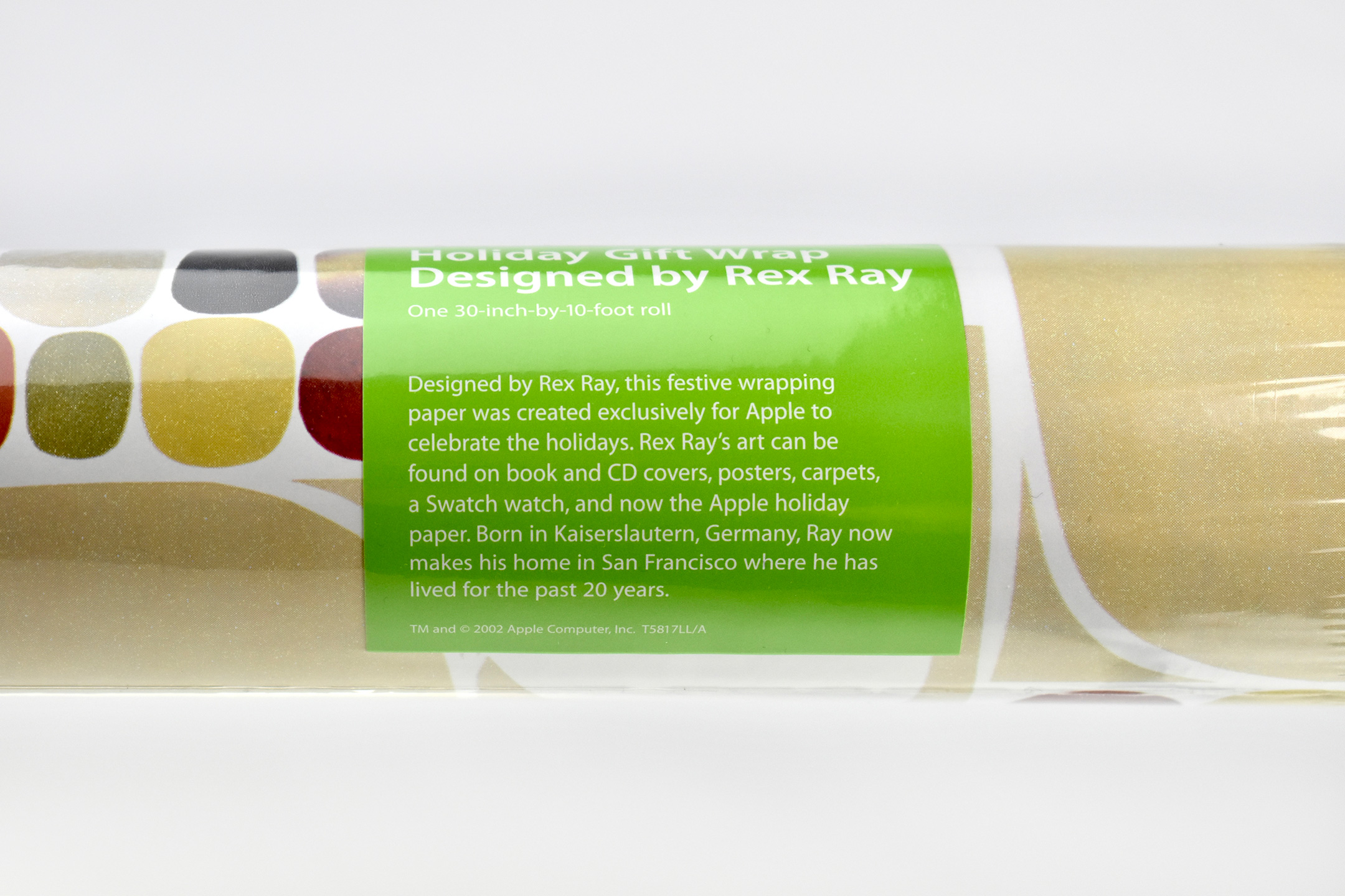
The label on the rolls of gift wrap were bright green with white text in the Apple Myriad font and matched Apple’s product packaging at the time. The label included a black-and-white headshot of Rex Ray, and the product description:
“Designed by Rex Ray, this festive wrapping paper was created exclusively for Apple to celebrate the holidays. Rex Ray’s art can be found on book and CD covers, posters, carpets, a Swatch watch, and now the Apple holiday paper. Born in Kaiserslautern, Germany, Ray now makes his home in San Francisco where he has lived for the past 20 years.”
Although the two designs are not named, the beige/brown design has the product number T5817LL/A, and the bright colored design has the product number T5818LL/A.
As a collector, I had no idea this product existed until it appeared on a local Facebook Marketplace post. I had to research it to make sure it was an actual Apple product and found it not only to be legitimate, but Apple had also made a magnetic poetry set with the beige/brown border design the same year (that I also found and acquired on eBay).
The woman from whom I purchased the gift wrap told me she had purchased all the rolls in stock at an Apple Store in 2002 (presumably Woodfield Mall in Schaumburg, IL—the only Apple Store in the Chicago area at the time). We negotiated a price, and I purchased all of 29 rolls she had.
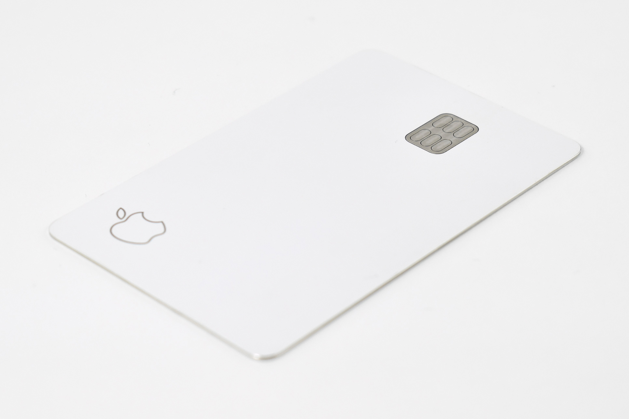
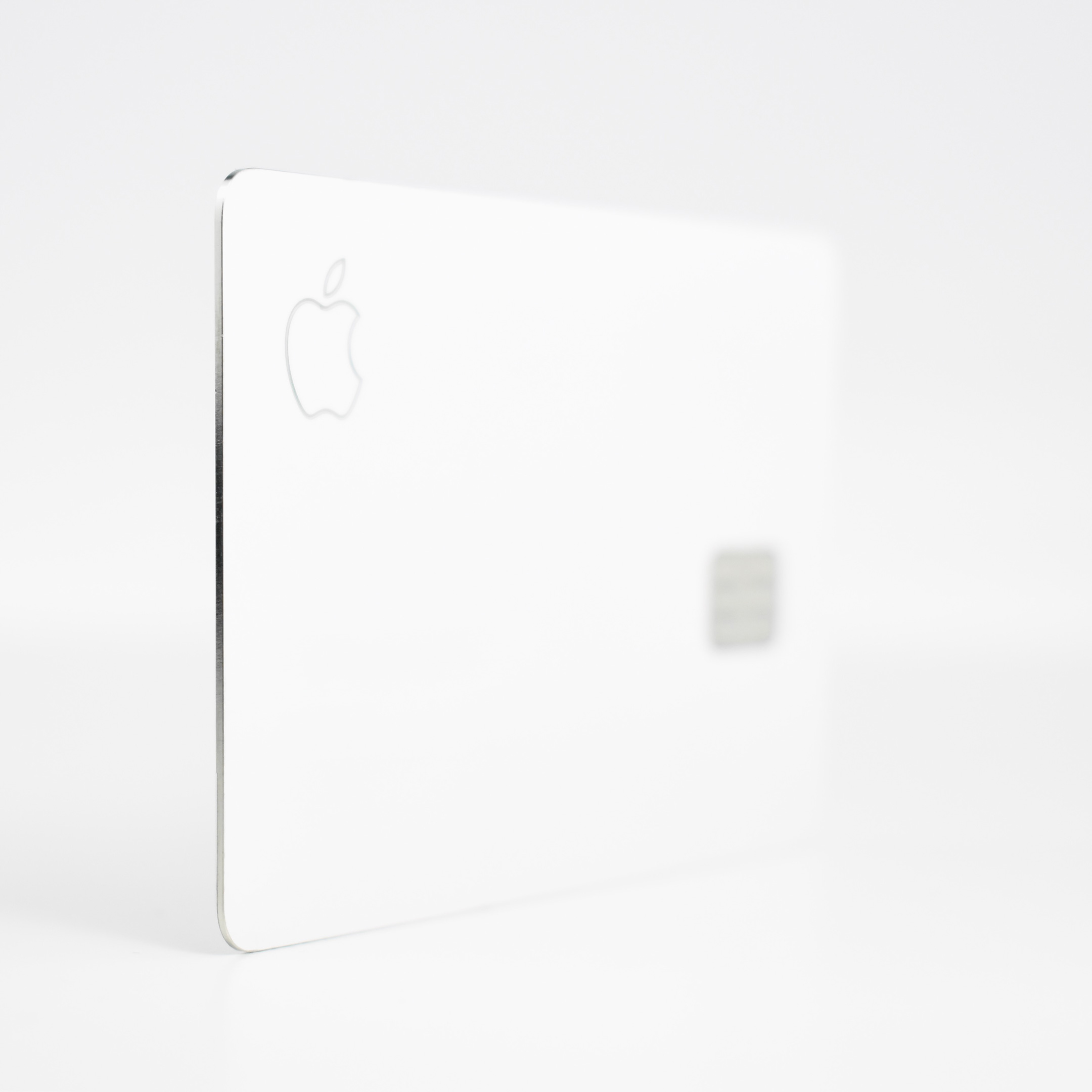
The Apple Card was a Mastercard credit card created by Apple and issued by Goldman Sachs. The Apple Card was designed primarily to be used with Apple Pay on an Apple device (e.g., iPhone, iPad, Apple Watch, Mac), but also included a physical credit card made of Titanium. The Apple Card was only available in the United States and reportedly had 12 million cardholders as of 2024.
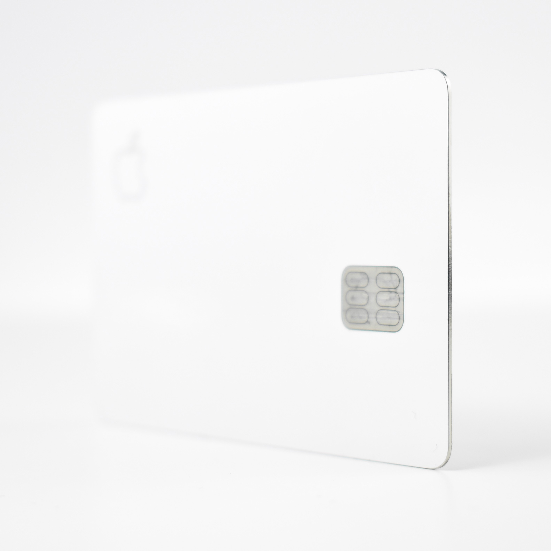
This [expired] physical Apple card is made of titanium and could be used at locations where Apple Pay payments were not accepted. The logos and cardholder name on the card were laser-etched. The card does not have a card number, CVV security code, expiration date, or signature. Apple described the card:
“With laser etching and clean styling, Apple Card is designed with the same craftsmanship we bring to all our products. And it’s the only credit card made of titanium—a sustainable metal known for its beauty and durability. When you use the card, you’ll get 1% Daily Cash back on every purchase. Since Mastercard is our global payment network, you can use it all over the world. For apps and websites that don’t take Apple Pay yet, just enter the virtual card number stored securely in your Wallet app.”
These features are part of Apple’s philosophy of security. Apple explains:
“With advanced security technologies like Face ID, Touch ID, and unique transaction codes, Apple Card with Apple Pay is designed to make sure you’re the only one who can use it. The titanium card has no visible numbers. Not on the front. Not on the back. Which gives you an enhanced level of security. And your data isn’t sold to third parties for marketing or advertising.”
MacRumors offers a periodically updated Guide about the Apple Card that explains its features. The resource includes information such as:
If someone finds or steals your card, there’s no real way for them to use it, at least for online purchases.
There’s still a traditional magstripe on the back, along with a built-in chip. While the card number and CVV are not on the card itself, you can find them in the Wallet app if you need them.
The physical Apple Card does not support contactless payments itself — you need to use your iPhone for Apple Pay payments.
There is no cost for the card and there is no fee associated with replacing it if you lose it.
Monthly Apple Card statements are provided in the Wallet app. You can save a PDF of the statement from the Wallet app so that you can access it on other devices.
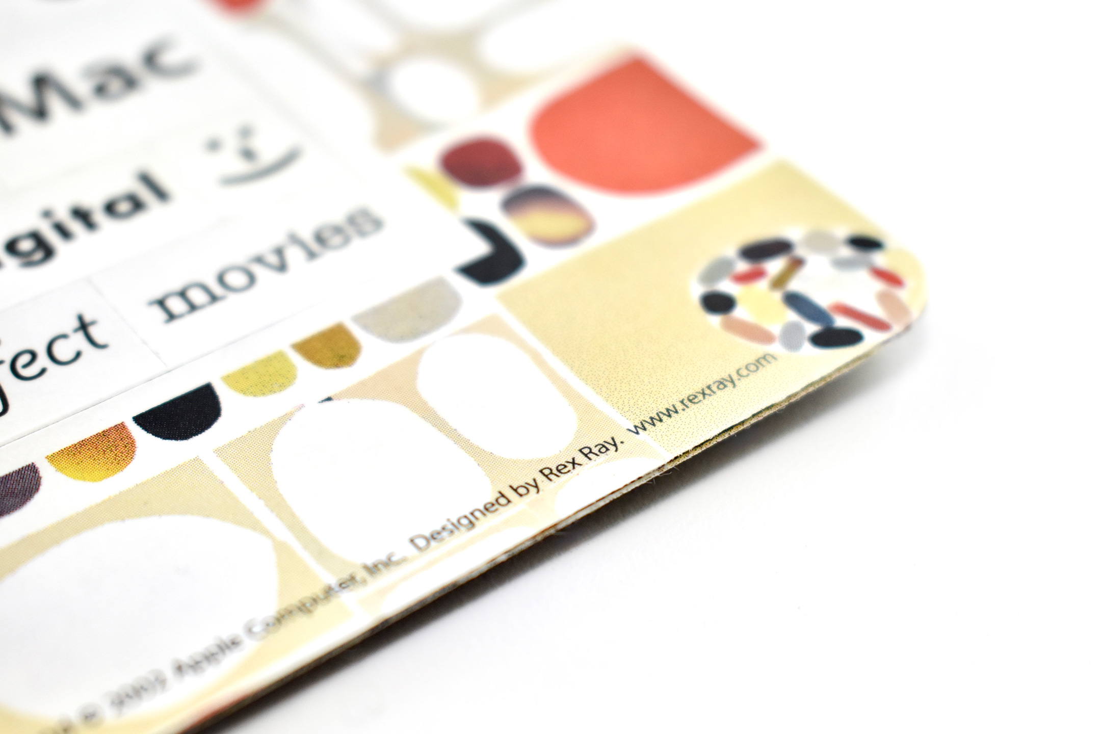
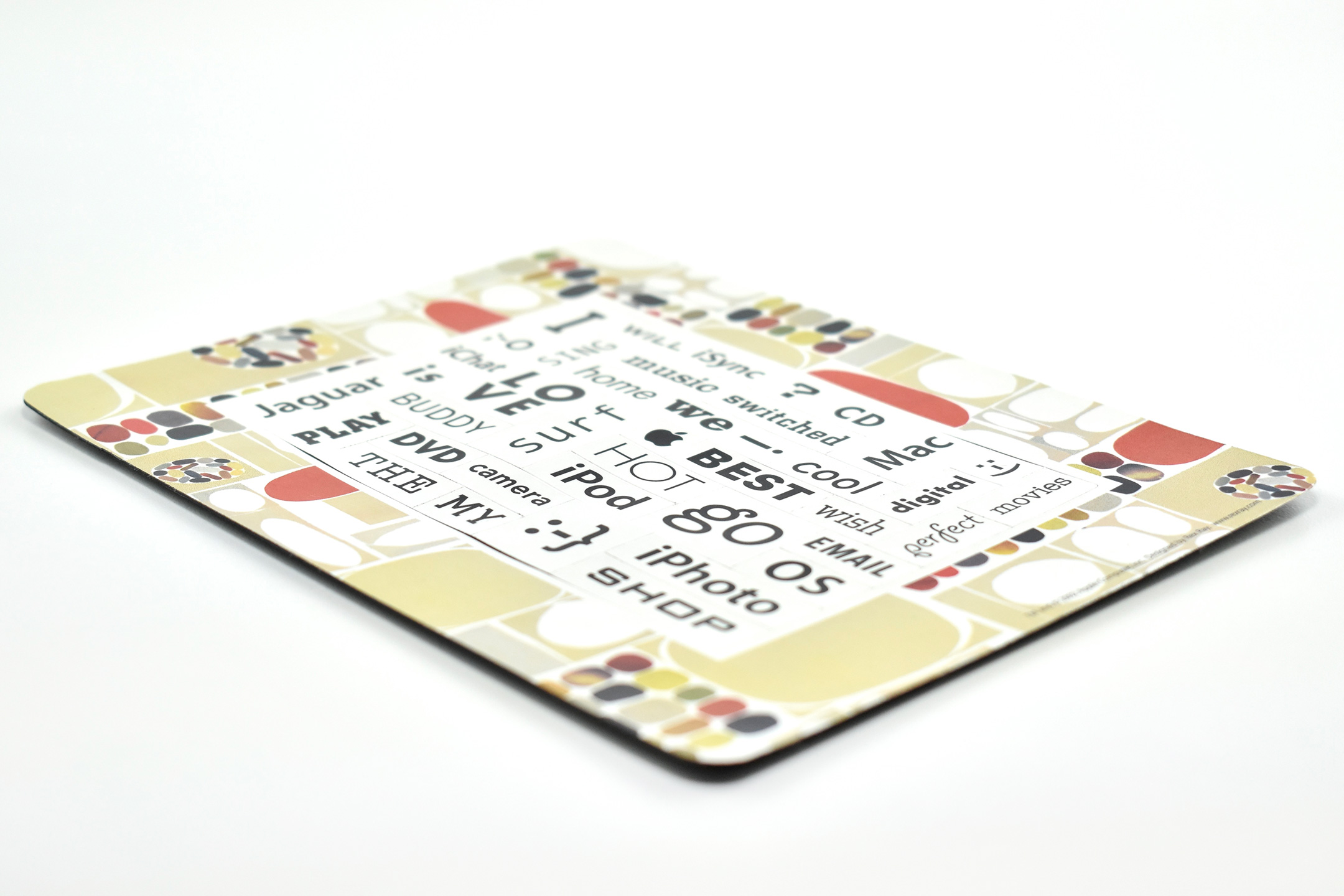
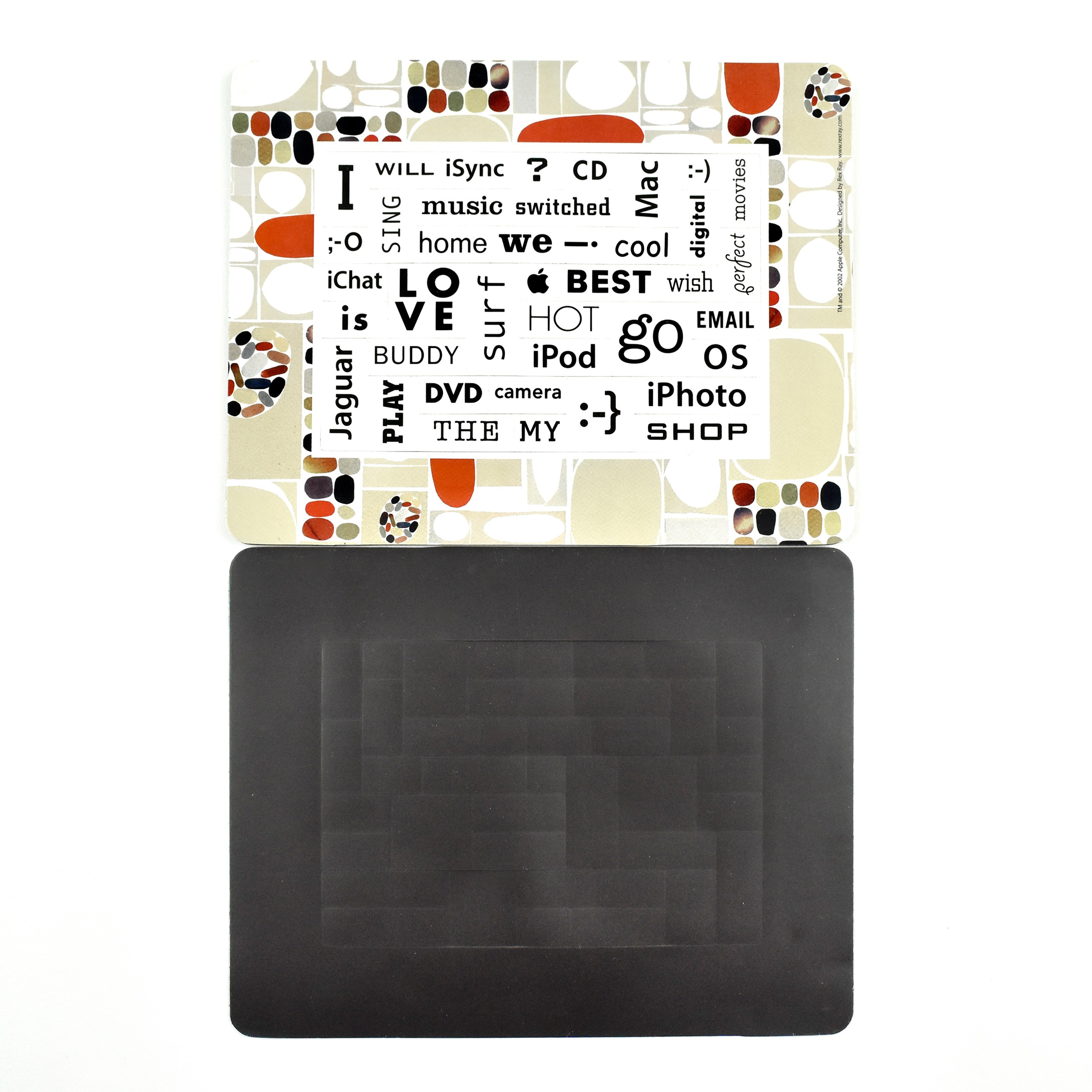
The border of this magnetic poetry set was designed by artist Rex Ray. Born September 11, 1956, and died February 9, 2015, Rex Ray was an “American artist best known for his innovative pop aesthetic in fine and commercial art—on canvases, wood panels, album covers, paper, book jackets, murals, and rock and roll posters.”
The border of this magnetic poetry set matches a design Ray created for Apple that was used for gift wrap, also available in 2002.
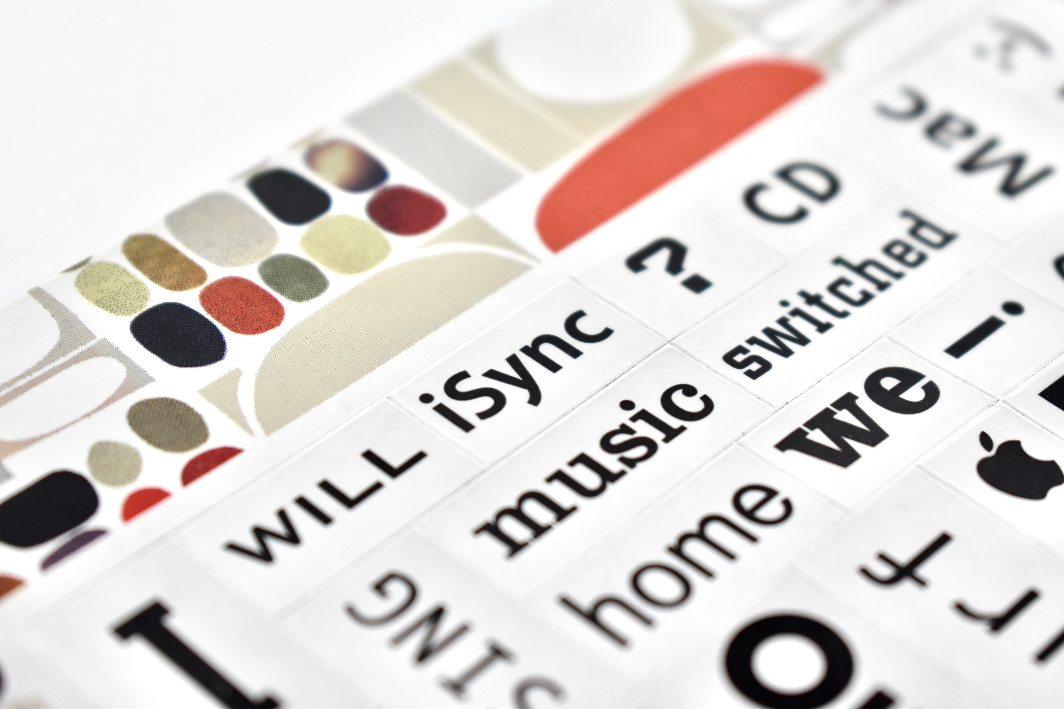
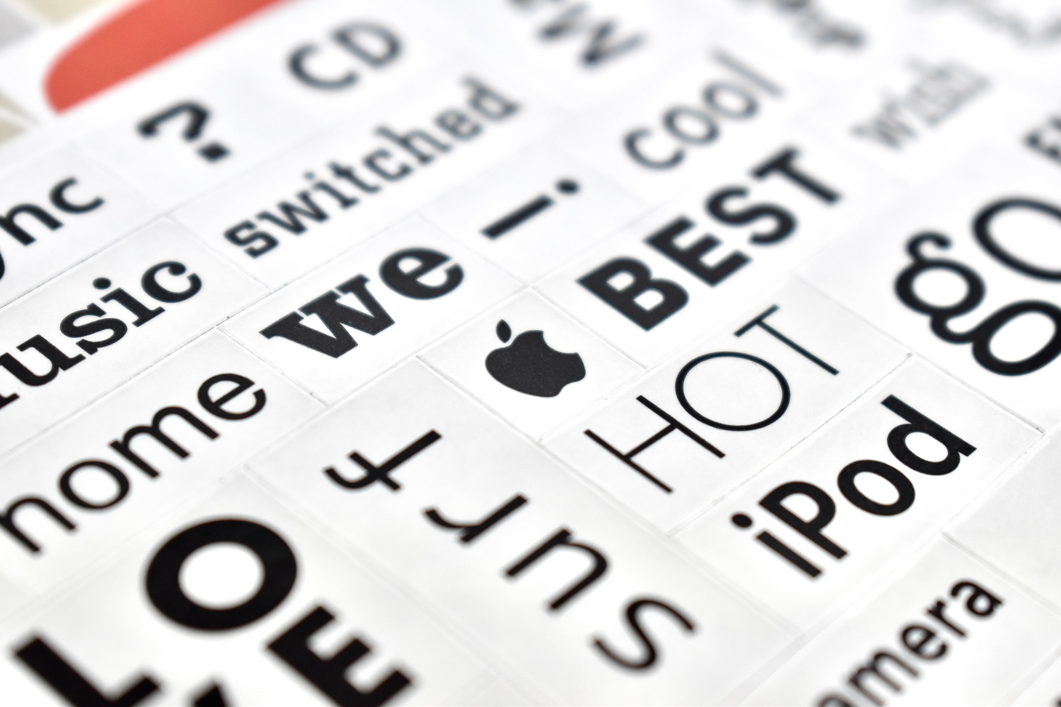
The inside of this magnetic poetry set was also used by Apple with a jaguar-skin border that was released along with Mac OS X version 10.2, “Jaguar.” The magnetic words are a combination of Apple products, words, punctuation-based emoji, and symbols. The complete list of poetry elements include (in alphabetical order):
The poetry magnet set measures 6.75 × 5.25 inches.
Interestingly, as of this writing in 2025, except for “Mac,” all other Apple products featured in this poetry set have been discontinued or are no longer in general use (iSync, iChat, iPod, iPhoto, Jaguar).
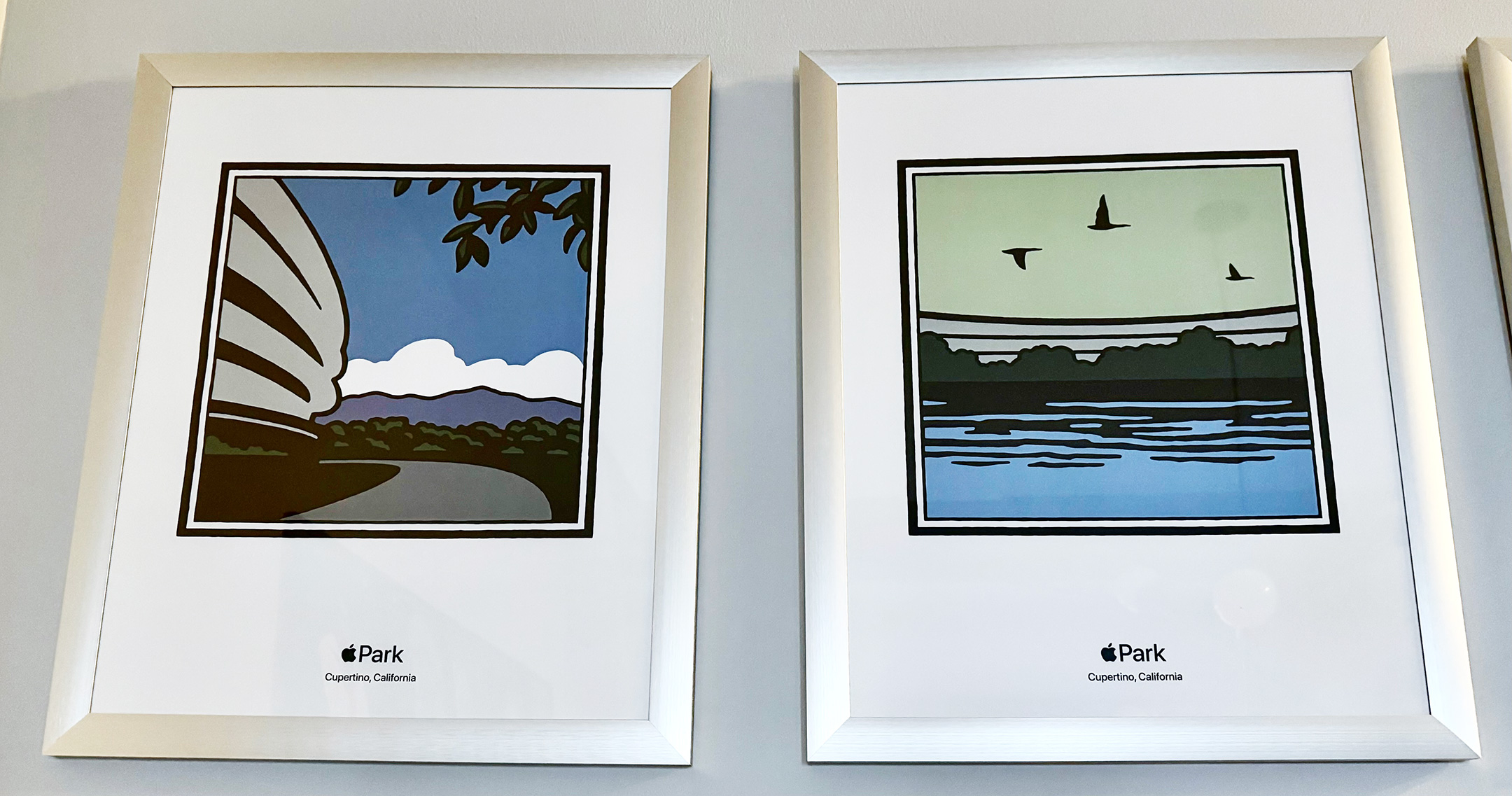
This set of posters was sold at the Apple Park Apple Park Visitor Center in 2022. The set includes four different designs by the graphic artist Michael Schwab. The posters were packaged in a white cardboard tube with a label that read, “Apple Park M. Schwab Poster Set (4pk) HP932LL/A.” Each poster measured 16 x 20 inches.
The designs included the following representations:
Apple Park office structure (a partial view)
Reflecting pool in the outdoor center of the Apple Park office structure with three birds flying above
Steve Jobs Theater at night with a crescent moon above
An apple tree, reminiscent of those growing in the outdoor center of the Apple Park office structure
This set is presented in the order that the posters were hanging in the Apple Park Visitor Center Apple Store. The poster designs were also available on white t-shirts (one design per shirt). In fact, when I first saw the posters in the Visitor Center Apple Store, it was not obvious to me that they were available for sale because they appeared to only show the details of the t-shirt design. An Apple employee let me know the posters were available.
According to Michael Schwab’s website, he was born in Oklahoma in 1952 and now lives and works in northern California. His biography states:
“From his studio in Marin County, he has established a national reputation as one of America’s leading graphic artists.
He has created national award-winning logos and posters for a remarkable list of prestigious clients, including Apple, Amtrak, The Golden Gate National Parks, Major League Baseball, Robert Mondavi, Muhammad Ali, Nike, Pebble Beach, Polo Ralph Lauren, Robert Redford, San Francisco Opera, Sundance, Sunset Books, and Wells Fargo, among others.
Having attended school in Texas, New York and California, Michael has a broad array of visual, cultural, and geographic references to which he regularly turns for ideas.
His work is easily recognized by his signature use of large, flat areas of color, dramatic perspectives and bold, graphic images of archetypal human forms.”
Please note, the photography style of this entry is very different from my typical posts because this set of posters hangs in my home. These photos were captured with iPhone 17 Pro in situ with inconsistent lighting, angles, and reflections.
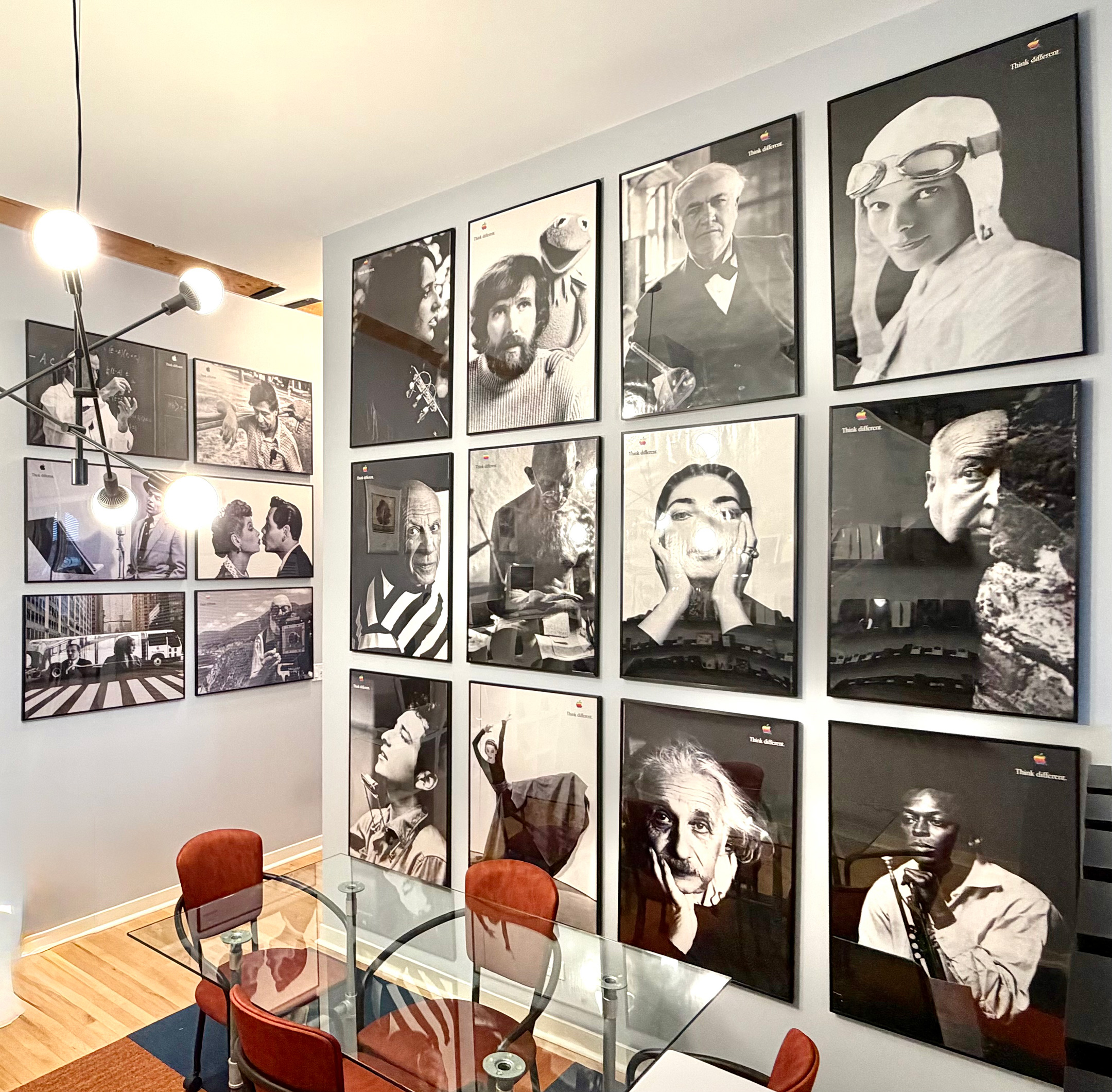
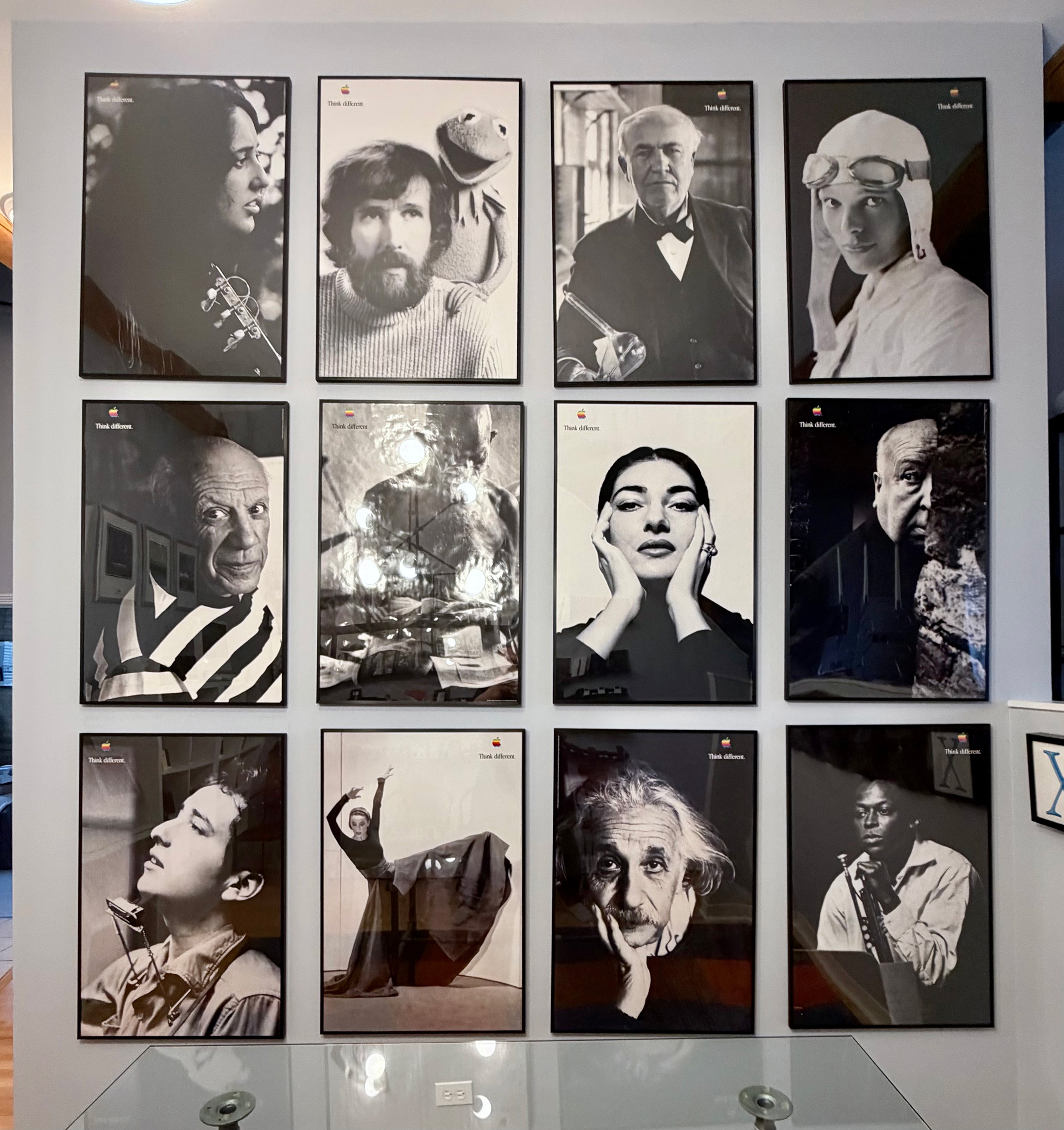
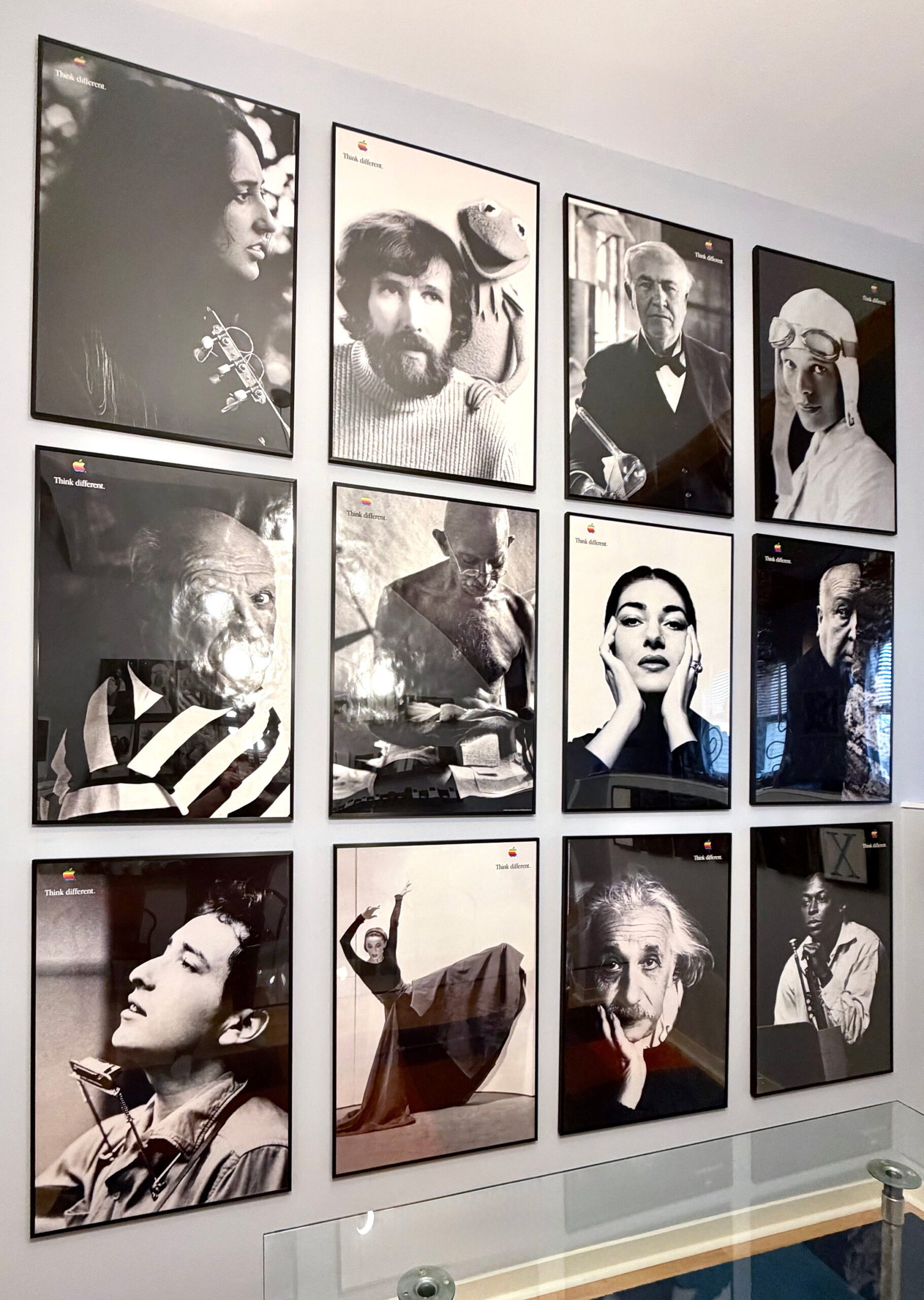
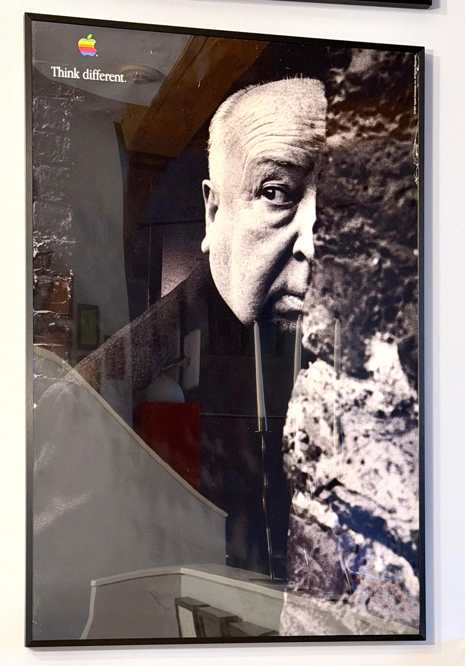
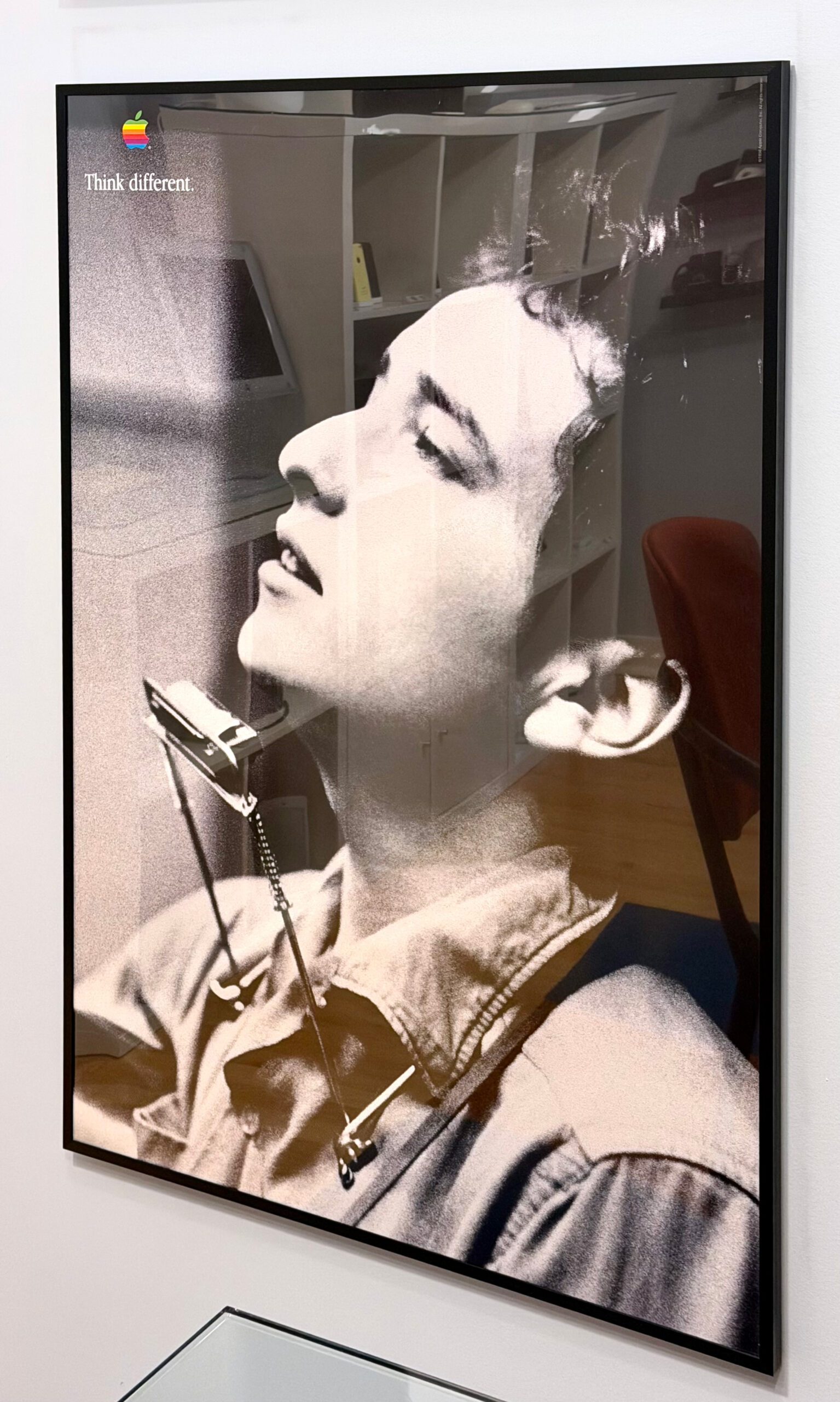
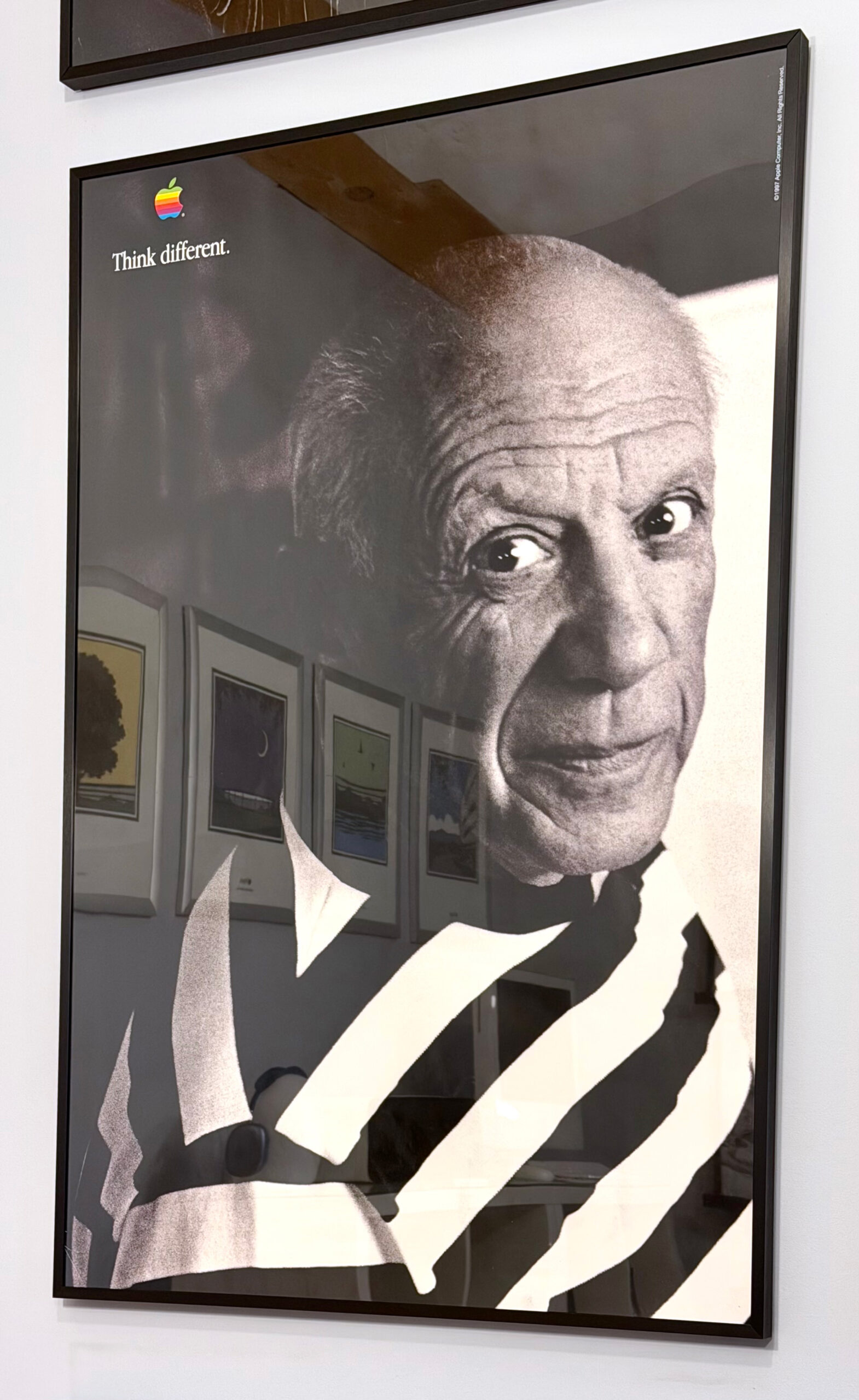
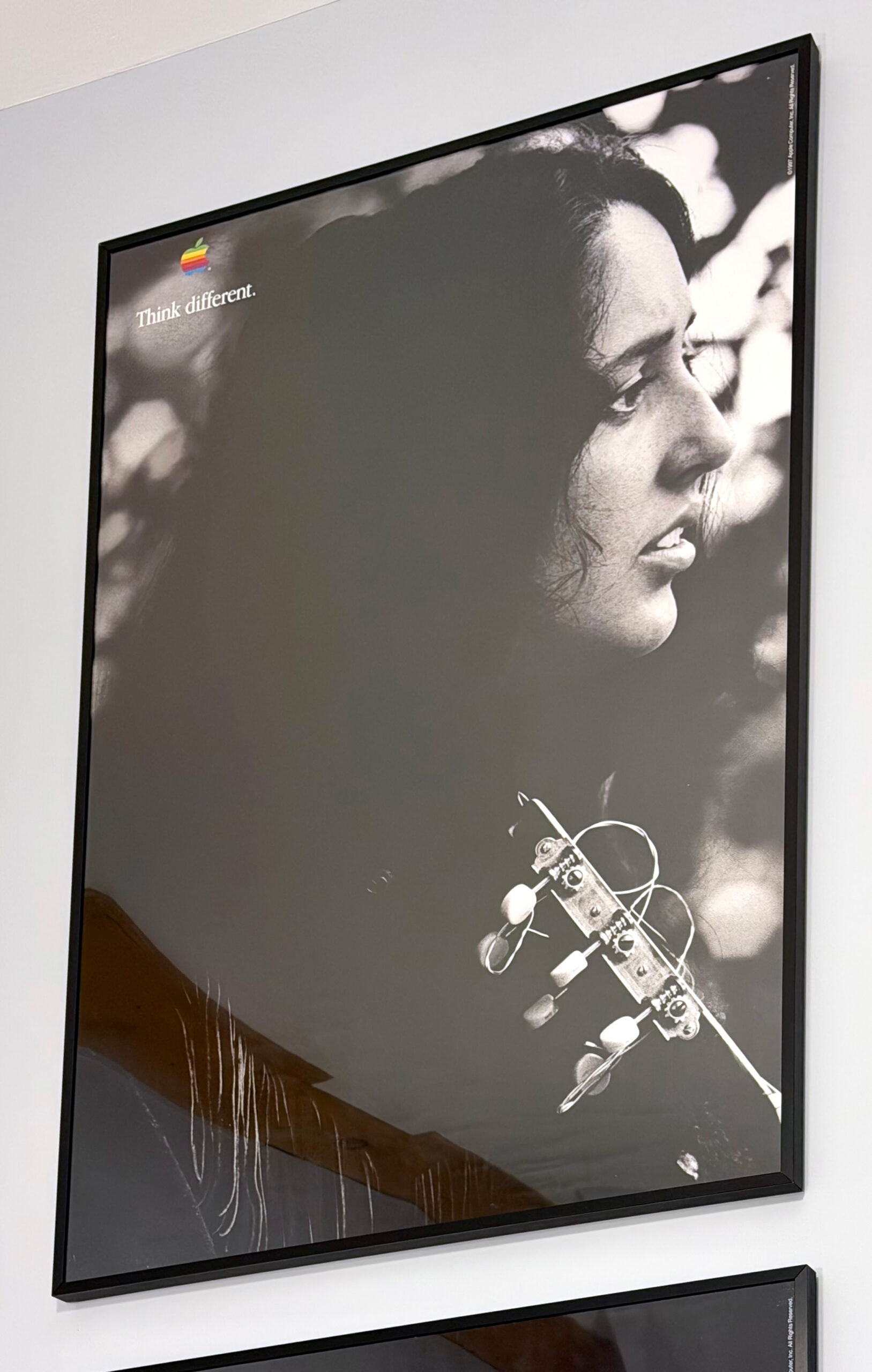
“Think different” was the slogan used by Apple in an advertising campaign during the years 1997–2002, and is still used in rare circumstances as of 2025. The Think different concept was created by advertising agency TBWA\Chiat\Day while working with Apple and Steve Jobs. Think different was first rolled out as a TV commercial and was followed by additional TV commercials, print/digital ads, and as part of Apple’s product packaging.
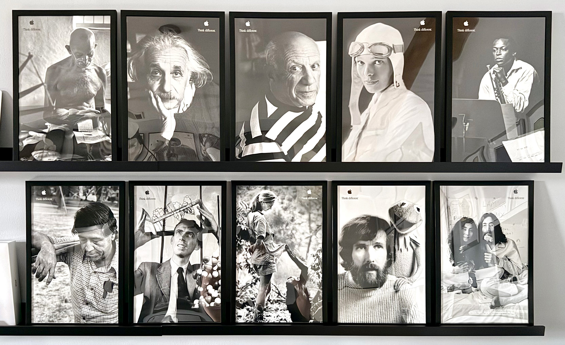
Posters in this set include:
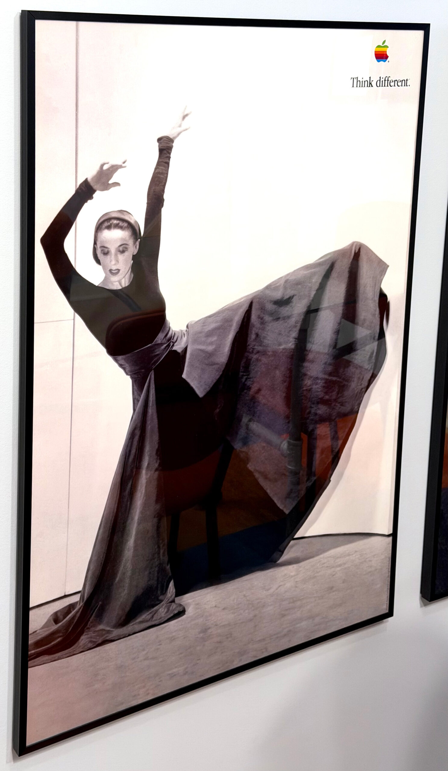
Joan Baez (24 x 36 inches, 1997). From poster set 2.
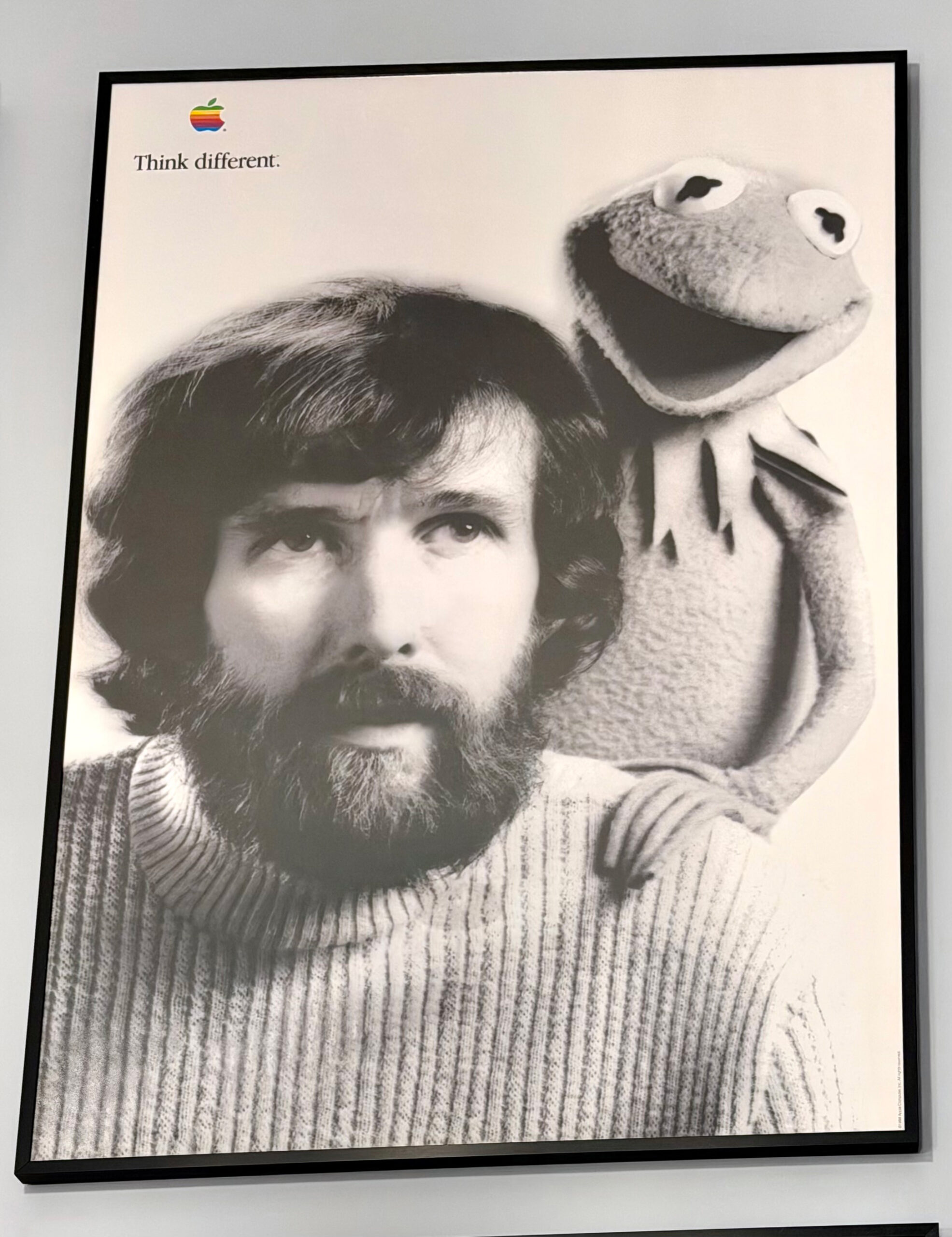
Jim Henson with Kermit the Frog (24 x 36 inches, 1998). From poster set 3.
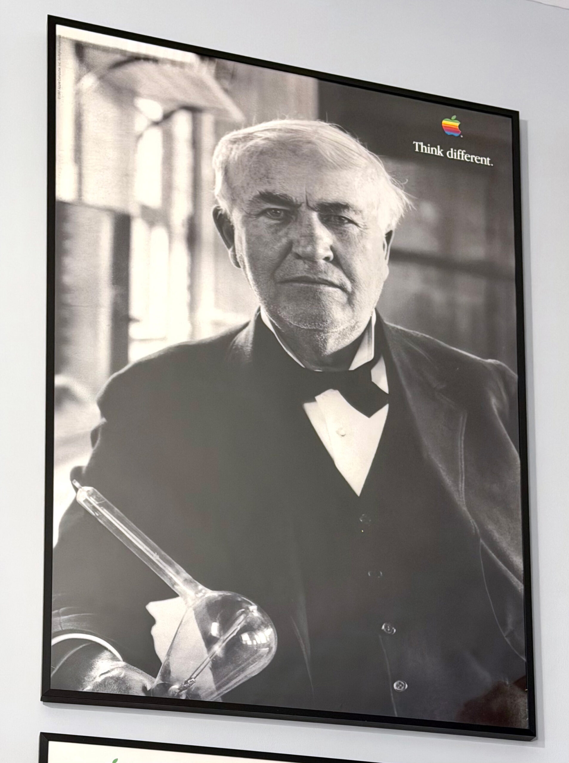
Thomas Edison (24 x 36 inches, 1997). From poster set 1.
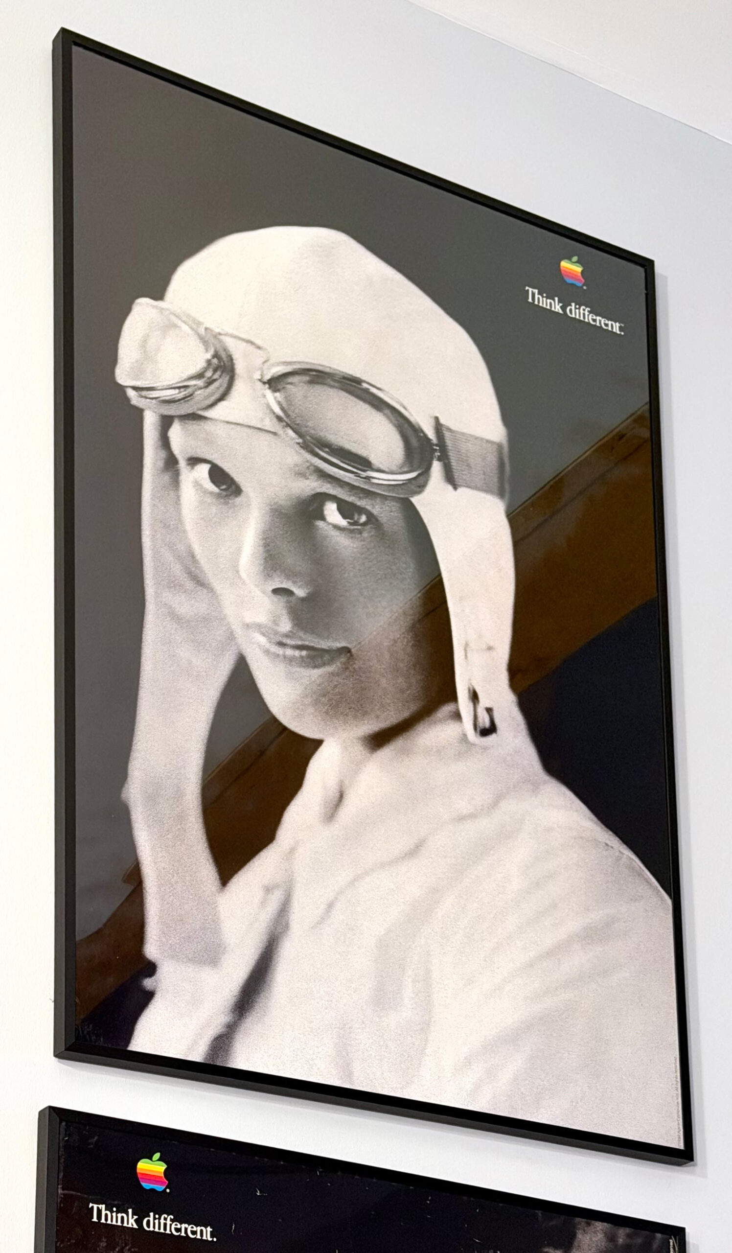
Amelia Earhart (24 x 36 inches, 1998). From poster set 1.
Picasso [side facing] (24 x 36 inches, 1997). From poster set 1.
Gandhi (24 x 36 inches, 1997). From poster set 1.
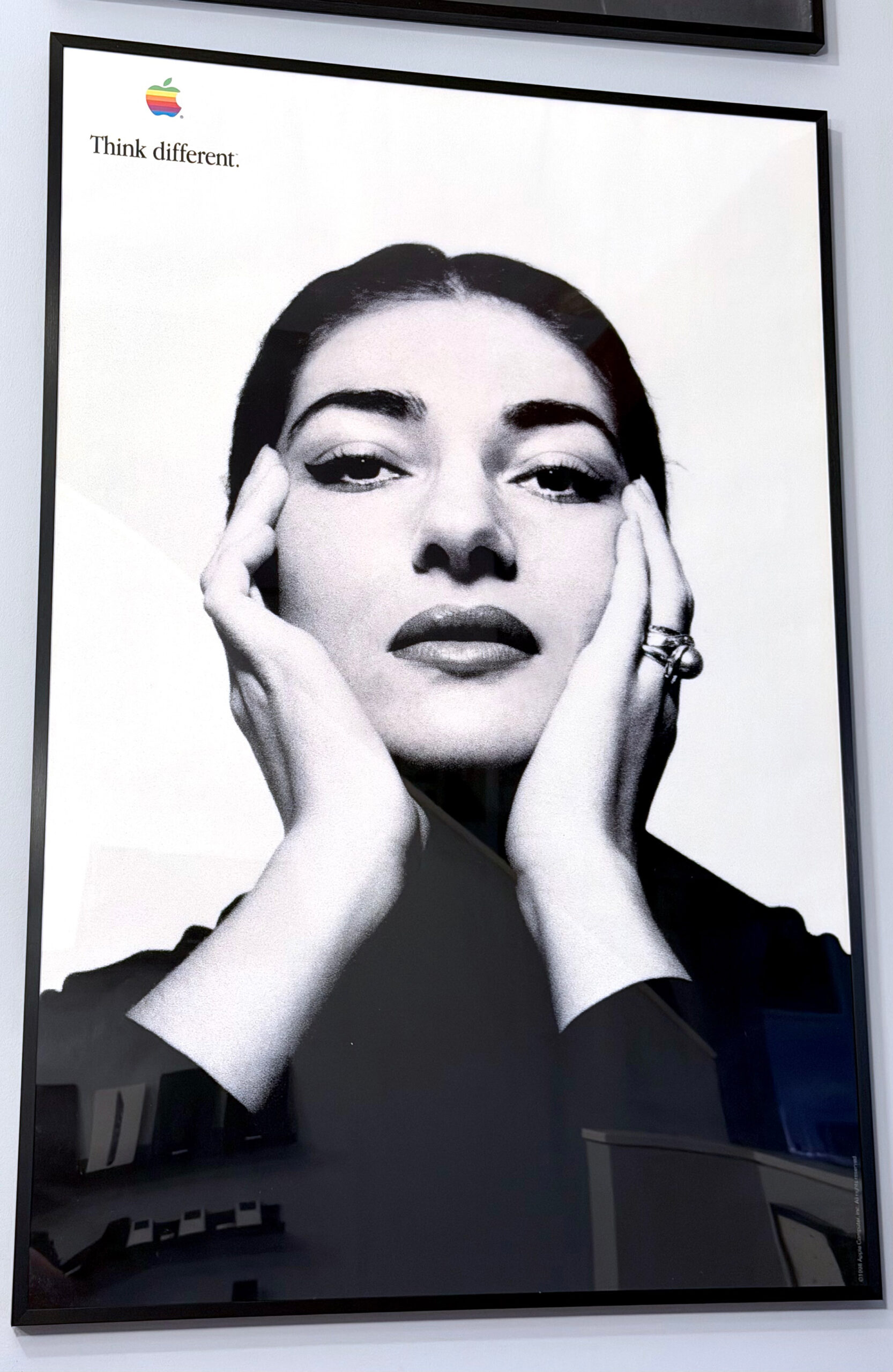
Maria Callas (24 x 36 inches, 1998). From poster set 2.
Alfred Hitchcock (24 x 36 inches, 1997). From poster set 1.
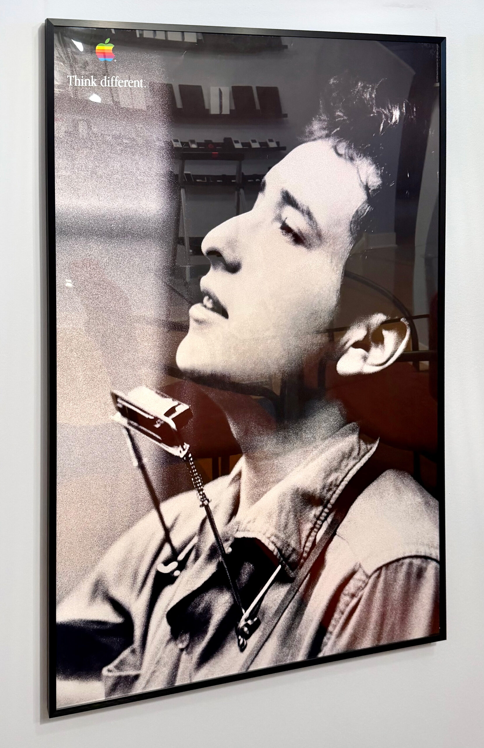
Bob Dylan (24 x 36 inches, 1998). From poster set 3.
Martha Graham (24 x 36 inches, 1997). From poster set 2.
Albert Einstein (24 x 36 inches, 1997).
Miles Davis (24 x 36 inches, 1998). From poster set 3.
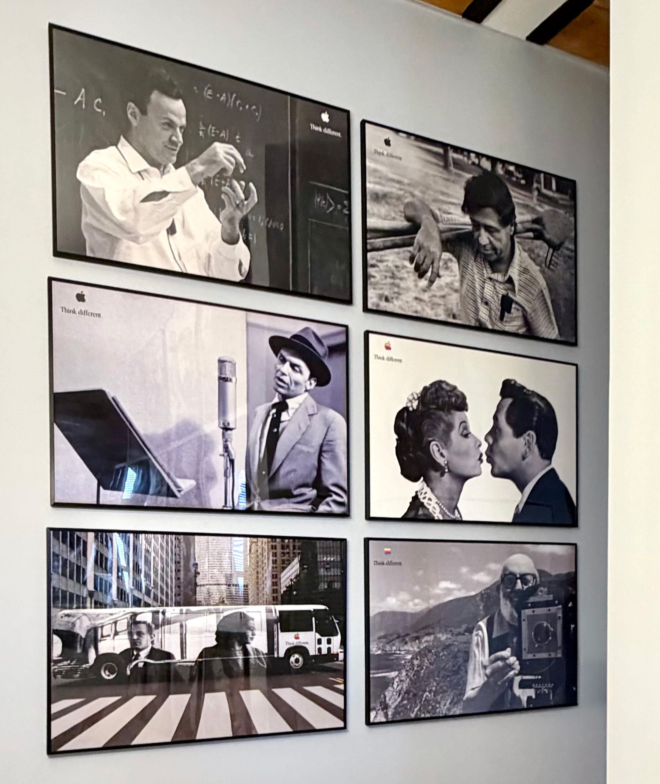
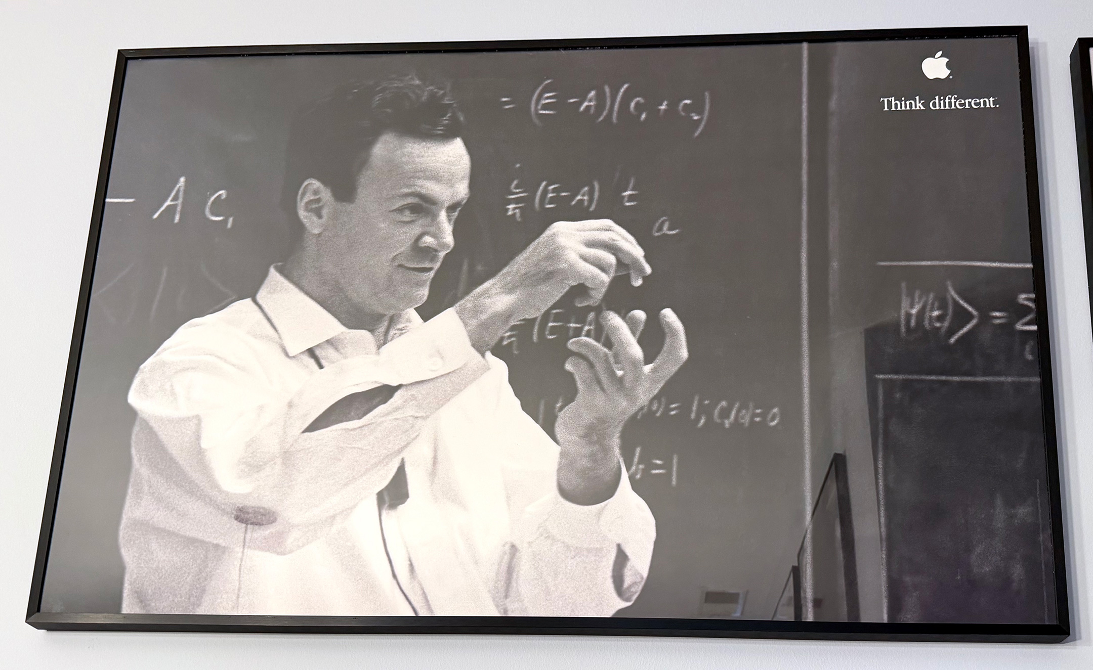
Richard Feynmann (36 x 24 inches, 1999). From poster set 4.
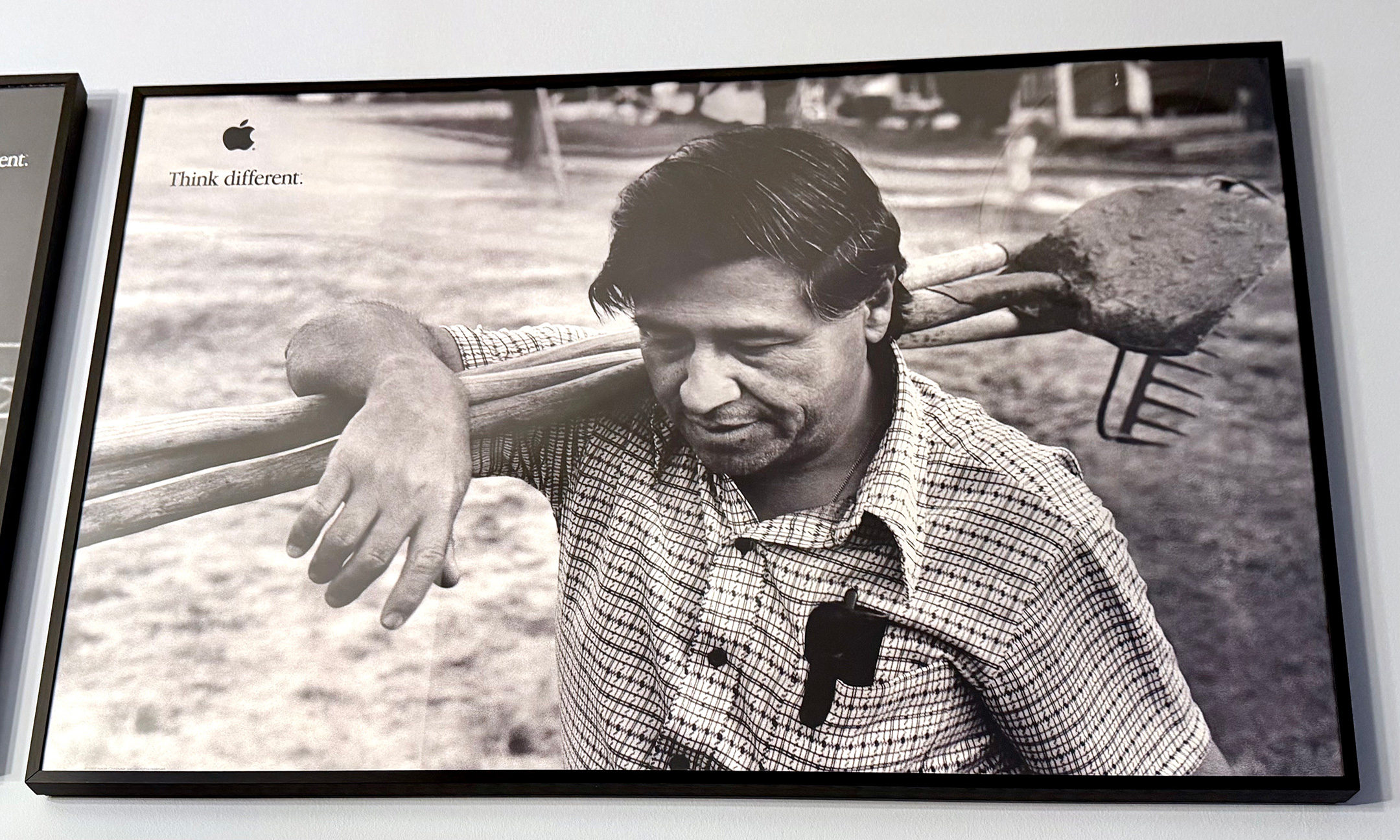
Cesar Chavez (36 x 24 inches, 1998). From poster set 4.
Frank Sinatra (36 x 24 inches, 1999). From poster set 4. [Print faded]
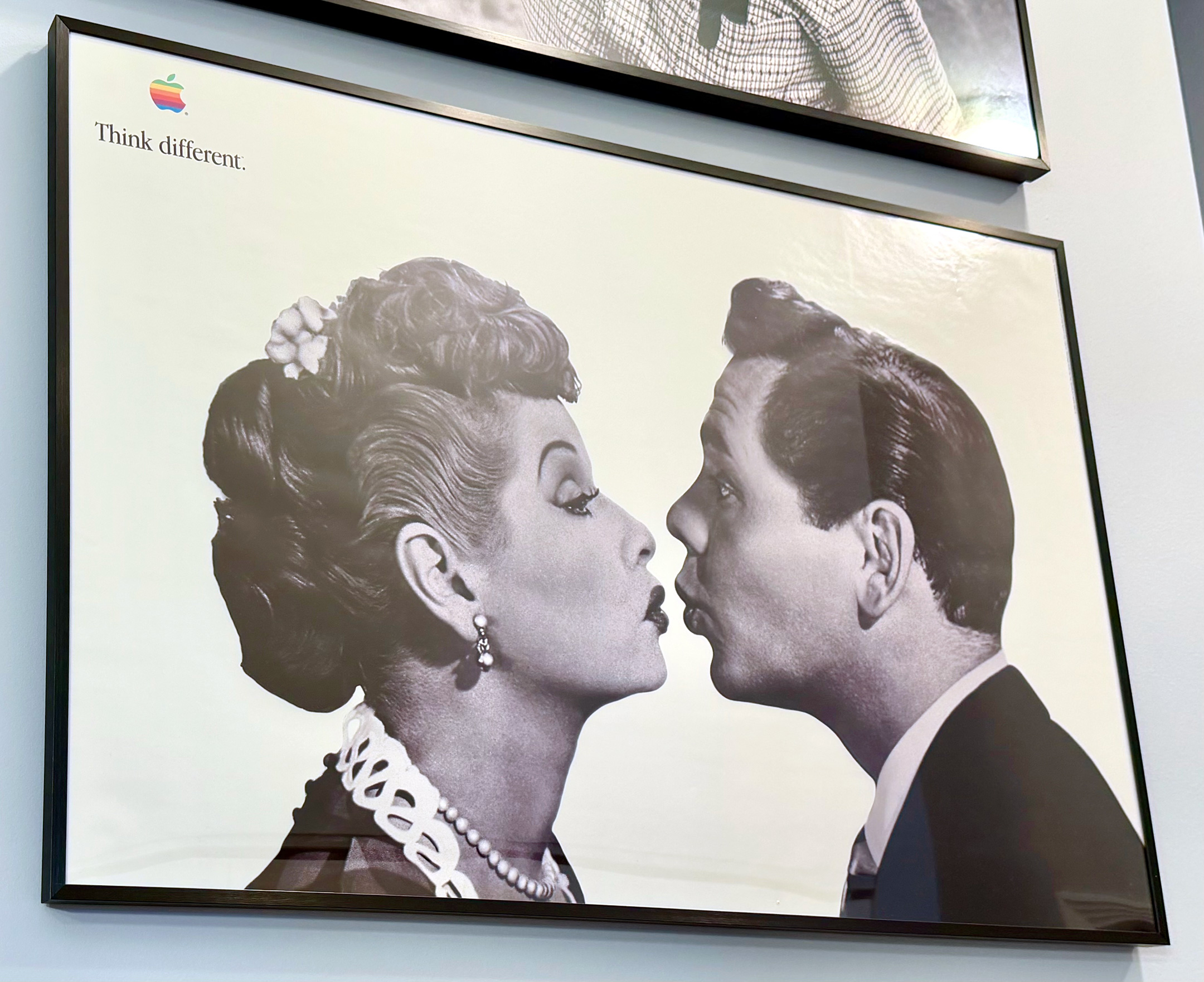
Lucille Ball & Desi Arnaz (36 x 24 inches, 1954/1998). From poster set 3.
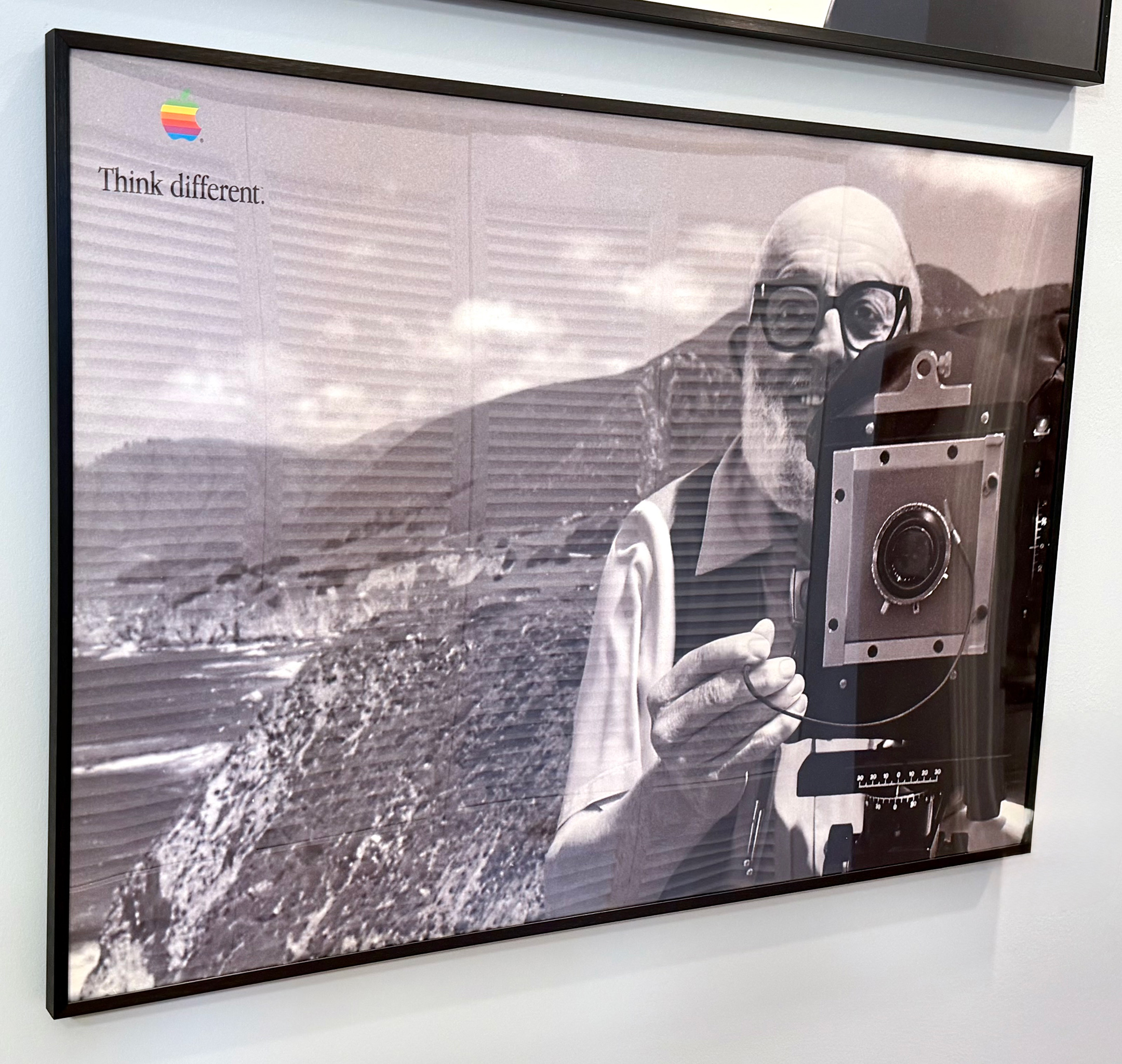
Ansel Adams (36 x 24 inches, 1998). From poster set 3.
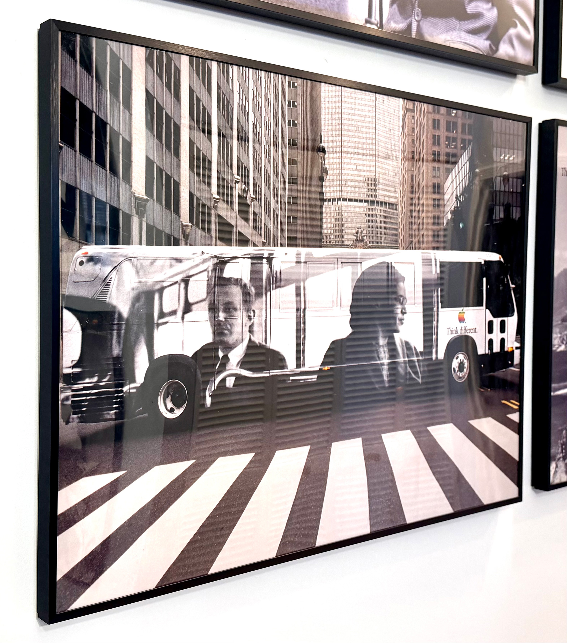
Rosa Parks bus (36 x 24, 1998). Education poster.
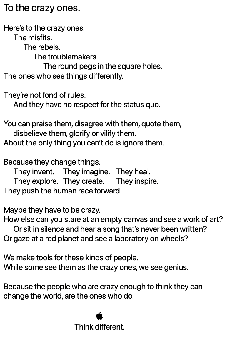
This advertising campaign was notable because it did not include imagery or mentions of any Apple products. The Think different idea was based upon a “manifesto” that began famously with “Here’s to the crazy ones.”
During the original TV commercial, voiced by Richard Dreyfuss, black-and-white film footage of iconic figures served as visuals to accompany the voiceover of a shortened version of the manifesto. Luminaries in the commercial included Albert Einstein, Bob Dylan, Martin Luther King Jr., Thomas Edison, Muhammad Ali, Gandhi, Amelia Earhart, Alfred Hitchcock, Jim Henson, Pablo Picasso, and others. The commercial ended with the multi-color Apple logo on a black background with white text (in the Apple Garamond font) Think different.
The print and digital ads also did not feature Apple products, just a black-and-white photo, the multi-color Apple logo, and the words “Think different.” One of the creative team members who worked on the campaign described the print concept: “The rainbow-colored logo served as stark contrast to the black and white photography, and, to me, it seemed to make the ‘Think Different’ statement all the more bold.”
In her 2011 book Design by Nature: Using Universal Forms and Principles in Design, Maggie Macnab described the concept of the Think different campaign:
“By identifying Apple’s core philosophy with the rebels and geniuses that changed the world by ‘thinking differently,’ the campaign established Apple as the ideology of the future. Apple was perceived as saving the day by making technology accessible to anyone. This move repositioned it well above its competition and far beyond the status of ‘product’ by connecting the user into a world of possibility.”
From the debut of Think different, the grammar of the slogan has been debated. Would-be grammarians cited the adverbial rule and admonished the slogan stating that “standard” English grammar dictates that adverbs must modify verbs—making “think differently” the “correct” usage. However as in this case, “different” can be used as an adjective that modifies the object “think”—suggesting a command to think in a different way. Thus, the slogan is parallel to other uses, such as “think big,” where “big” is used as an adjective. Using this logic, “think big” cannot be corrected to “think bigly,” just as “think different” could not be changed to “think differently” without changing its meaning.
In the United States, four sets of 24 x 36 inch Think different posters were released. Set 1 included Amelia Earhart, Alfred Hitchcock, Pablo Picasso, Mahatma Gandhi, and Thomas Edison. Set 2 included Maria Callas, Martha Graham, Joan Baez, Ted Turner, and the Fourteenth Dalai Lama (not officially released due to licensing). Set 3 included Miles Davis; Ansel Adams (landscape orientation); Lucille Ball and Desi Arnaz (landscape orientation); and Bob Dylan (not officially released due to licensing). Paul Rand and Jimi Hendrix were part of Set 3, but not included in all sets that were shipped (also likely due to licensing). Set 4 included Frank Sinatra, Richard Feynman, Jackie Robinson, and Cesar Chavez.
An unofficial Set 5 included film directors that was never released, including Charlie Chaplin, Francis Ford Coppola, Orson Welles, Frank Capra, and John Huston.
The 36 x 24 inch Rosa Parks bus poster is unique in this set as it was created and distributed to education customers and not part of a larger set. Further, the poster is a color photo of a black-and-white photo on the side of a New York City bus.
I have collected many of Apple’s Think different posters, print ads, and other materials, including a set of 10 posters that measure 11 x 17 each and were distributed to educators. Some designs in this Think different education set are cropped versions of the 24 x 36 posters.
The 24 x 36 posters photographed here are displayed in my dining room on two walls to create a gallery effect. I also included a photo of the 11 x 17 posters on the facing wall. You will note that the photography style of this entry is very different from my typical posts. These photos were captured with iPhone 17 Pro in situ with inconsistent lighting, angles, and reflections.
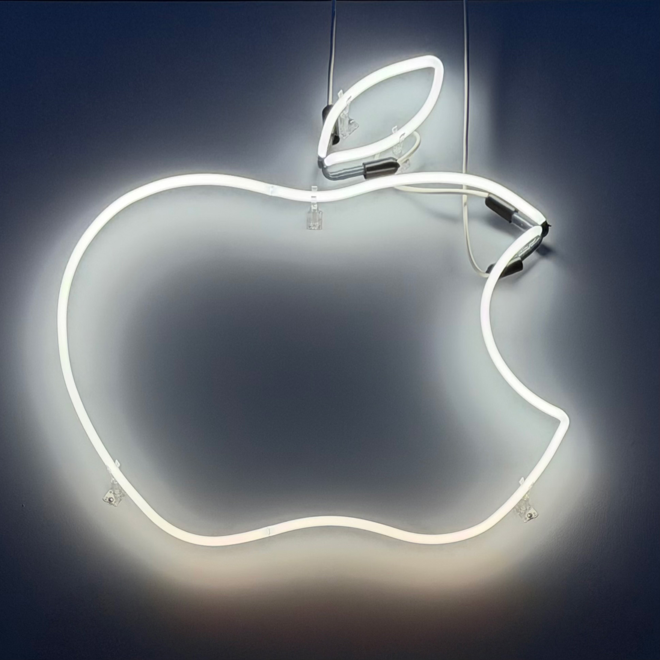
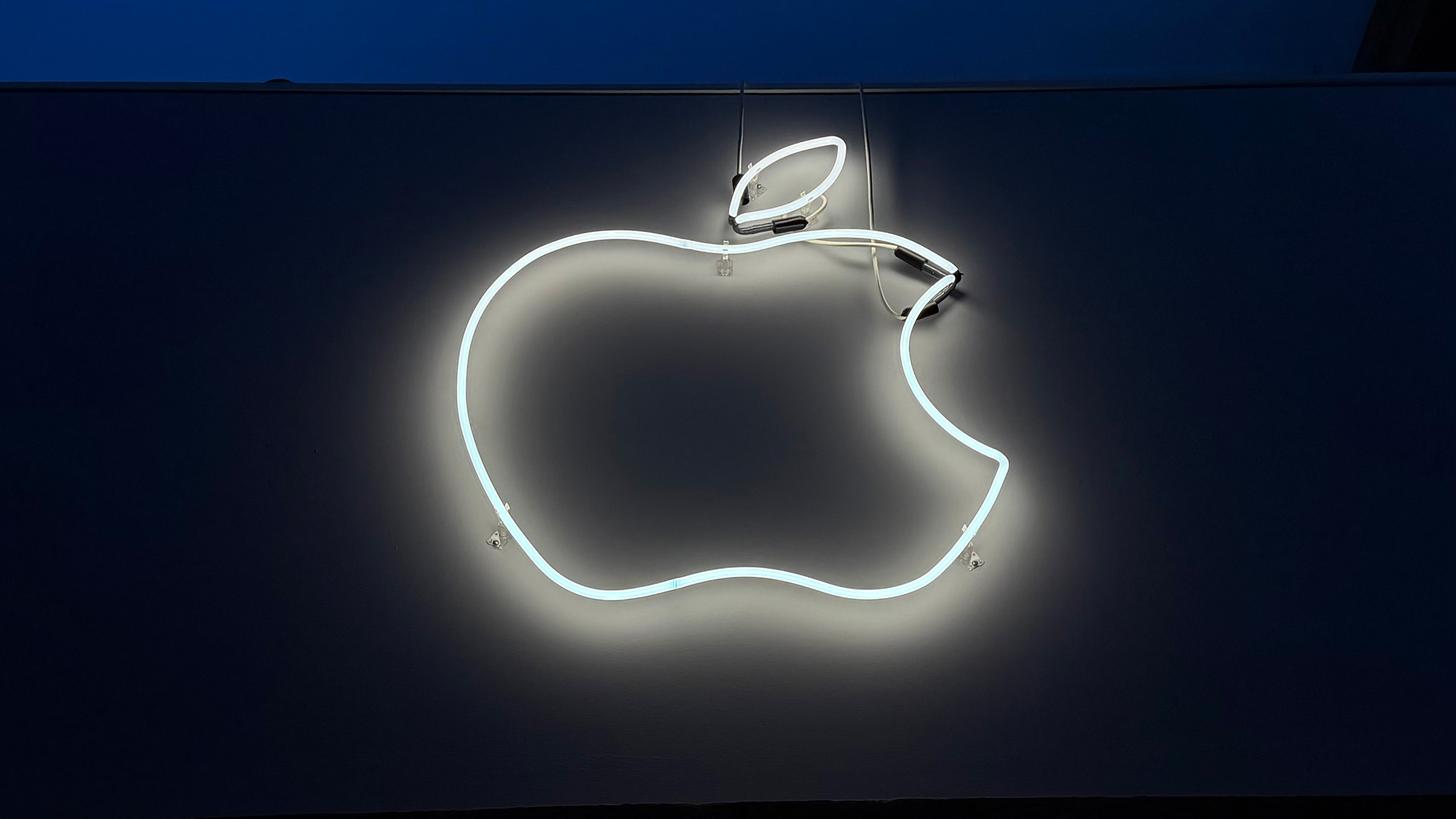
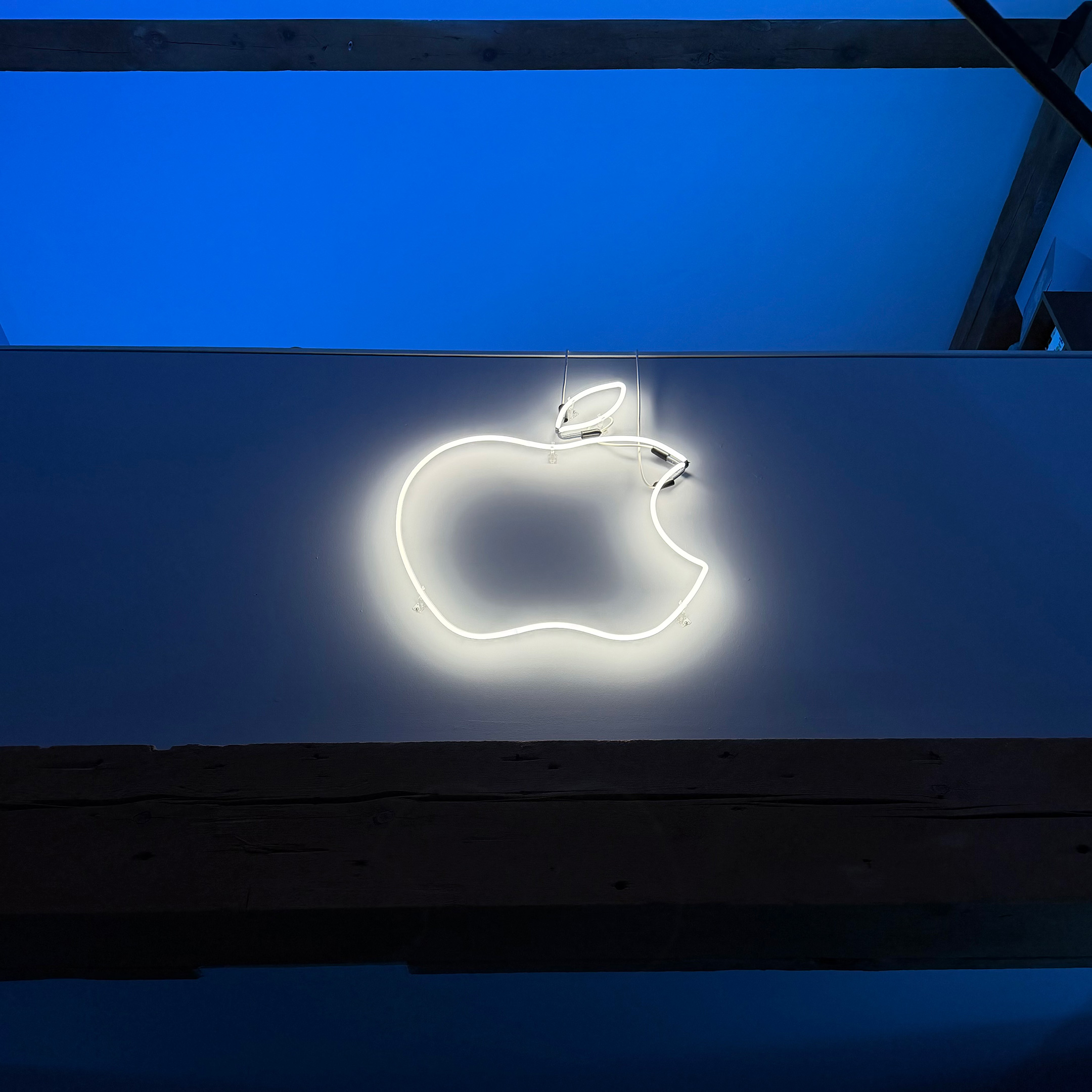
Back in 2014, I contacted Neon Shop Fishtail, a well-known neon shop in Chicago, and inquired about the possibility of fabricating a neon Apple logo for my home.
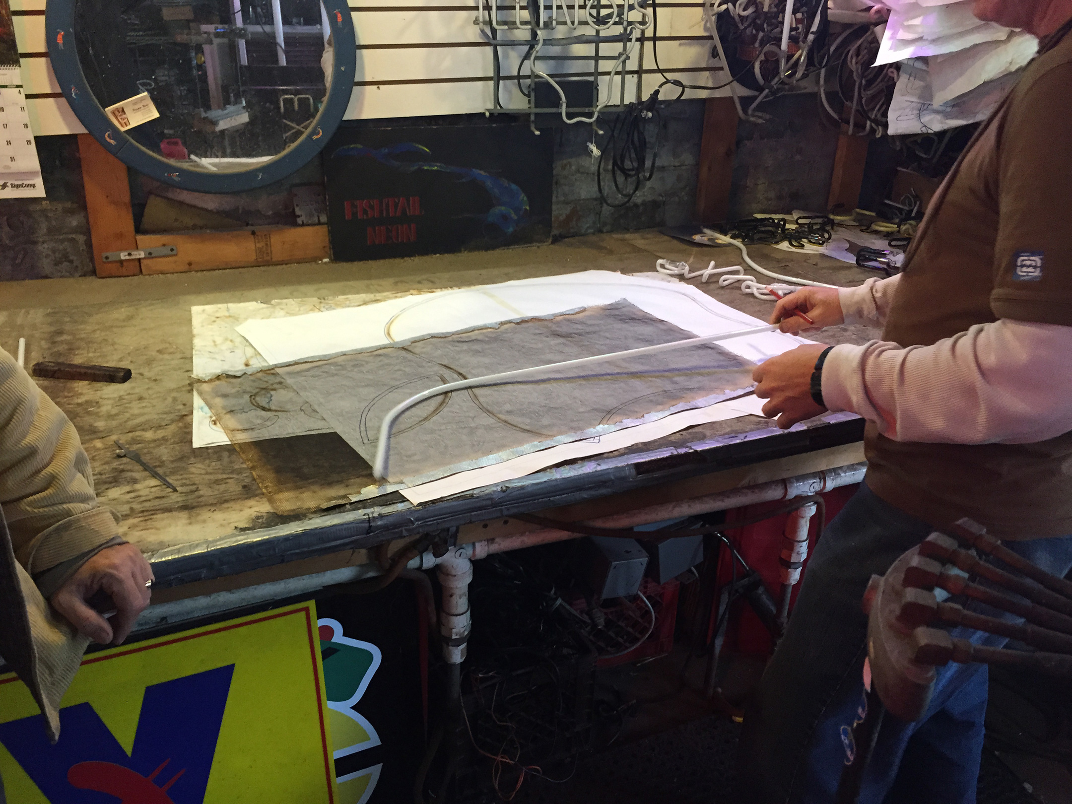
I contacted the general email address on the website and quickly received a response from Tom Brickler, whom I later learned is the owner of the shop. I sent a Photoshop mockup of the idea I was envisioning. He told me that he liked the project and that he could start it later that week.
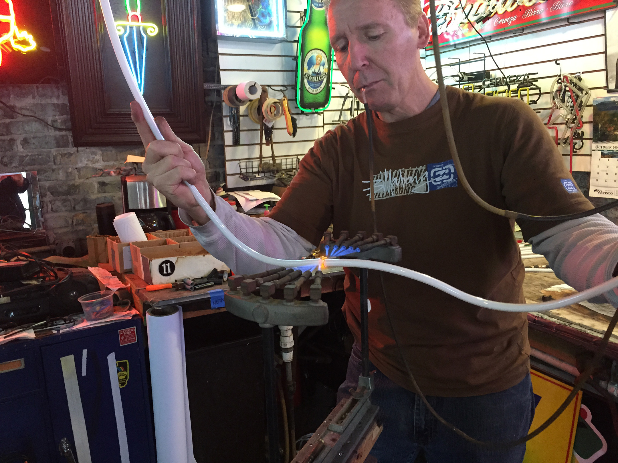
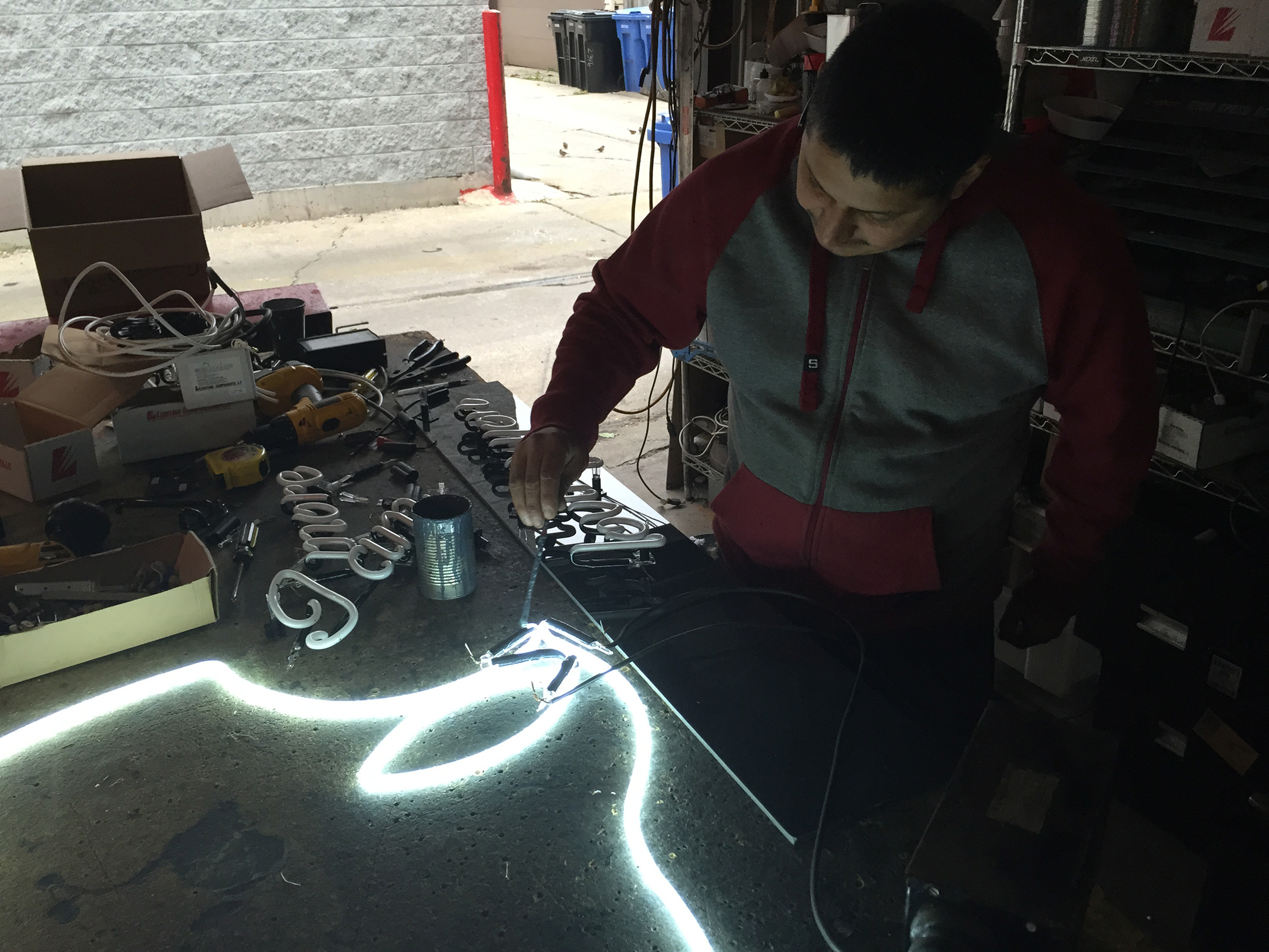
On a whim, I asked if the shop allowed customers to watch the fabrication of projects. I was very surprised when he invited me the next Friday afternoon. They not only allowed me to watch the fabrication, but they very generously allowed me to take photos and video, all captured on my iPhone 6—my personal iPhone at the time.
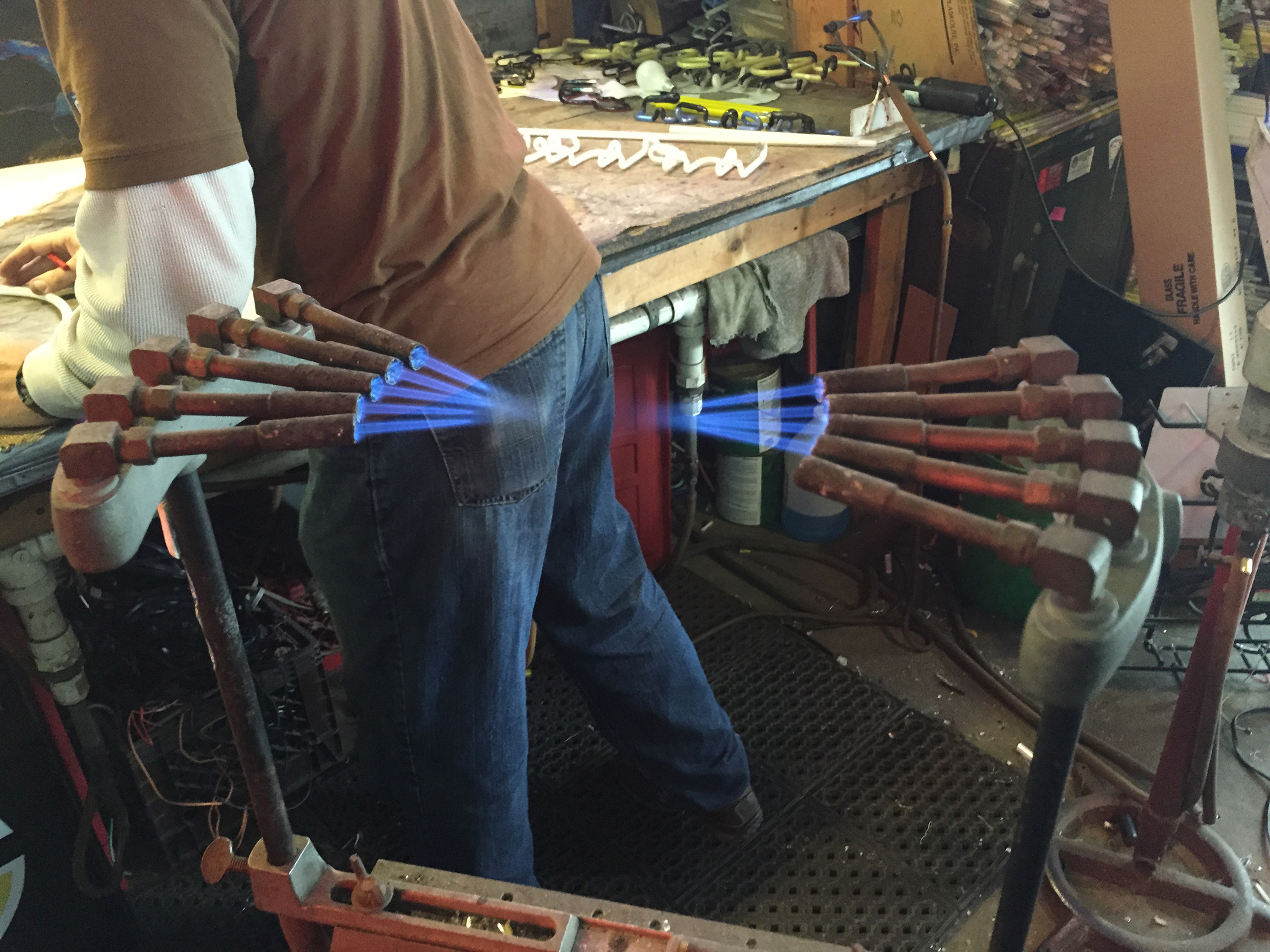
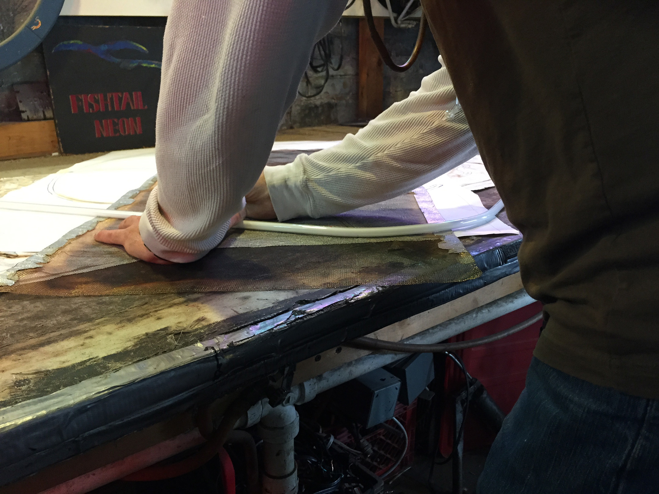
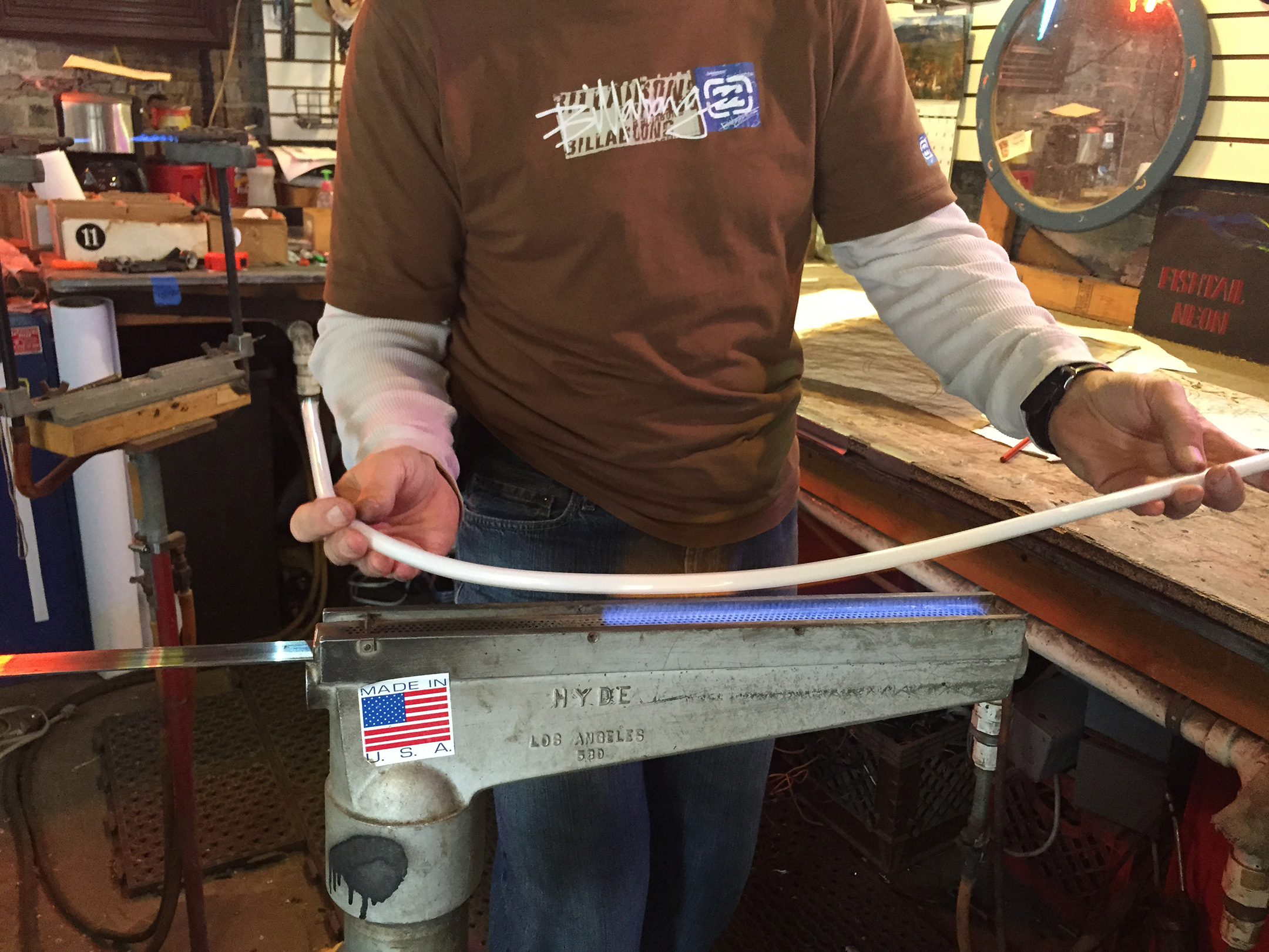
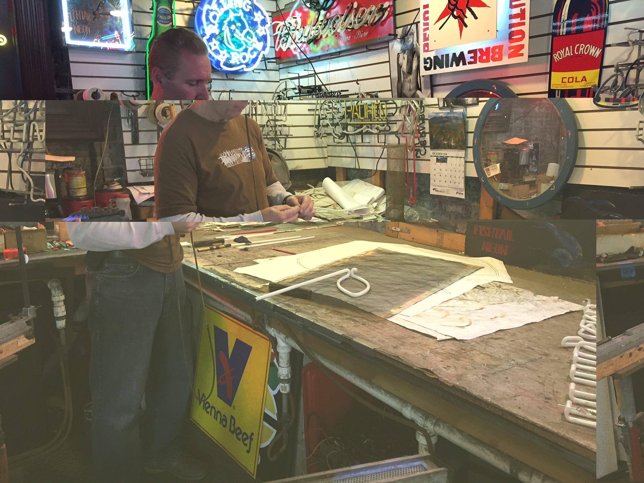
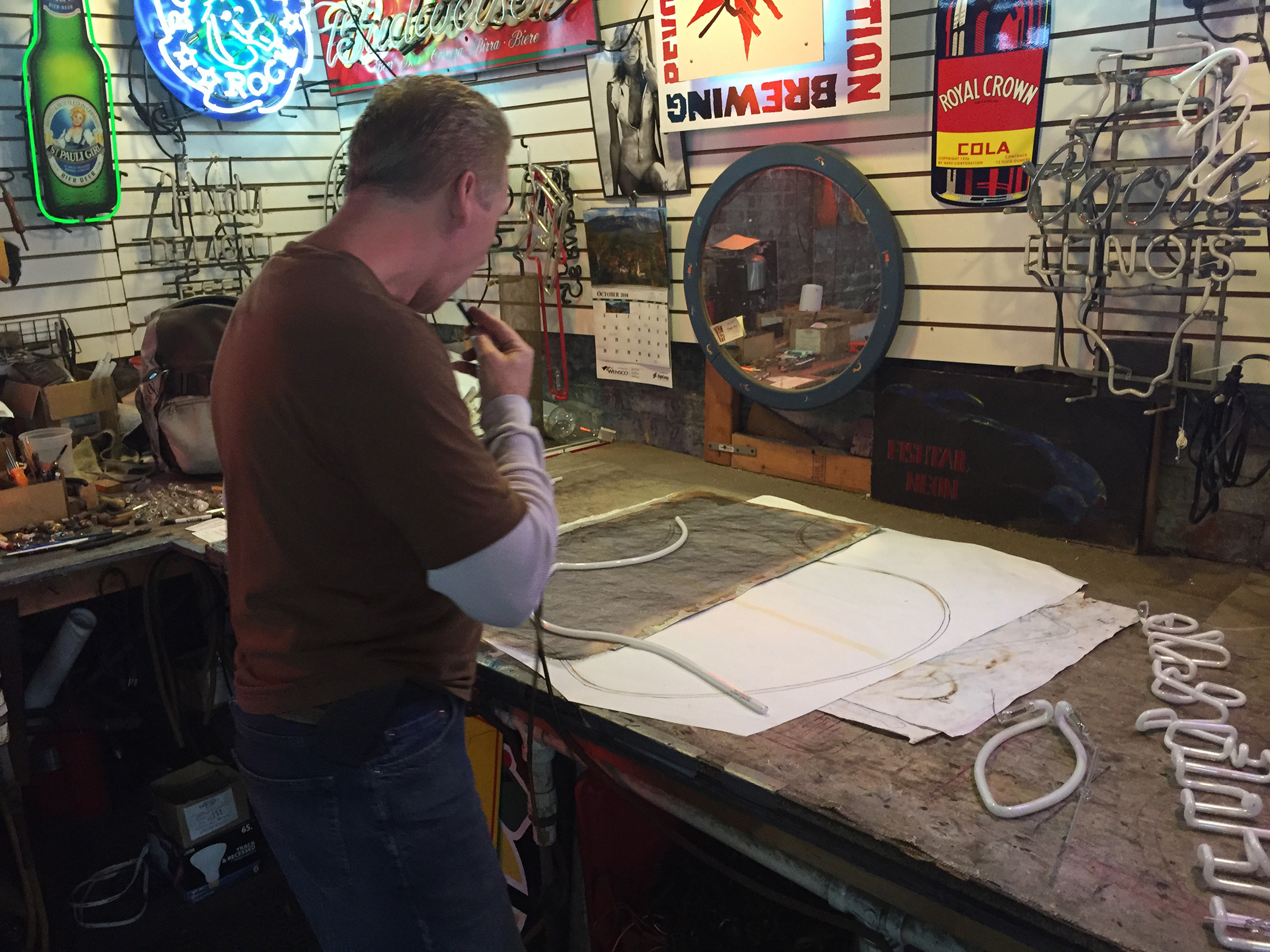
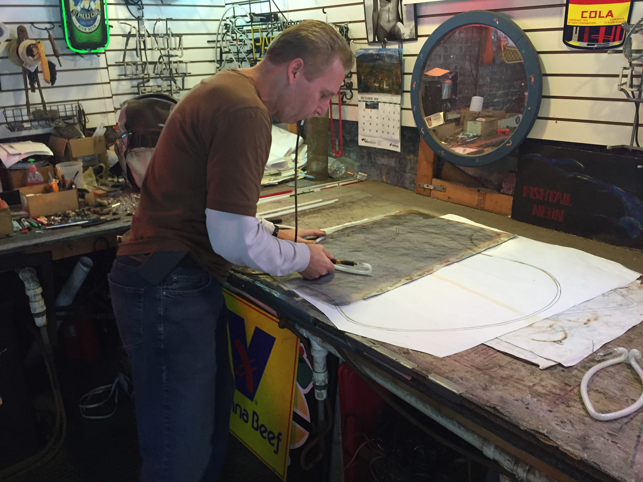
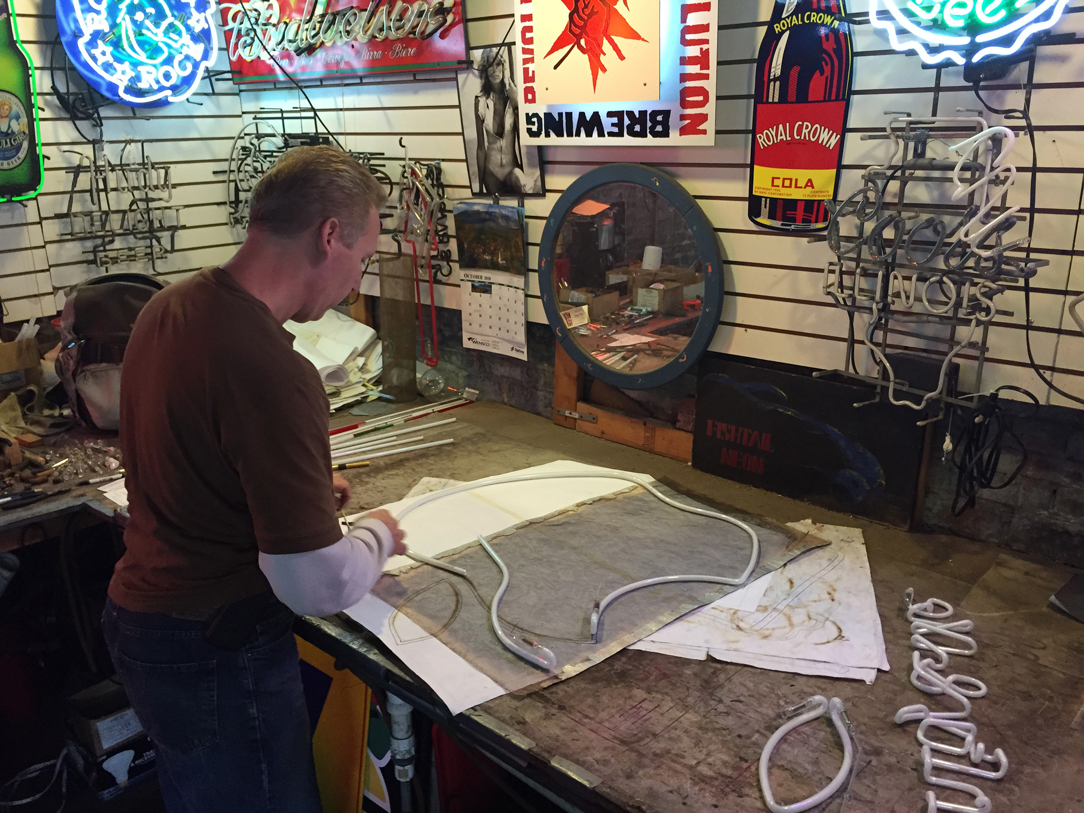
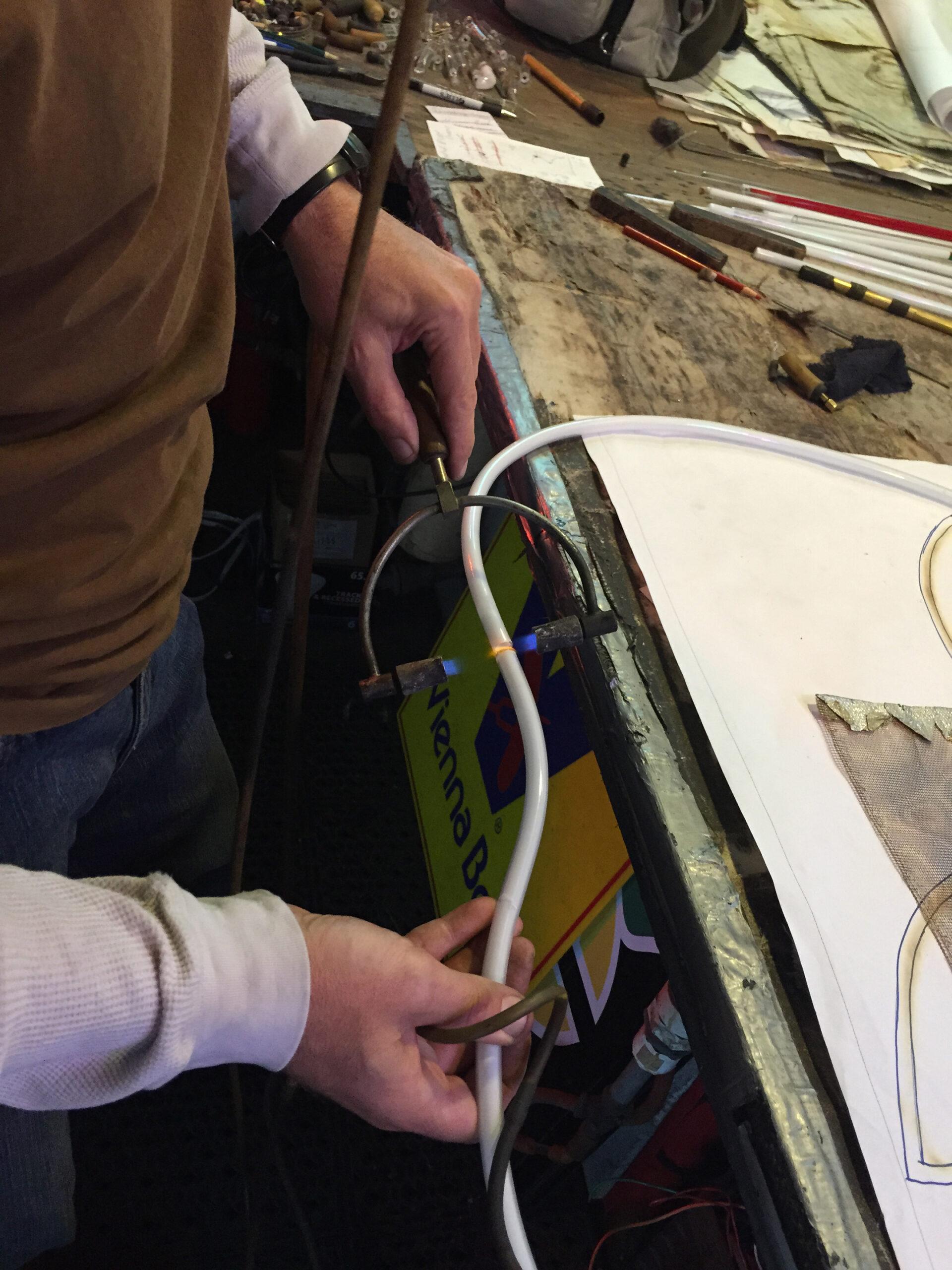
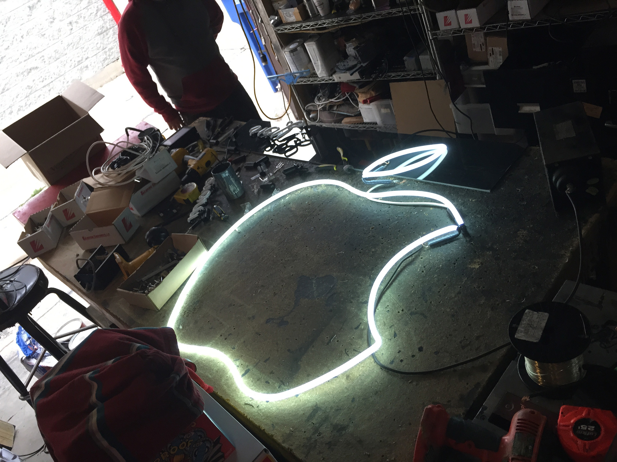
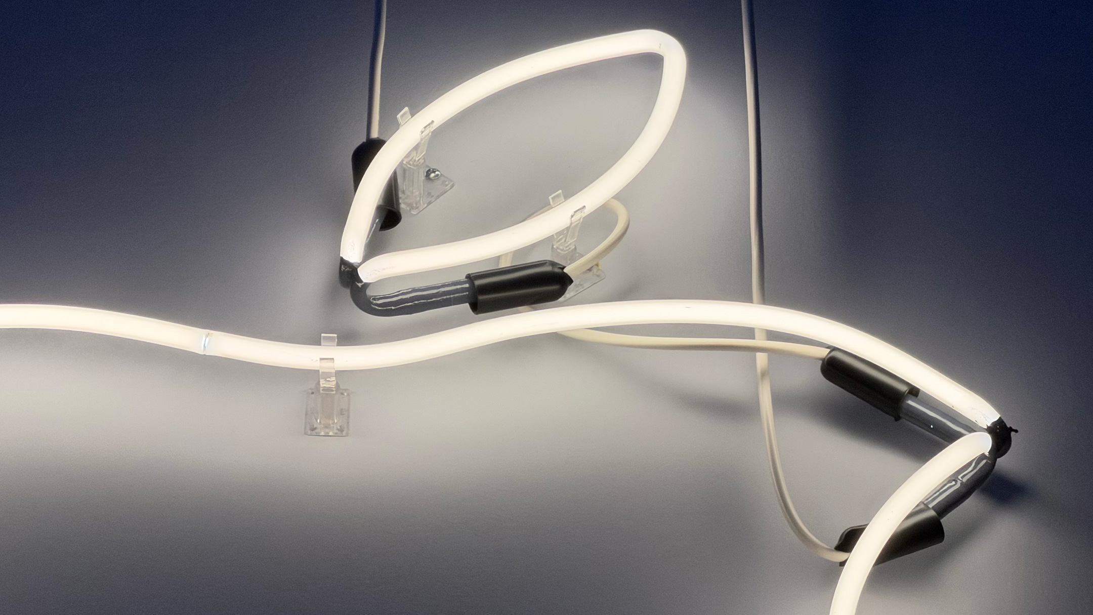
The experience was fascinating to watch, and it became immediately clear that the three men involved in the project were extremely skilled craftsmen. Before I arrived, neon artist John Noga had already shaped three pieces of the logo, but he had not yet fused them together. I was able to watch him create the leaf part of the logo from a straight white glass tube. He then trimmed and joined the larger pieces to form the lower apple part of the logo with the top, bottom, and “bite.”
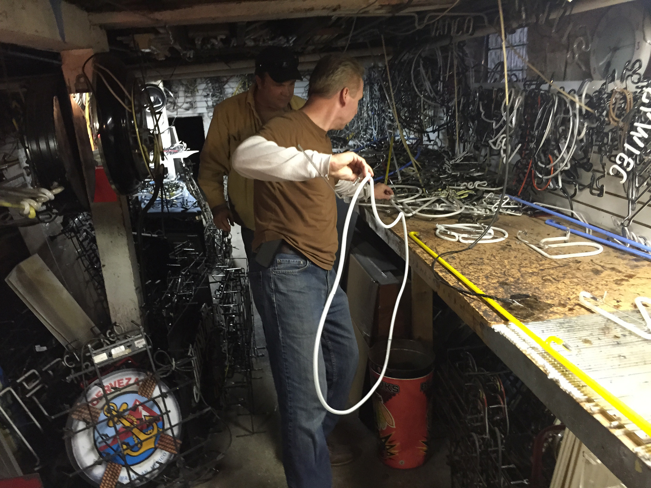
The next step was to bring the project to the shop basement where the two pieces were electrified with 15,000 volts of electricity, heating them to 550˚F to burn out the impurities inside the glass. The white tubes were then pressure-filled with argon gas so, when electrified, the piece would produce a white glow.
The last two steps, completed by Chevo Carreño, included “burning in” the tubes with electricity so the entire shape would glow evenly. As the burning-in commenced, it was easy to follow the path of the glow getting brighter until the entire piece was even. He finished the project by painting the non-glowing parts of the tubes with a foul-smelling substance that effectively blocked out the light. He let me select the color, and I went with gray. I was also able to select the wire color and chose white.
I took the logo home that day.
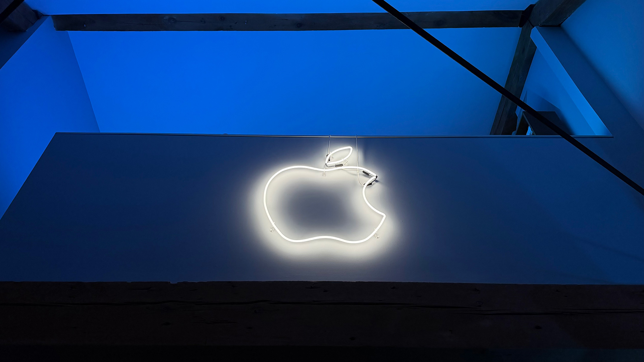
About one month later, I finished the installation with help from my then-neighbor and owner of a painting company, Alex Tenuta. The logo is supported by clear plastic clips attached to the wall, and the wiring is a simple series circuit that attaches to a dimmable transformer that plugs into a standard outlet. The logo is mounted on the half-wall of my loft, about 15 feet up.
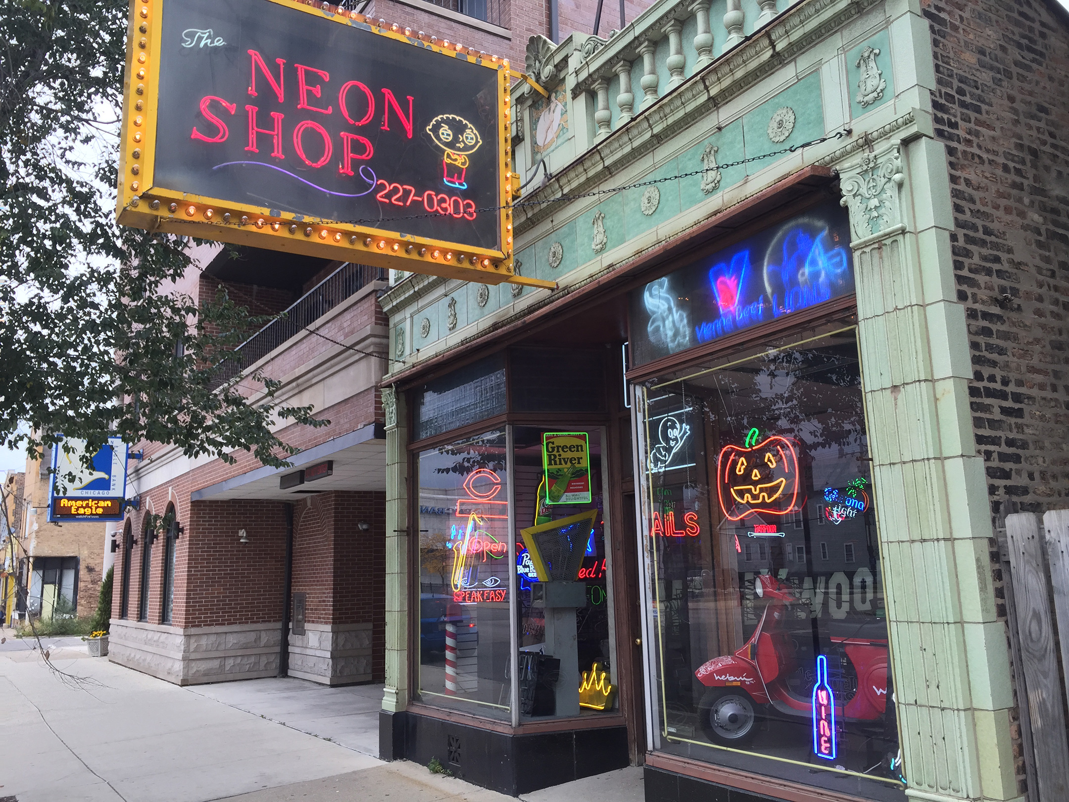
Tom Brickler, also known as “Neon Tom,” named Neon Shop Fishtail after a fishtail ribbon burner used for making sweeping curved bends with glass over fire. After nearly 40 years, he describes his business as strong with “work in the major motion picture industry, business signs, custom art for residential, and signage for the industry.” The website adds, “We specialize in making our own signs in the handmade custom way neon is made and take great pride in what we do!”
Neon Shop Fishtail is located at 2247 North Western Avenue on Chicago’s north side, and handmade work can be viewed in the store. Brickler invites anyone to visit, “even if you are not in the market for a neon sign…after coming in, you will now be noticing neon everywhere, and hopefully you will come up with an idea that we can create in light.”
I distinctly remember recording the process at Neon Shop Fishtail, and to this day I very much appreciate that they timed the completion so I could watch and learn part of the process. I still remember how effortless they made process seem and the obvious experience and artistry in every step. I also remember being surprised by the specialized tools and open flames that were burning around the shop in unexpected locations.
Using my many clips, I created a “making of” video back in 2014 and posted it on YouTube. Neon Shop Fishtail has included on the front page of their website since I sent them the link in 2014. Over 10 years later, my video has well over 14,000 views—BY FAR the most views of any video I have ever made!
This set of postcards was available in 2003 at the time of the release of the iPod Generation 3 with an all-touch interface and dock connector. This was the first iPod redesign following the original iPod design (with FireWire port and a mechanical scroll wheel in Generation 1, followed by a touch-sensitive wheel in Generation 2). The postcard set featured a black silhouette dancer on a bright single-color background with the dancer holding a white iPod and wearing the iPod’s white earbuds connected with its white wire.
The visually striking silhouette concept began as print ads and posters, but in 2004 expanded to TV commercials featuring dancers and then-popular songs available on the iTunes Store. Among the many iPod silhouette commercials produced between 2004–2008, the two I remember best were Jet’s “Are You Gonna Be My Girl” and U2’s “Vertigo.”
The postcards measure 6 x 4 inches. The back of each postcard is printed with the same text:
iPod and iTunes. Mac and Windows. Rock and Roll. Together, they changed the way we listen to music. And now everyone can enjoy the most acclaimed digital music player and music software ever created. Because now iPod and iTunes work together on a Windows PC the same way they always have on a Mac. Walk, ride, run, drive, and go anywhere with up to 10,000 songs in your pocket. Easy to load, easy to love. The ultraportable iPod comes in 10GB, 20GB, and 40GB models and holds up to 10,000 songs. And iTunes makes it a cinch to organize, arrange, and sync all your music from your Mac or Windows PC to your iPod. Shop the record store of the 21st century. In the iTunes Music Store, you can download most any song for just 99¢, then load it on your iPod. You can also preview any song for free and create an account to let your kids shop for music. www.apple.com/itunes
In researching this post, I found an impressive compilation video titled “Every Apple iPod Ad ever. 2001-2012” by YouTube user way310. Using Apple’s Shazam app, I made a list of every silhouette-style video shown. I identified 21 different songs that either use the original silhouette style or a style closely inspired by the concept as it evolved over the years [notes included in brackets]:
N.E.R.D, “Rock Star” (Jason Nevins Remix Edit)
Jet, “Are You Gonna Be My Girl”
Black Eyed Peas, “Hey Mama (Mixed)”
Feature Cast, “Channel Hopping”
Steriogram, “Walkie Talkie Man”
U2, “Vertigo”
The Vines, “Ride” [live-action commercial, silhouette posters come to life]
Daft Punk, “Technologic”
Gorillaz, “Feel Good Inc”
Ozomatli, “Saturday Night”
Eminem, “Lose Yourself” (From 8 Mile) [background uses multiple colors and patterns, artist rendered in more detail]
Caesars, “Jerk It Out” [green background with animated iPod shuffle arrows]
Bob Dylan, “Someday Baby” (Alternate Version, “Modern Times”) [white background, artists rendered in muted tones]
Wynton Marsalis, “Sparks”
The Fratellis, “Flathead” [stylized, multicolor design for backgrounds and silhouette figures]
Paul McCartney, “Dance Tonight”
Wolfmother, “Love Train”
Quantic & Nickodemus, “Mi Swing Es Tropical” (feat. Tempo & The Candela Allstars)
Susan Kare (born 1954) was the designer who created the icons, graphics, and fonts for the original Macintosh. Kare graduated from New York University with a Ph.D. in fine arts in 1978. After graduating she moved to California and worked at the Fine Arts Museums of San Francisco. Her high school friend and member of the original Macintosh development team, Andy Hertzfeld, called her in 1982 and asked her to draw icons and text elements for the Macintosh project.
Kare’s original drawings for Apple were created in 32×32-pixel grids. AIGA documented her original work for Apple and acknowledged that Kare “created some of the most recognizable icons, typefaces, and graphic elements in personal computing: the command symbol (⌘), the system-failure bomb, the paintbrush, and, of course, ‘Clarus the Dogcow.’” Her work was characterized as “a canvas of approachable visual metaphors that are instantly recognizable decades later.”
Some of Kare’s work can be found in the Museum of Modern Art in New York City. According to Kare’s website:
“Kare believes that good icons should be more like traffic signs than illustrations; easily comprehensible and not laden with extraneous detail. She has observed that just because millions of colors are available, maximizing their use in an icon does not necessarily improve it. When symbols (icons or logos) are meaningful and well-crafted, they need not be frequently redesigned.”
This print, “Hello on Blue,” is a limited edition, numbered 27/200, and signed and dated by Susan Kare. It is a giclée fine art print that is 25 inches wide x 17 inches tall. The work is printed using archival ink on acid-free Hahnemühle Photo Rag paper. Although this is not an “official” Apple product, I am proud to feature Kare’s work among my Apple collection.
This iconic “hello” cursive script image that was originally designed by Kare has been used by Apple numerous times over the years, beginning with the introduction of the original Macintosh on January 24, 1984 during Apple’s Annual Shareholders Meeting. After Steve Jobs showed the Macintosh live on stage, he played a TV commercial that shows a carrying case being unzipped, the Macintosh lifted onto a table, and the black-and-white screen displayed the “hello” cursive design. A few other uses of the “hello” design include:
May 6, 1998: Steve Jobs introduced the original translucent Bondi blue iMac with the screen displaying “hello (again)”—with “hello” in the original cursive script and “(again)” in Apple Garamond.
December 2022: During my own visit to Apple Park in Cupertino, visitors to the Apple Briefing Center were greeted with a sculpture approximately 4 feet wide of “hello” that is airbrushed in the colors of Apple’s original multicolor logo.
2023: Apple Developer provided “Hello Developer” online, described as “A monthly guide to the latest developer activities, stories, and news” that features the original “hello” image in different formats in different editions from October 2023–June 2024.
October 28, 2024: Apple releases an iMac Announcement video that begins with the cursive script “hello” and then expands to “hellllllo” with each “l” in a different color of the original Apple logo; in the presentation the iMac is updated to the M4 chip and is available in “new vibrant colors.”
October 29, 2024: The Mac mini is updated in a video announcement using the “hello” image stylized with the Apple Intelligence logo, emoji, the Jolly Roger flag (a nod to the original Macintosh team), and a 3D wire frame.
This is a rare Mac Collection blog entry for a non-Apple product, but I consider its crossover appeal to warrant its own post. Many thanks to Tom for this gift that was purchased at the Haynes Motor Museum in Sparkford, Yeovil, Somerset, England.
For automobile enthusiasts worldwide, Haynes is instantly recognizable as “the worldwide leader in automotive and powersports equipment repair, maintenance and customization manuals, with over 150 million sold to date globally.” The publisher is based in the United Kingdom, and they note on their website:
“Haynes Publishing was founded in 1960. The main office is located in Somerset, England. The Haynes Manuals team is headquartered in Newbury Park, CA [USA] and is part of Haynes North America, Inc., which also publishes Chilton Repair Manuals in print and Clymer Repair Manuals in both print and online editions.”
Haynes Manuals are written by expert technicians and based upon tear-downs of each vehicle that they describe as a “step-by-step procedure for dismantling a vehicle or piece of equipment part-by-part. This is followed by the detailed rebuilding of the vehicle.” Hundreds of photos and videos accompany the tear-down process that are used in creating the manuals. They tout their manuals as “the ultimate DIY guide books for used, collector, and newer model vehicles and powersports equipment.”
In addition to automotive manuals, Haynes has offered manuals in their signature style in a variety of “lifestyle” categories. As of 2024 their website lists the following lifestyle options: Aviation; Maritime; Military; Motorcycling; Motorsport; Music; Rail; Space; Caravanning & Camping; Cooking, Food + Drink; Computing; Fitness, Sport + Wellbeing; Hobbies + Leisure Activities; Home, DIY + Garden; History + People; Pet & Animal Care; and Sci-Fi.
This Haynes tome is from 2003 and is titled The Mac Manual: The Step-by-step Guide to Upgrading, Maintaining and Repairing a Mac by Keith Martin (2023).
The back of the book provides the following description:
“This full-colour manual shows how easy it is to upgrade, maintain and repair a Mac – from a beige G3 to a flat-screen iMac. From adding more memory or upgrading the processor to installing a new DVD drive, it takes the reader through each stage using plain English and clear step-by-step photographs. Along with information on software and peripherals, this manual will save you time and money, giving a basic understanding of all areas of Mac hardware and installation – without blinding you with science.”
The author, Keith Martin, at the time of its publication was considered “an acknowledged Mac expert with a talent for debunking jargon and explaining how things work in plain English, is the full-time Technical Editor of MacUser, the UK’s most authoritative and best-selling Mac magazine. He lives in south-west London.” As of 2024, he describes himself as a “consultant, practitioner and lecturer in print and digital publishing, design, tech, and 360 virtual reality imaging.”
“Think different” was the slogan used by Apple in advertising 1997–2002, and is still used in some circumstances as of 2024. The “Think different” concept was created by advertising agency TBWA\Chiat\Day while working with Apple and Steve Jobs. “Think different” was used in its original concept in a TV commercial and in print/digital advertisements, and the “Think different” slogan was used as part of many TV commercials, print/digital ads, and on product packaging.
The Think different concept started with a “manifesto” that began famously with “Here’s to the crazy ones.”
Here’s to the crazy ones. The misfits. The rebels. The troublemakers. The round pegs in the square holes. The ones who see things differently. They’re not fond of rules. And they have no respect for the status quo. You can quote them, disagree with them, glorify or vilify them. About the only thing you can’t do is ignore them. Because they change things. They push the human race forward. While some may see them as the crazy ones, we see genius. Because the people who are crazy enough to think they can change the world, are the ones who do. Think different.
Apple’s print and digital “Think different” ads did not feature Apple devices, just the Apple logo and the words “Think different.” One of the creative team who worked on the campaign described the print concept: “The rainbow-colored logo served as stark contrast to the black and white photography, and, to me, it seemed to make the ‘Think different’ statement all the more bold.”
This black denim jacket was made by Canadian manufacturer International Denim. The style has been described in other sources as a “varsity” style jacket. Its main body is made from high-quality black denim, with the cuffs and bottom band made from black rib knit elastic fabric.
Overall, the jacket is in excellent condition. The back of the jacket is embroidered in white with the words “Think different.” in Apple’s Garamond logotype that was used in the Think Different ad campaign. Apple’s classic six-color logo is embroidered and centered above the logotype.
The tag on the inside of the jacket includes the following information:
ID Sport by International Denim 100% Cotton Made in Canada CA05976 RN42206